


Yellen Declares Mission Accomplished. Why Does this Scare Me?
Maybe I don't like the arrogance, maybe I've seen the "all clear" prematurely too many times before and maybe there continues to be too many inconclusive signals...Let's take a look.
Just to be clear, today’s note is not an attempt to be overly pessimistic.
It is, however, intended to highlight some of the challenges that we continue to see and a reaction to the arrogance of policy makers.
We are mindful (and experienced in the fact) that markets have the ability to humble the best the and the brightest.
We are open minded as to how both the economy and the markets can resolve this year. The path is not obvious and having an extreme conviction is likely a recipe for underperformance.
“What we’re seeing now I think we can describe as a soft landing” Janet Yellen, January 5, 2024
1. Inconsistency in the Labor Report (Part 1)
While many initially cheered this morning’s employment report, we found some concerning inconsistency.
First, the labor force participation (chart below) dropped from 62.8% to 62.5%.
The US labor force is approximately 168 million people (source: Bureau of Labor Statistics). The 0.3% drop in labor force participation represents 500 thousand people.
The unemployment rate dropped from 3.8% to 3.7%. However, all else equal, fewer participants in the labor force means a lower unemployment rate.

Source: Bloomberg. Through year-to-date 2024.
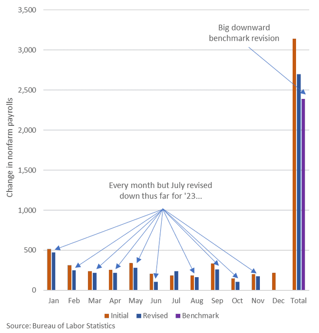
2. Inconsistency in the Labor Report (Part 2)
When the monthly non-farm payroll figures are released, they are an initial estimate.
Once released, payrolls are revised in the subsequent two months and then again in the annual benchmarking process. The final benchmark revision will be released in February.
As can be seen on the chart below, payroll estimates for every month of 2023 with the exception of July have been revised down. In addition, the initial benchmark revision reflects an even softer employment environment.
What was initially reported as over 3 million jobs added during 2023 is actually fewer than 2.5 million.
Again, this is not meant to be overly bearish, it is to say that it may be early to declare victory.
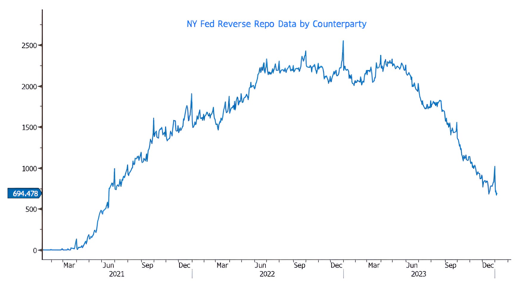
3. Watch What We Do, Not What We Say - Liquidity
Many that followed US equity markets last year were surprised by their strength in light of elevated valuation, flat year-over-year earnings growth and a Fed tightening cycle that was characterized as higher for longer.
In addition to raising the Fed Funds rate, the Fed was restricting liquidity by shrinking its balance sheet in a policy known as quantitative tightening (“QT”). Previous attempts to shrink the Fed’s balance sheet were coincident with equity market volatility.
What became obvious looking back was that despite talking about tightening (always with a hint of an upcoming pause), both the Fed and the Treasury strategically added stealth liquidity throughout the year.
In March, in response to the regional banking crisis, the Fed reversed half of its quantitative tightening to that point and bought $400 billion in securities to stimulate bank lending.
Shortly thereafter, the US government hit its debt ceiling and the Treasury added liquidity through its General Account.
Once the debt ceiling was lifted (and the government went on a further spending binge), the Treasury added liquidity through Reverse Repos (chart below).
The Reverse Repo account initially grew during the post-Covid QE period from 2020-2021. At the time, the Fed printed so much money that the excess needed a place to go. That place was the Reverse Repo account.
As the account is drawn down, this money is used (instead of bank reserves) to buy Treasury bonds. In other words, while the Fed is shrinking its balance sheet, this "stealth" QE has somewhat off-set the impact.
The Reverse Repo account is being drawn down quickly and maybe by the time it has been fully depleted, the Fed will be providing liquidity the old-fashioned way through rate cuts.
Source: Bloomberg. Through year-to-date 2024.
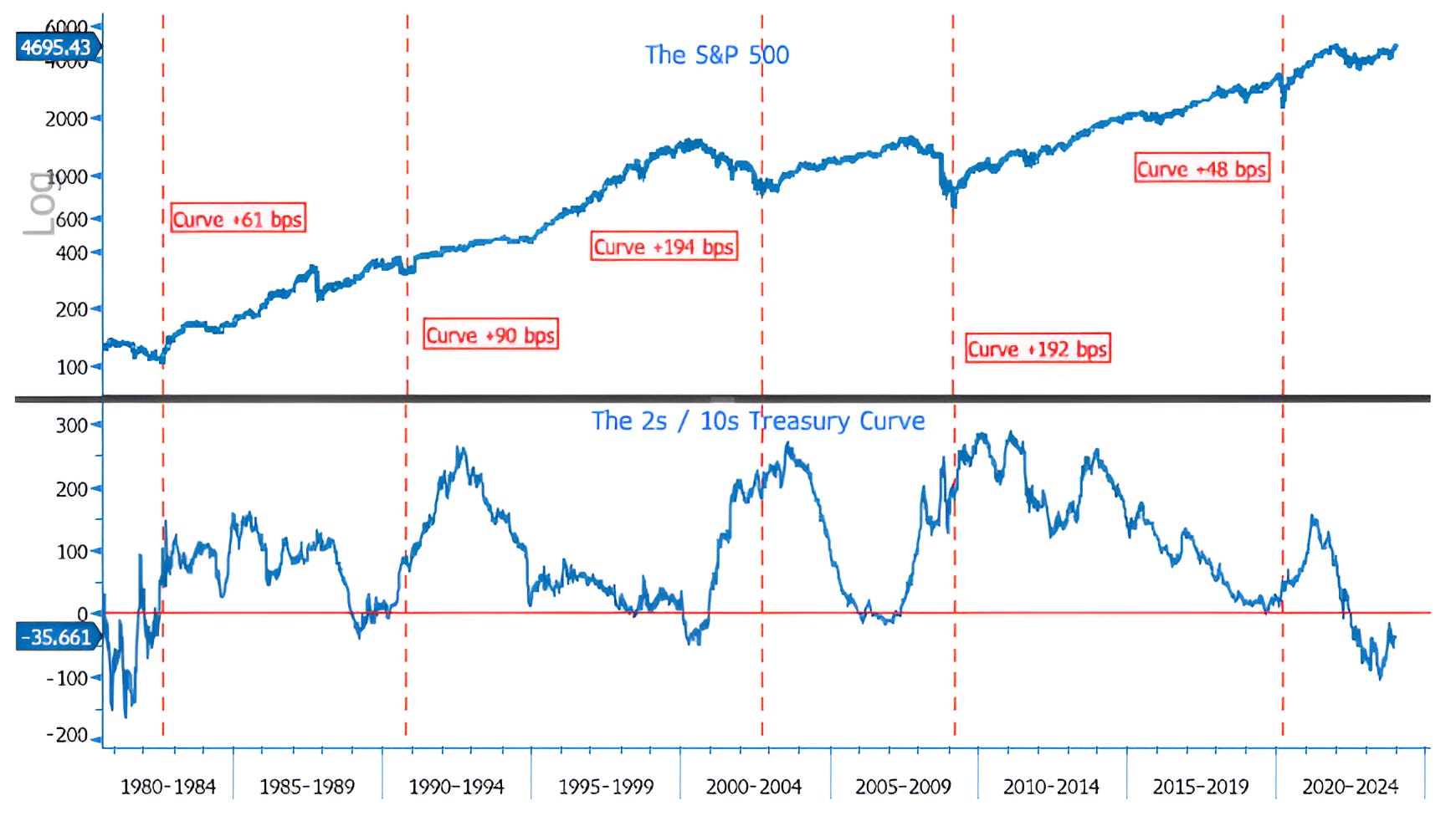
4. It’s the Un-Inversion that We Need to Watch
The top panel of the chart below shows the S&P 500. The lower panel shows the difference between 10-year and 2-year US Treasury yields (the 2s / 10s curve).
The vertical red-dashed lines are at the low of the S&P 500 after each inversion with an annotation of the difference between 10-year and 2-year Treasury yields at the time of the low.
While many have been focused on the fact that the 2s / 10s curve is inverted, historically, the un-inversion has been more difficult than the inversion.
In each instance that the curve has become inverted over the past 45 years, the low in the S&P 500 has occurred once the curve has re-steepened. (Past performance is not indicative of future results).
Again, in our view, declaring victory may be premature.
Source: Bloomberg. Through year-to-date 2024.
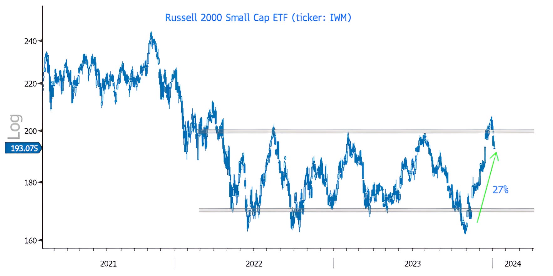
5. One Corner of the Equity Market We Like to Watch When Focusing on the Economy - Small Caps
Small Cap shares (chart below) are often seen as an equity market barometer of the US economy.
When the Russell 2000 Small Cap ETF (ticker: IWM) rose 27% from October 27 to December 27 and broke through the ceiling that had contained it for the prior 20 months, it appeared to signal economic resilience.
However, since hitting a peak just over a week ago, the Small Cap ETF has dropped 6% and fallen back below its long-term ceiling.
At this point, they can re-group and make another (hopefully more sustainable) move north. This might be seen as an indication that Treasury Secretary Yellen’s “all clear” signal was warranted.
If, however, Small Caps continue their recent fall and once again become “stuck” in the range (between the two grey shaded areas) that has characterized the past 20 months, the economic and equity market outlook may be a little less clear.
We will continue to monitor with an open mind.
.