Deterioration Under the Surface
Despite a nearly relentless march upwards (13 of the last 14 weeks positive), fewer and fewer shares are participating.
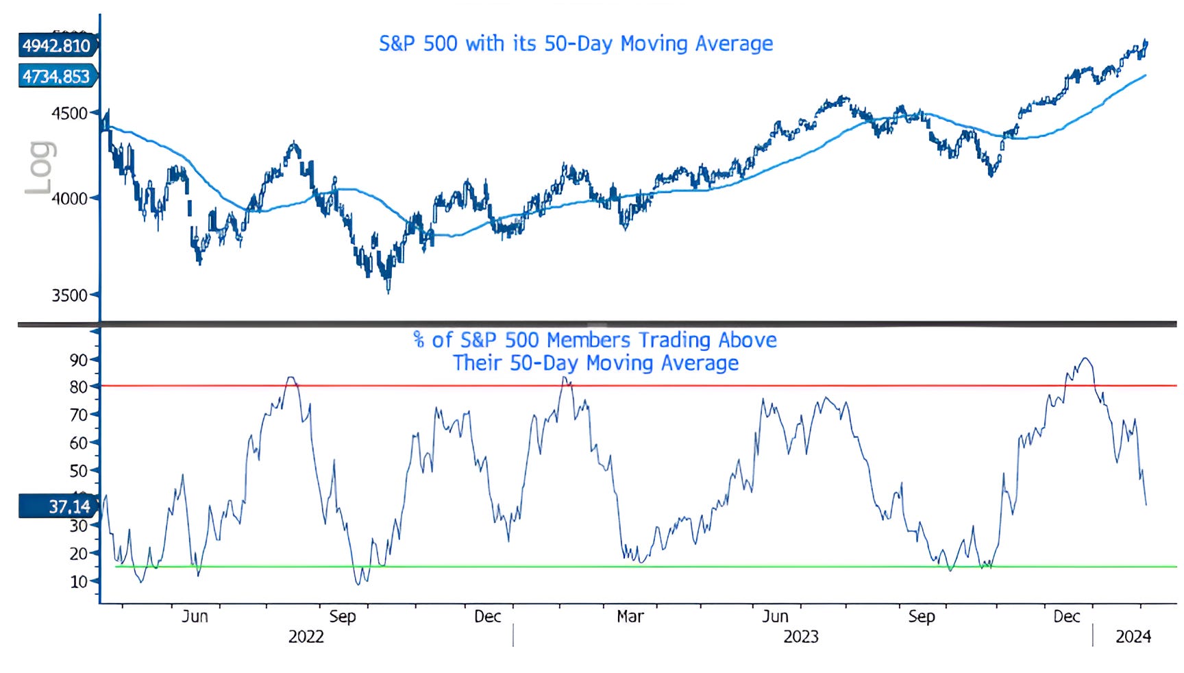
1. Bad Breadth - Part 1
The top panel of the chart below shows the S&P 500 with its 50-day moving average (curved light blue line).
The lower panel shows the percent of S&P 500 members trading above their respective 50-day moving averages.
Since December 26th, when the percent of S&P 500 members trading above their respective 50-day moving averages peaked at just over 90%, the S&P 500 has gained 3.3%, while 53% of the indexes underlying shares have not only traded down, they have traded down through their 50-day moving averages.
This is a reflection of bad breadth. Fewer and fewer shares leading the index higher.
Again, this is not a catalyst, but in our view, makes the equity market fragile.
If the S&P 500 / equity market loses its leaders (Magnificent 7 / AI), there is little to turn to for support.
(Past performance is not indicative of future results)
Source: Bloomberg. Through year-to-date 2024.
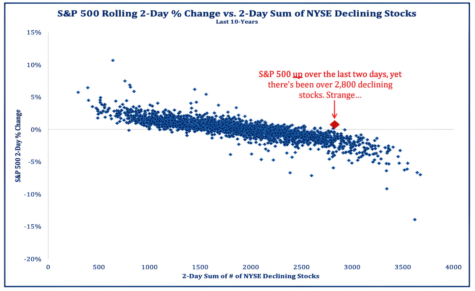
2. Bad Breadth - Part 2
The team at Strategas (my favorite independent research provider) presented a shorter term way to look at what’s happening “under the surface”.
They looked at the 2-day change % in price of the S&P 500 vs. the 2-day sum of declining shares in the NYSE (New York Stock Exchange). (chart below)
What they found is that the past two days have been an outlier - not an extreme outlier - but an outlier nonetheless.
Over the past 10 years, when so many shares on the NYSE are declining, the S&P 500 has had negative performance.
In the current period, it’s been positive.
What we think may be happening is that portfolio managers who underperformed last year and in January are now chasing AI-related shares regardless of valuation. We described this in chart 5 here. This may be pushing a few stocks higher at the expense of the rest.
Source: Strategas and Bloomberg. Through year-to-date 2024.
3. Another Cautionary Signal (but Not a Catalyst)
We look at a number of macro, economic, inter-market and intra-market indicators to help inform our overall view and strategy.
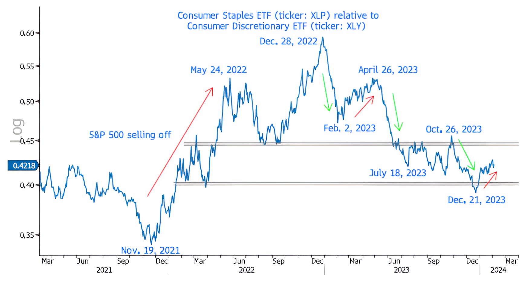
One of our favorite intra-market relationships is between Consumer Staples shares and Consumer Discretionary (chart below).
When Consumer Staples shares begin to outperform Consumer Discretionary (red arrows on the chart) shares, it can provide an early warning signal of an equity market drawdown. (Past performance is not indicative of future results).
In November 2021, Staples began to outperform, the S&P 500 peaked 5 weeks later during the first week of January 2023.
The outperformance at that time ended on May 24 and the S&P 500 found a short-lived low 3 weeks later.
Conversely, when Discretionary shares outperformed from December 28, 2022 to February 2, 2023, it coincided with an 11% 5-week move higher in the S&P 500.
More recently, we find it notable that Consumer Staples began to outperform on December 21st.
This was shortly before the peak in S&P 500 companies trading above their respective 50-day moving averages (December 26 / chart 1).
While this is not a catalyst and we don’t know if it will hit the headline level of the S&P 500, this, in our view, is another yellow flag.
Although we would never rely on any one indicator to shape our investment strategy, when we consider the chart below; the strength of the dollar (shown here); weakness in Small Caps (here); and questionable economic backdrop (here and here), we have recalibrated our portfolios.
While we have not stepped on the brakes, we have let up slightly on the gas.
Source: Bloomberg. Through year-to-date 2024.
4. This May Turn At Some Point
Overnight it was reported that Warren Buffett / Berkshire Hathaway has made another purchase in Occidental Petroleum Corp OXY 0.00%↑ .
Berkshire Hathaway now owns nearly $250 billion of Occidental Petroleum shares or 28% of the company. (This is not a recommendation to buy or sell any security).
However, this is not about Occidental, it is about the Energy (oil) sector.
Although the oil price has come down 45% from its Ukraine Invasion peak, the character of the sector overall has changed.
Oil companies have been disciplined in their capital allocation and rather than spend on new developments, they have been reducing debt and returning money to shareholders through dividends and share buybacks (several companies highlighted this in their most recent earnings calls).
What this means is that if oil demand begins to outstrip supply (we have been surprised that it hasn’t already), there has been limited investment to make up the difference and prices may rebound higher than many are currently considering. If this were to happen, we believe energy shares would do well. (This is not investment advice).
Furthermore, we see the Energy sector as a possible hedge to technology shares.
Because rising oil prices can lead to higher headline inflation and often higher inflation is consistent with lower valuation multiples this can disproportionately impact shares trading at high PEs. We saw this in 2022. (Past performance is not indicative of future results).
Finally, the Energy Sector ETF (ticker: XLE) relative to the S&P 500 (chart below) is at a level that acted as a floor (and a springboard) in March 2022.
While it may not happen again, we like the valuation, corporate discipline and hedging characteristics of Energy shares. (This is not investment advice).
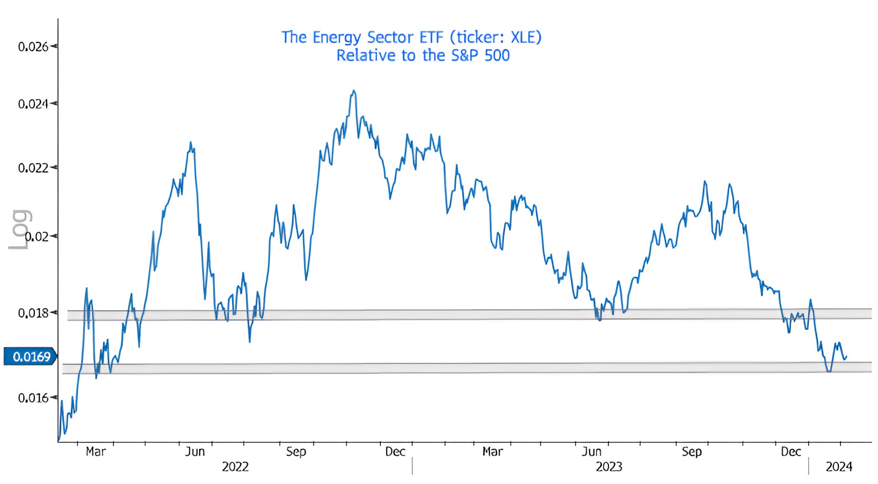
Source: Bloomberg. Through year-to-date 2024.
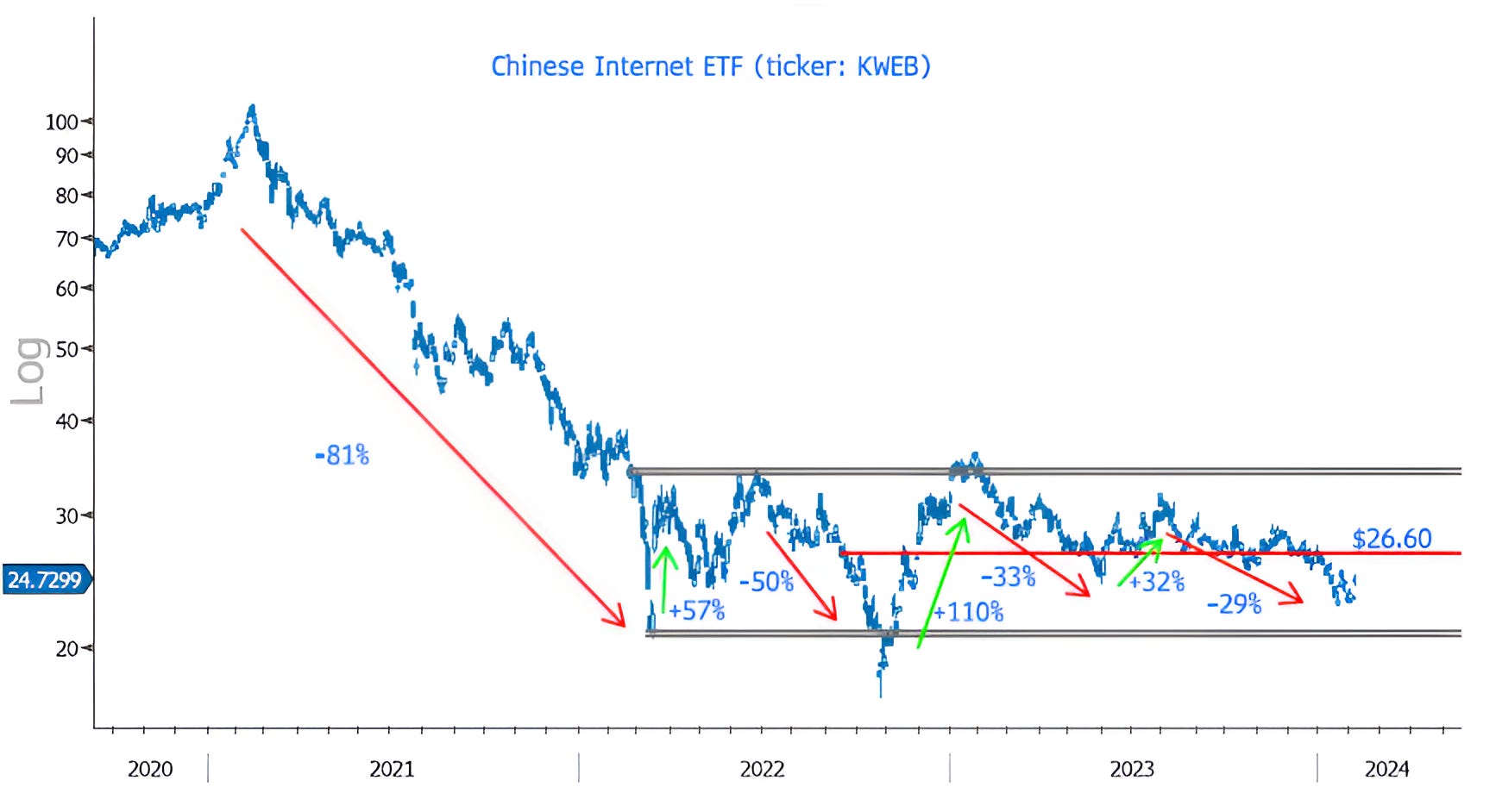
5. Looking for a Possible Bounce in Chinese Internet Shares
The chart below shows the seemingly wild ride of the Chinese Internet ETF (ticker: KWEB).
The reason I write “seemingly”, is that we’ve seen this pattern before:
Technology shares after they dropped 83% from 2000 - 2002 bounced and essentially traded sideways for 3 years;
Financials after they dropped 85% from 2007 - 2009 bounced and traded sideways for 3 years;
I used to have a list of “extreme sell-offs” that Morgan Stanley had compiled (at least 10 years ago) that included drops in the price of oil, gold collapses and different equity crashes in the US and globally.
Each “extreme sell-off” exhibited the same pattern - after the crash, there is a long sideways move characterized by large moves in up and down (+/- 30%-50%). (Past performance is not indicative of future results).
Chinese Internet shares seem to be following the typical pattern.
We are not looking for the Chinese Internet shares to move out of their current range, but if they simply rally to the redline in the chart at $26.60 that would be a 14% move higher from yesterday’s close.
As a reminder, the ETF is 10.2% Alibaba and 10.2% Tencent.
Alibaba which reports tomorrow morning, is trading at 8.8x 2024 earnings. (This is not a recommendation to buy or sell any security).
Yesterday, the Shanghai Composite (not completely the same as the Chinese Internet ETF), had its 6th consecutive day with 3x more declining than advancing stocks .
That has never happened the 27 year history of the index.
It has, however, gone 5 days in a row three times in the past:
October 22, 2001: +10.0% two months later;
July 7, 2010: +11.7% two months later;
December 15, 2011: +10.2% two months later.
(Past performance is not indicative of future results)
While this is NOT investment advice, perhaps something to think about.