

Everyone on the Same Side of the Boat
Whether it's equity (chart 1) or fixed income (chart 2), the consensus seems similarly aligned. While this can be resolved with limited volatility, it's always a concern. Let's dig in...
I am a believer that markets often do what will hurt the most participants and sometimes do what’s least expected.
With that in mind and considering the consensus views that a) “inflation is under control”; b) the Fed will cut multiple times and; c) 10-Year Treasury yields will come down, this narrative continues to concern me.
I’ve covered parts of this before (mainly here) including oil and shipping costs (due to the Yemen conflict) both impacting inflation, and I wanted to highlight another potential inflation element today (see Chart 4).
As a reminder inflation and higher long-term yields (which are related) are often inversely correlated to equity valuation multiples (not that valuation has been a focus of investors).
With an equity market that trades at an elevated / above average multiple (and an extreme equity risk premium) - a market that we’ve characterized as fragile - we see it as particularly vulnerable to higher yields.
1. Sentiment is (Once Again) Becoming Stretched
The chart below shows the S&P 500 with annotations of the levels of the CNN Fear and Greed Index and the National Association of Active Investment Managers (“NAAIM”) Exposure Index at recent short-term peaks.
The CNN Fear and Greed Index (here) is currently 79 (a little higher than on the chart below) which places it in the “Extreme Greed” category.
The NAAIM Exposure Index (here) is at 93, a little lower the 103 level from December 27 that preceded the (small) drop in the S&P 500 during the first week of the year. (At the time, we highlighted this here).
Neither the CNN Fear and Greed Index or the NAAIM Exposure Index is at a peak level that we have seen over the past year, but both are elevated and perhaps suggesting investor complacency.
This does not mean a correction is imminent, but we want to continue to be aware and vigilant.
Our strategy (which has admittedly been overly conservative in this environment) has been to increase cash a little, purchase some downside insurance (if suitable) and to emphasize the strongest sectors and companies. Despite highlighting concerns / imbalances, we have reiterated not to over-react. (This is not investment advice).

Source: Trading View, Tom the Trader, CNN.com, NAAIM. Through year-to-date 2024.
2. Consensus Sees 10-Year US Treasury Yields Moving Lower During 2024
Following Friday’s chart of the 10-Year US Treasury Yield where we showed that they were pushing against 4.2% (4.17% today) and wrote “a break above the 4.2% and perhaps, more importantly the 4.3% barrier (this has been a critical long-term level) could re-open the door to 5.0% yields,” we found the survey below interesting.
The chart below presents survey results from attendants at a Goldman Sachs Global Strategy Conference in London. to the question “Where do you expect 10-Year US Treasury yields to end 2024?”
As can be seen below, 78% of respondents see the 10-Year US Treasury yields ending the year below 4%.
The consensus (beyond those in the survey below) sees 10-Year US Treasury yields ending 2024 at 3.75% (source: Bloomberg).
Very few (3%) Goldman Sachs Global Strategy Conference participants see the 10-Year US Treasury yields ending 2024 above 5% - the level I cited.
To me, similar to chart 1, this reflects a lot of (most likely professional) investors and portfolio managers on one side of the boat.
(Past performance is not indicative of future results)

Source: Bloomberg. Through year-to-date 2024.
3. What’s New Zealand Got to Do, Got to Do with It? What’s New Zealand but a Second Hand…
Over the past 6 years, the Reserve Bank of New Zealand (“RBNZ”) has made policy decisions for their Official Cash Rate which have foreshadowed the Fed’s moves in the Fed Funds rate. See chart below. (Past performance is not indicative of future results).
Why is this important?
Over the past 5 weeks, the market has gone from expecting a cut in New Zealand to pricing in a near-term hike.
The market probability (the same methodology that we often cite when we say 5 Fed rate cuts are priced in) for a RBNZ hike in one of its next two meetings (either February or April) has risen from pricing in a cut in mid-January to a 86% likelihood of a 25 basis point increase.
If the market predictions of a hike are correct for Reserve Bank of New Zealand, and the Fed once again follows the RBNZ’s policy decisions, markets could be in for a surprise and a re-pricing.
Again, we see equities vulnerable in this scenario.
Interestingly, the RBNZ invented the 2% inflation target in 1989. It was the first developed world central bank to do so. The Fed adopted a 2% inflation target in 2012, 23 years after the RBNZ.
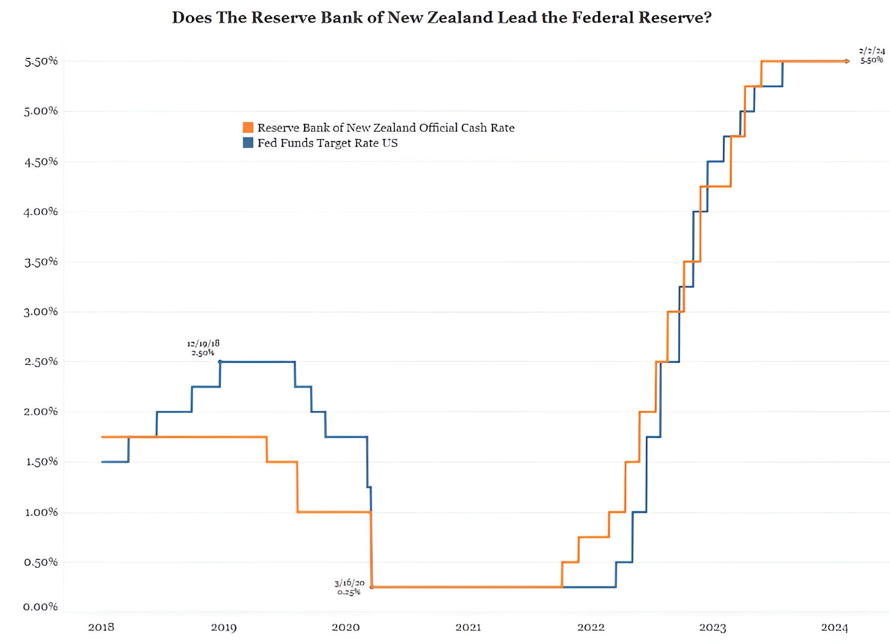
Source: Bianco Research and Bloomberg. Through year-to-date 2024.
4. Will Food Prices Move Higher?
When the official US CPI (inflation) report is released tomorrow, our expectation is that it will be benign and in-line with expectations.
Our concern is that inflation will remain elevated and trend higher over time.
Below is a chart of Agricultural Commodities based on the price of the Invesco DB Agriculture Fund (ticker: DBA) (this is not a recommendation to buy or sell any security) and the United Nations Food and Agriculture World Price Index.
These two series have often traveled in tandem as agricultural commodities are a major input into food prices. (Past performance is not indicative of future results).
The point of this chart is that if Agricultural Commodities prices remain elevated, the decline in food prices over the past year could reverse.
If this were to occur, it could be a component of higher than expected inflation (along with elevated oil and shipping prices).
We will keep an eye on this.

Source: Bloomberg. Through year-to-date 2024.
5. European Equities at an Interesting Level
We are constantly trying to identify opportunities that will diversify our portfolios.
We believe that diversification - asset class, region, currency, sector - is one of the core components of risk management.
While we don’t want to sacrifice returns at the alter of diversification, we thought the chart below of the Vanguard European Equity ETF (ticker: VGK) was interesting and potentially compelling. (This is not a recommendation to buy or sell any security, nor is it investment advice).
Let’s start with interesting.
European equity markets have much lower exposure to technology than the S&P 500 and higher allocation to cyclical sectors such as energy, materials, financials and industrials.
Often we read about challenges in Europe - articles about farmers strikes, Ukraine war, German economic slowdowns, integrating immigrants etc. (I am sure they read similar articles about the US).
However, when we view the chart of the European Equity ETF it is knocking on the door of its highest level in 2 years.
Why is this potentially compelling?
We have drawn in a rudimentary “reverse head and shoulders” pattern on the chart (the 3 green curves and the grey shaded area).
If the European Equity ETF were to move meaningfully above the grey shaded area (the neckline), the expected move (based on technical analysis methodologies) would be to the green dashed line at the January 2022 high.
The January 2022 high is 8% higher from current levels. (There is no guarantee that it will achieve this / this is not investment advice).
That said, when we consider the current level of the S&P 500 of around 5025, an 8% move higher would mean an index level of 5425. While this is achievable over time, we don’t expect this level in the near-term.
As a result, if the European Equity ETF were to act in the manner that we have described and the “reverse head and shoulders” pattern achieves its measured target, the European Equity ETF could provide a compelling diversification benefit to US-oriented equity investors. (This is not investment advice).
