

Going Off the Rails on a Crazy Train!
With the all-time highs in US equities that we expected, we are beginning to see increased bullish sentiment and complacency. Current levels are likely a good place for a pullback. Let's dig in...

For the past month, we have been highlighting our view that the major US indexes (the S&P 500 and Nasdaq 100) would:
achieve new all-time highs;
rally another 2-3%;
draw in investors that have been waiting for an “all-clear” signal;
and (beginning in mid-July to early August) sell-off.
With the S&P 500 and Nasdaq 100 both at (or near) all-time highs, we are beginning to see the complacency and overly bullish sentiment that we expected (see chart 3, below).
With several major macro-catalysts in the past including trade policy and the One Big Beautiful Bill, markets will remain focused on post-tariff inflation (see chart 4, below), the Fed and earnings season (begins next week, we will include a baseline, preview on Thursday).
Given valuations at top decile levels (chart 2, below) and the set-up we expected, we would not be adding to equity exposure at current levels.
We continue to see a 5-10% correction giving way to a year-end rally.
Until then, we’re “Going Off the Rails on a Crazy Train.”
Today’s title is in honor of Ozzy Osbourne who performed his final concert over the weekend.

1. The S&P 500: New All-Time High
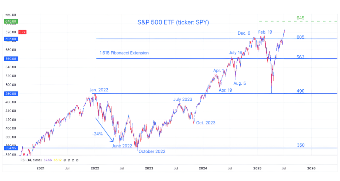
Source: TradingView. Through year-to-date 2025.
The chart above shows the S&P 500 ETF (ticker: SPY).
A month ago (here), we presented our view that the S&P 500 and the Nasdaq 100 would move above their respective highs and pull investors in.
We expected each index to move up another 2-3%, breed complacency and then drop.
Last Thursday, the S&P 500 moved 2.2% above its February high.
From current levels, we see an elevated possibility of a 5-10% correction back to around 580 on the S&P 500 ETF before moving to our year-end target of 645 (around 6450 on the index).
Obviously, predictions like these are not exact, but we find having a scenario in mind is helpful in understanding market moves and planning our reactions in advance.
(This is not a recommendation to buy or sell any security and is not investment advice. Past performance is not indicative of future results. Please do your own research and due diligence).
2. We May Be the Only Ones that Still Care About Valuation
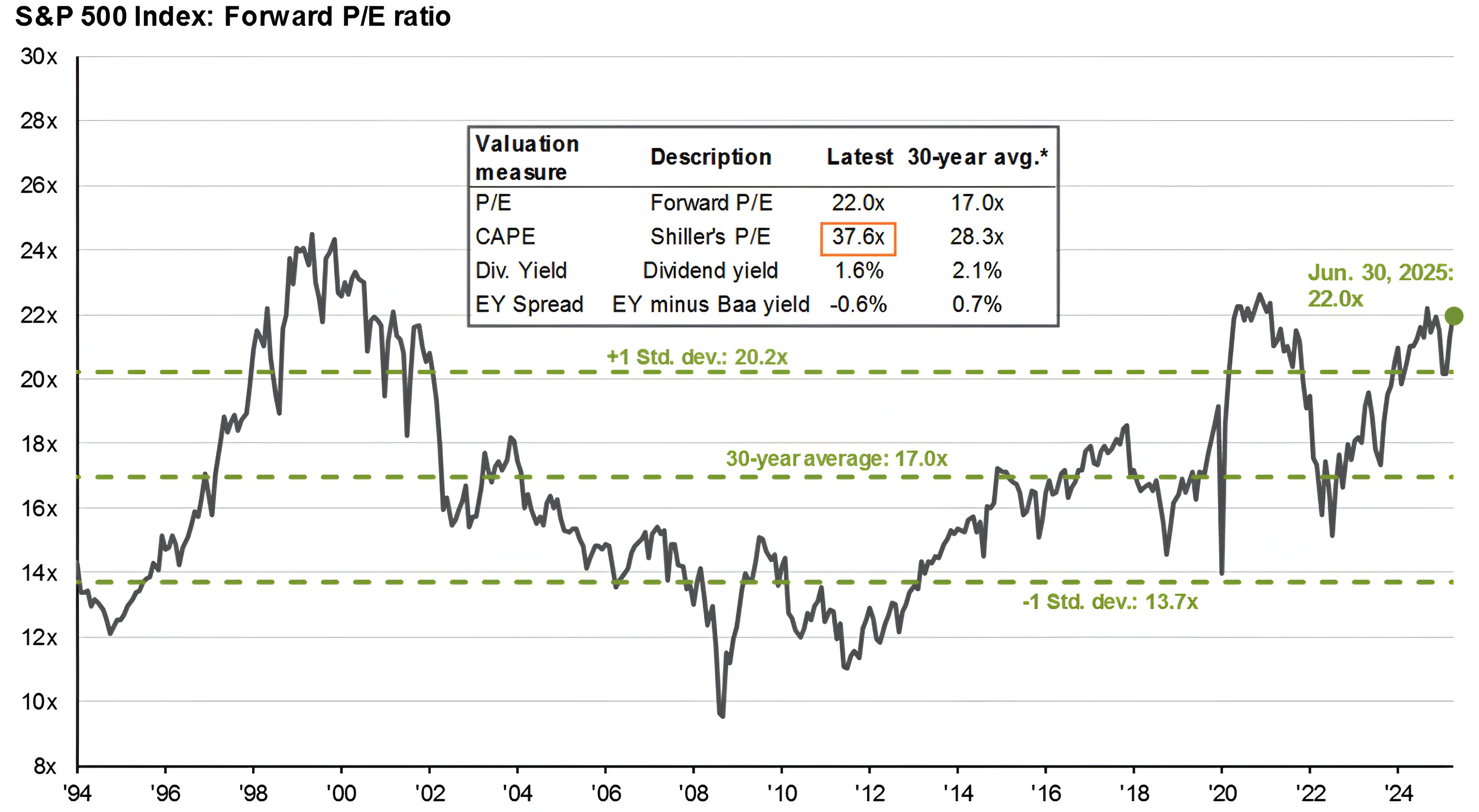
Source: JP Morgan. Through year-to-date 2025.
The main (graphical portion) of the chart above shows the price to forward earnings of the S&P 500.
The box overlay on the chart shows the current valuation of the S&P 500 based on different measures vs. their respective 30-year averages.
All S&P 500 valuation metrics are in their top decile.
We last showed this chart two months ago (chart 2 here). At the time, the forward PE multiple on the S&P 500 was at 20.1x.
Since then, it has expanded back to 22.0x.
As my mother likes to say:
“nothing good happens in Central Park after midnight;”
“nothing good happens below the 200-day moving average;” and
“nothing good happens above 22x forward earnings.”
There are two caveats:
There is nothing magical that says the S&P 500 must retreat from current levels - rather, we see elevated valuation levels as a constraint to further upside;
As earnings season begins next week, we will “drop” Q2 2025 earnings from the price to forward earnings calculation and replace it with Q2 2026 expected earnings. Given current earnings estimates, this calendar “flip” will reduce the price to forward earnings multiple from 22.0x to 21.2x.
Again, we see this as a constraint to significant near-term further upside rather than a downside catalyst.
(Past performance is not indicative of future results. This is not a recommendation to buy or sell any security and is not investment advice. Please do your own due diligence).
3. Sentiment is Becoming a Bit Frothy
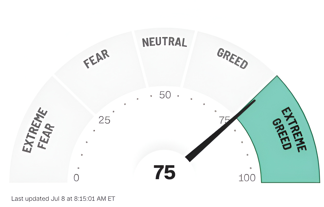
Source: CNN.com. Through year-to-date 2025.
The chart above shows the current CNN Fear and Greed Index.
As a reminder, the CNN Fear and Greed Index is a compilation of seven different indicators that measure some aspect of stock market behavior.
While the index is down slightly from last week’s reading of 78 (also in the Extreme Greed zone), these are the two highest readings of the last year.
In addition to the CNN Fear and Greed Index, the National Association of Active Investment Managers (NAAIM) Exposure Index (here) is also near levels that, in the past, have represented near-term peaks in sentiment.
Similar to valuation, we don’t see sentiment as a downside catalyst, rather its something to be cognizant of.
While we would not necessarily reduce exposure based on these readings, we would not add at current levels as we would expect better buying opportunities ahead.
(Past performance is not indicative of future results. This is not a recommendation to buy or sell any security and is not investment advice. Please do your own research and due diligence).
4. US Inflation
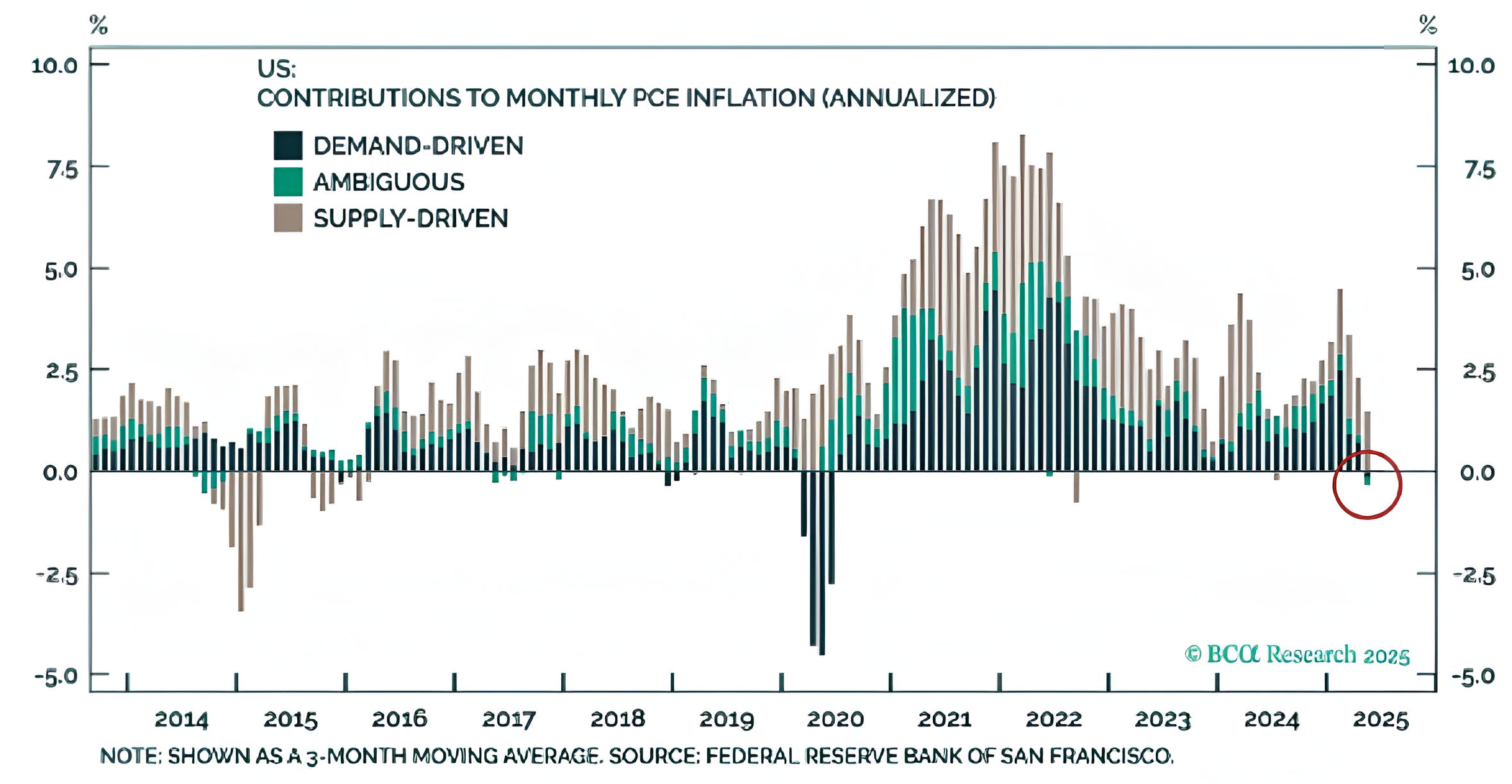
Source: BCA and the Federal Reserve Bank of San Francisco. Through year-to-date 2025.
The chart above shows the three-month moving average of contributions to the monthly US Personal Consumption Expenditures (PCE) Inflation Index Annualized broken down by demand driven factors, ambiguous and supply driven factors.
This chart is trying to make the point that the only prices currently rising in the US are supply driven prices rather than demand driven (which are declining).
While I think the conclusion at this point may be a stretch and we don’t want to read too much into it, I really like this framework of supply vs. demand inflation.
If one were to reflect on the 1970s in the US, when OPEC constrained oil supply and US inflation spiked as a result, we can consider whether the correct policy response was to increase rates.
In today’s environment, as supply chains are disrupted due to the ever-changing tariff policy, it may be interesting to apply this type of supply vs. demand inflation framework to monetary policy.
(Past performance is not indicative of further results. This is not a recommendation to buy or sell any security and is not investment advice. Please do your own due diligence).
5. Large Drawdowns Lead to Healthy Bull Markets
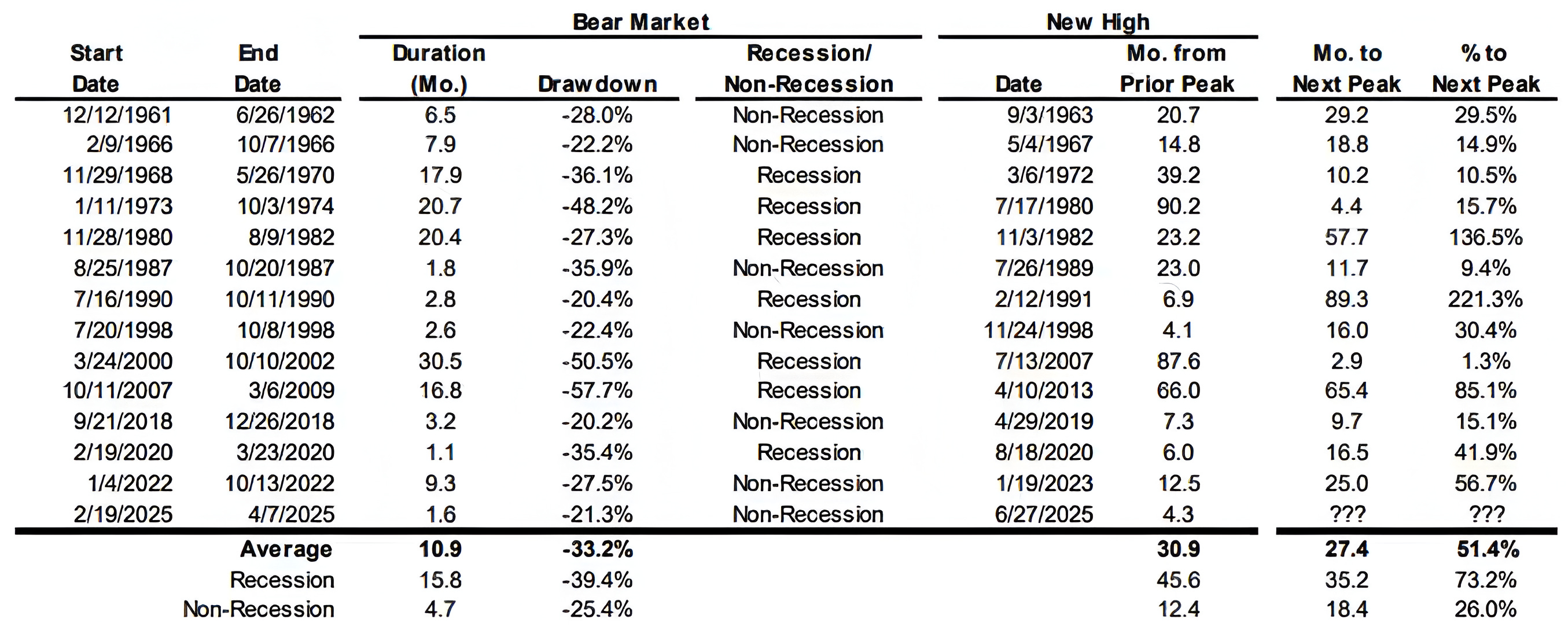
Source: Evercore ISI; FactSet. Through year-to-date 2025.
The chart above shows the S&P 500 Performance after a 20%+ drawdown period has recovered to a new high.
After past non-recessionary 20%+ drawdowns and reclaiming all-time highs, the S&P 500 has rallied 26% on average over the next 18 months.
Historically, this has not been in a straight line and as we have expressed above, we expect a better buying opportunity over the next two to three months, but interesting nonetheless.
(Past performance is not indicative of future results. This is not a recommendation to buy or sell any security and is not investment advice. Please do your own research and due diligence).