


Livin' La Vida Loca
Was that the entire rotation? Will 2024 be characterized as a year with limited volatility? Today, we evaluate the US equity market character and provide a timing signal. Let's dig in...
1. Significant Rotation or Meaningless Noise?

Source: TradingView. Through year-to-date 2024.
Yesterday, we wrote that given the strength over the past week in the Dow Industrials, “we are left to question whether the current softness that is showing up in the S&P 500 and Nasdaq 100 is simply a rotation away from technology and into some of the shares that had been under-performing.”
Today, we wanted to explore this further.
The chart above shows the Nasdaq 100 relative to the Equal Weight S&P 500.
In our view, this relationship is a great way to capture the overall market character and any potential rotation.
From December 2021 (when the Fed vocally considered tightening sooner than some had expected) to January 2023 (when the end of the tightening cycle began to be anticipated), the Equal Weight S&P 500 outperformed the Nasdaq 100 (the chart moved down).
[As an aside - in general, the valuations of high growth companies (Nasdaq 100) that have a disproportionate share of their overall value further in the future are more sensitive to increases in the discount rate (often the 10-Year Treasury Yields) than lower growth companies (Equal Weight S&P 500). (Past performance is not indicative of future results).]
Since January 2023, the Nasdaq 100 has outperformed the Equal Weight S&P 500 (the chart has moved higher).
The relationship is now battling the 1.618 extension of its December 2021 to January 2023 sell-off.
Frequent readers might recognize that our technical targets for the S&P 500 and Nasdaq 100 are the 1.618 extensions of their respective 2022 sell-offs. The battle at that extension in the chart above may be indicative of the levels relevance.
Looking closely at the chart above, on the climb from January 2023 back to the December 2021 peak, the relationship had three distinct periods of the Nasdaq 100’s dramatic outperformance (spikes higher in the chart).
The first two periods resolved with short, slight downtrends.
These downtrends after a climb are known as “bull flags” in technical analysis parlance. They are a pause that refreshes.
The third spike higher - to just below the December 2021 peak (the lowest horizontal blue line) was met with a sideways move that lasted longer than the bull flags.
Since April, the Nasdaq 100 outperformance has been characterized by another two spikes higher.
The first one had a very short “bull flag” that brought the relationship back to down the February high.
We will see if the current move after a spike is a) bull flag; b) long sideways move; or c) a significant character change in the relationship.
For now, our view is that the pause in the relationship that began last week will resolve in continued Nasdaq 100 outperformance.
We will watch this chart closely to see if there has been a more significant character change (or rotation) in US equities. Currently, it is too early to draw that conclusion.
(This is not a recommendation to buy or sell any security and is not investment advice. Please do your own research and due diligence).
2. A Closer Look at Corporate Margins

Source: Bloomberg and Strategas. Through year-to-date 2024.
The chart above shows the estimated next 12-month S&P 500 operating margin.
We have consistently questioned the earnings growth expectations for the second half of 2024 and first half of 2025. (See here).
As operating margins are simply earnings divided by sales, below is summary of expected sales and earnings growth for the next four quarters:
For Q3 2024: analysts are projecting earnings growth of 8.2% and revenue growth of 4.9%.
For Q4 2024, analysts are projecting earnings growth of 17.6% and revenue growth of 5.5%.
For Q1 2025, analysts are projecting earnings growth of 15.4% and revenue growth of 5.8%.
For Q2 2025, analysts are projecting earnings growth of 15.5% and revenue growth of 5.9%.
Looking at estimates and implied margins above, I am still confused.
Why in Q3 is revenue growth expected to be approximately 5% and earnings growth 8%, but in Q4 revenue growth is expected to be 5.5% and earnings are expected to grow 17%.
This might make sense if it were a one time event - perhaps the reversal of a large loss - but the heightened margin trend (the difference between sales growth and earnings growth) continues into the first half of 2025.
While we highlighted in chart 5 here that CEOs plan to reduce expenses, we just don’t fully understand where the rapid margin expansion from Q3 2024 to Q4 and beyond will come from.
(This is not a recommendation to buy or sell any security and is not investment advice. Please do your own due diligence).
3. A Framework for Long-Term Buying / Selling
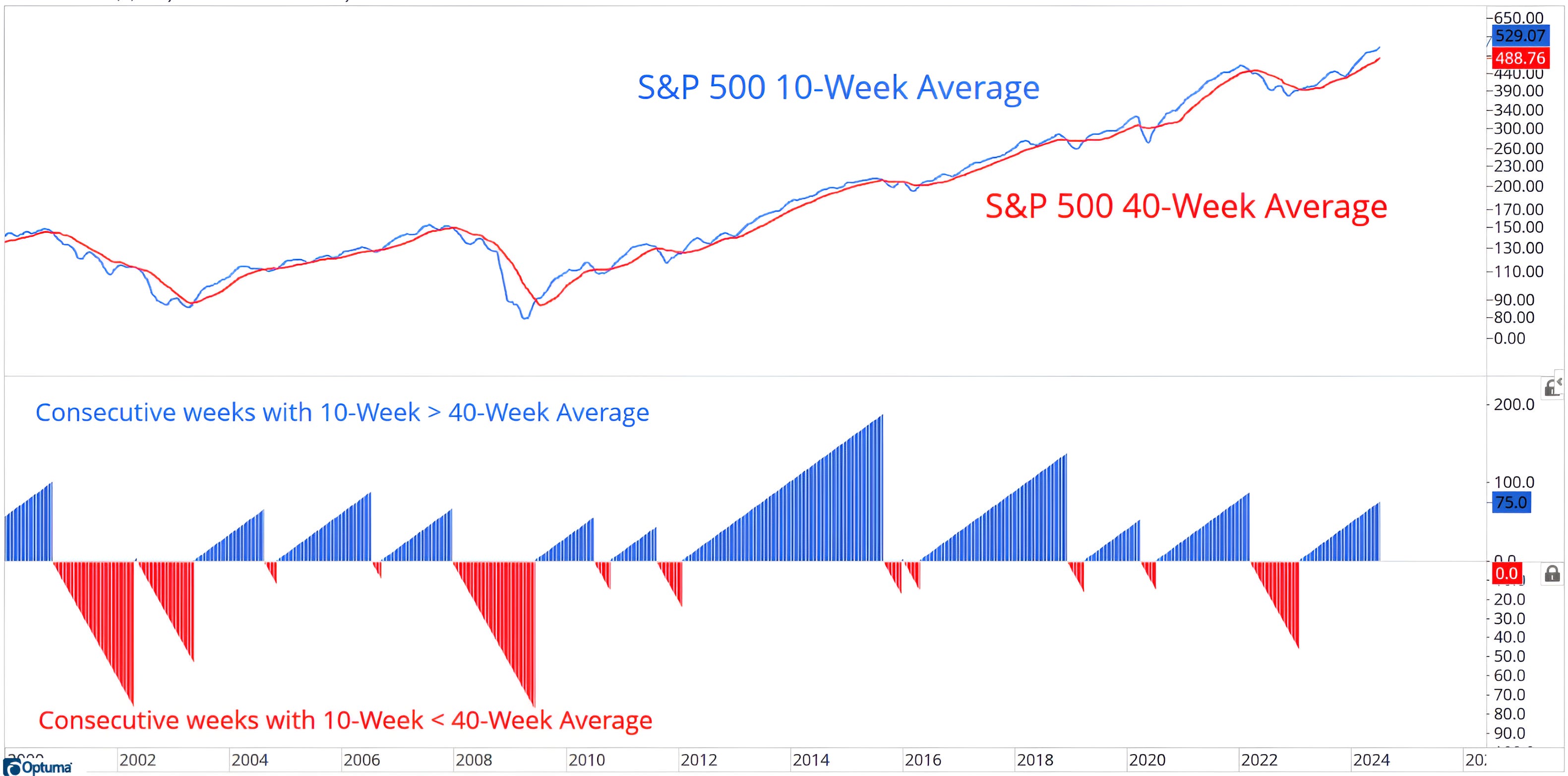
Source: Optuna / Investors Intelligence. Through June 19, 2024.
The top panel of the chart above shows the 10-week (blue line) and 40-week moving averages (red line) of the S&P 500.
The bottom panel shows the weeks when 10-week moving average is above (blue) and below (red) the 40-week moving average.
In general, the 10-week moving average is a proxy for the 50-day and the 40-week is equivalent to the 200-day moving averages. By using weekly moving averages, it reduces the noise in the dailies.
I like the chart above as it provides a good reflection of the long-term character of the market - bullish or bearish and provides a rudimentary timing signal.
When the 10-week moving average falls below the 40-week moving average, it is often a time to be cautious.
As an example, the 10-week moving average of the S&P 500 most recently fell below the 40-week moving average in March 2022, two months after the S&P 500 2022 peak. The 10-week moving average moved back above the 40-week moving average in January 2023, three months after the October 2022 low.
Selling and buying based on this signal helped avoid 7% of the 26% drawdown. Not perfect, but helpful.
This 10-week / 40-week moving average frameworks can be used on different indexes and markets and, while it wont provide a “sell” signal at the top or a “buy” signal at the bottom, it can help investors avoid portions of a significant drawdown or to increase exposure.
(Past performance is not indicative of future results. This is not a recommendation to buy or sell any security and is not investment advice. Please do your own due diligence).
4. Will Inflation Expectations Hold Back the Fed?

Source: Apollo / Torsten Slok. Through year-to-date 2024.
As a reminder, in January the market was pricing in six Fed rate cuts this year.
After the last Fed press conference, the market sees the most likely Fed path as two cuts - one in September and one in December.
While we have argued that the Fed needs to cut because of the outstanding (and growing) United States debt and its refinancing needs, we have questioned the fundamental rationale with inflation above 3%; unemployment contained; and equities near all-time highs.
Since Volcker beat the 1970s inflation, one of the key considerations in establishing Fed policy has been expectations.
The chart above shows both the median (blue line) and mean (green line) 5-10 year (long-term) inflation expectations.
According to Torsten Slok from Apollo, the publisher of the chart, “There is a major gap opening up between the mean and the median of long-term inflation expectations, which means that half of the population has long-term inflation expectations that are dramatically higher than the other half.”
Parsing the data further, he found that lower income households had much higher long-term inflation expectations than higher income households.
This may have to do with home ownership vs. rent or limited disposable income leading to greater price sensitivity.
Regardless of why lower income households feels differently about inflation than higher income cohorts, this sensitivity may impact the timing and cadence of the Fed rate cut cycle.
(This is not a recommendation to buy or sell any security, please do your own research).
5. Is a 5.5% Drawdown “Enough”?
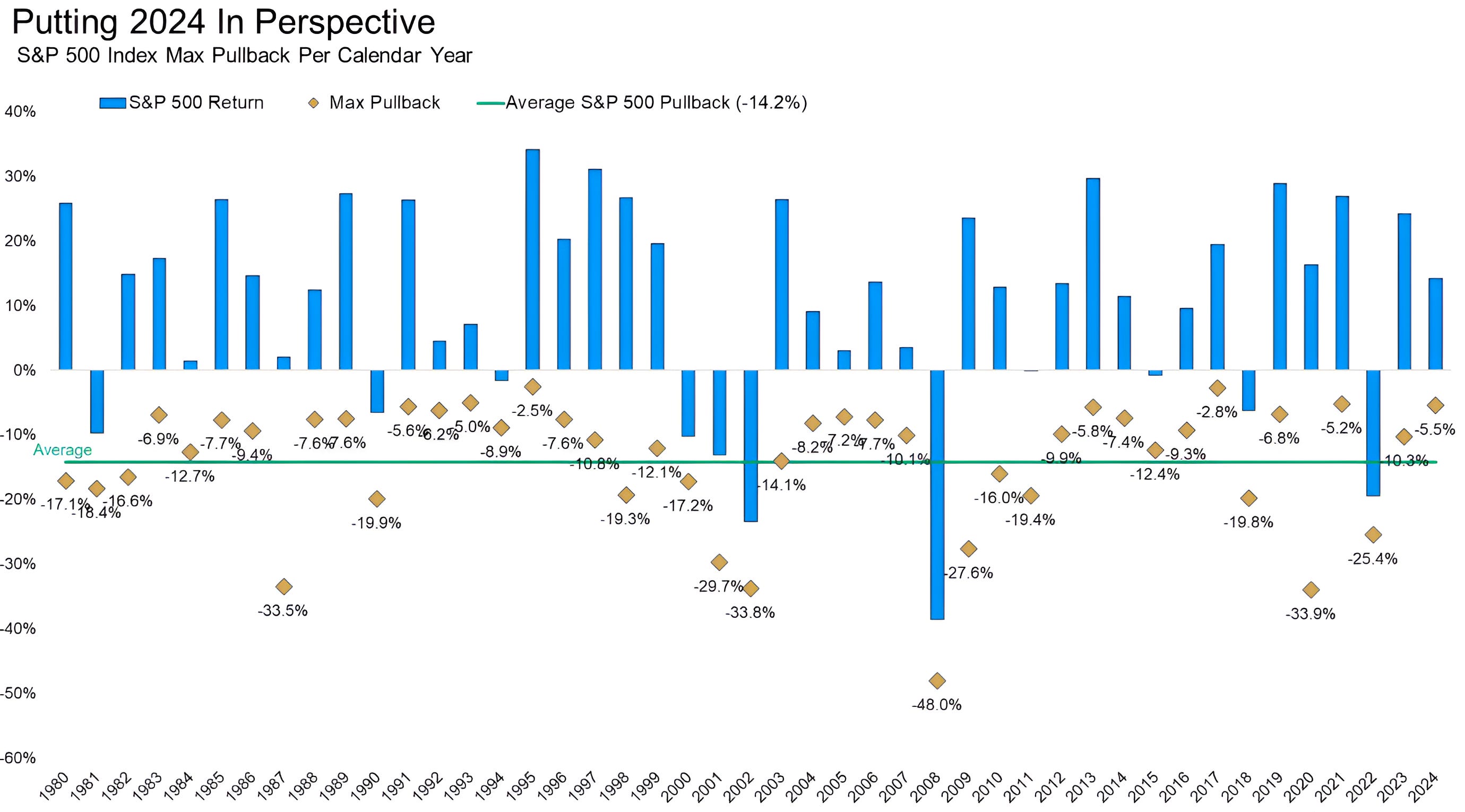
Source: Carson Investment Researh, Y Charts, Ryan Detrick. Through year-to-date 2024.
Following yesterday’s chart on losses (here) and the chart on daily volatility that we showed last week (chart 5 here), we wanted to show the chart above that considers annual S&P 500 returns (blue bars) and drawdowns (gold diamonds).
The largest peak to trough sell-off (drawdown) in the S&P 500 year-to-date has been 5.5%.
The average maximum annual drawdown over the last 43 years has been 14%.
There have been two years when the maximum drawdown did not exceed 3% and four years when the maximum drawdown was between 5% and 6%. (There were no years when the drawdown was between 3% and 5%).
While the most significant S&P 500 drawdown in 2024 thus far has been below average, there is no reason the S&P 500 has to experience a deeper pullback this year.
(This is not a investment advice and is not recommendation to buy or sell any security).