


Might as Well Jump!
After the 10% sell-off, a combination of oversold readings, negative fund flows and bearish sentiment, meant the S&P 500 was bound to jump. It is now back in the "battle zone." Let's dig in...

Following the many of moves of the Trump administration is exhausting.
However, Trump seems to have a consistent playbook: “punch them in the face and give them a bag of ice.”
The most recent example - particularly within the economics and markets sphere - is the tariff policy.
Markets sold off as Trump presented super aggressive tariffs and rallied as he retreated back to a more benign policy.
However, in my view, markets may not be responding directly to tariff policy.
We have cited imbalances for some time and certainly the uncertainty around the tariff policy and its potential impact didn’t help, but if tariffs were the main reason for the recent US stock market volatility, then the ETFs from the two countries that have the most to lose in a trade war with the US - Mexico and Canada - would not be up 13% and 3%, respectively, year to date and both be outperforming the S&P 500.
We believe that questions around the economy, particularly as President Trump and Treasury Secretary Bessent try to slow spending are the main reason behind the recent drawdown.
In our view, the fiscal stimulus and spending during 2024 masked some of the economic imbalances. As fiscal spending is contained , a more organic view of growth may emerge.
In the meantime, after the sell-off and bounce, markets seem to be waiting to evaluate the strength and direction of the economy.
We have cited Treasury Secretary Bessent many times who seems to have President Trump’s blessing in slowing the economy.
How slow? We and the market, cannot be sure.
Furthermore, in the next few months, President Trump will attempt to pass a range of tax cuts that will include everything from eliminating taxes on tips and social security to extending his “Tax Cuts and Jobs Act” from 2017.
If passed, this will provide a stimulus as President Trump aims to transition the reliance on US economic growth from the government back to the private sector.
Equities have tried to price in a range of these scenarios.
The indexes - as they often do when they are awaiting critical information - find themselves right at the battle zone range that we’ve been citing for some time - the convergence of the 200-day moving average and the 1.618 Fibonacci extension of the 2022 sell-off (even if you don’t understand this one, it has been a worthwhile guide).
After selling 15-20% of our equity portfolios earlier in the yeae and raising cash, last week, we added 5-10% back.
In general, we allocated to the ideas and sectors we were showing (dividends, energy, Japan, China, Gold miners (below) and selective speculative growth. (We prefer to write this in advance or concurrent with purchases, but hopefully, it was implied with our expectation of a bounce).
With the indexes back at their respective 200-day moving averages, we’ve added puts and put spreads to off-set (and then some) our recently added equity exposure.
In uncertain times…
Might as well jump! (but with a net - our puts and put spreads!)

1. The S&P 500: Over Its 200-Day, but Below Its 40-Week
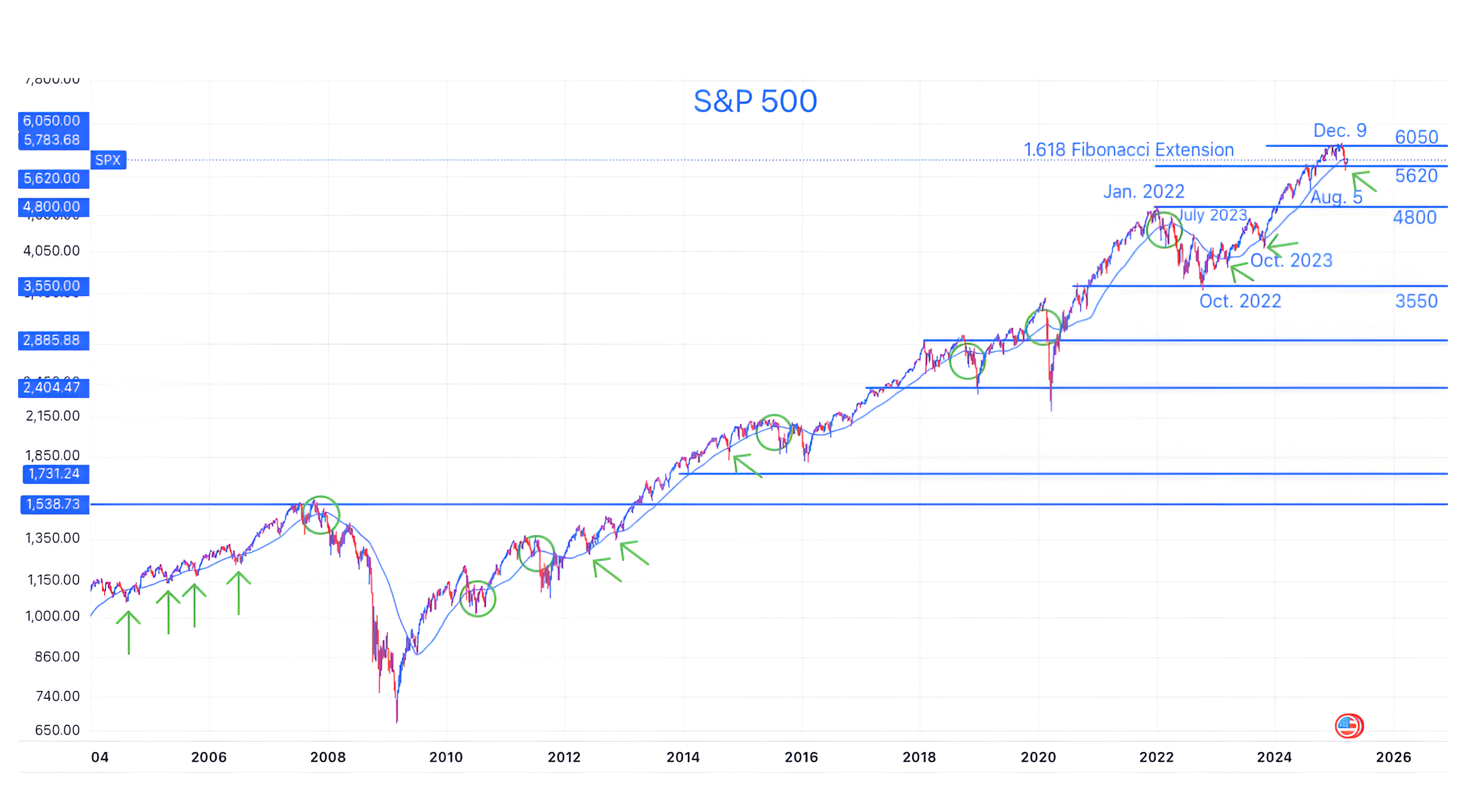
Source: TradingView. Through year-to-date 2025.
The chart above shows the S&P 500 with its 40-week moving average (curved light blue line).
Over the past few days, I’ve been taking a longer-term look at the S&P 500 to put the current sell-off, break of the 200-day moving average and subsequent rally into context.
To reduce the “noise,” I pulled up the weekly chart and instead of looking at the 200-day moving average, I included the 40-week (5 x 40 = approximately the 200 day) moving average.
While yesterday’s rally brought the S&P 500 back above its 200-day moving average, it remains below its 40-week moving average.
All of this action is taking place as the moving averages converge with the 1.618 Fibonacci extension level of the 2022 sell-off. A scenario, we have highlighted as a possibility.
On the chart, I’ve tried to delineate slight breaks of the 40-week moving average with arrows and larger, longer break with circles.
There are some interesting considerations when looking at the longer term chart:
In the run-up from 2003 to the 2007 S&P 500 peak, the index “checked back” with the 40-week moving average regularly (left side of the chart).
These “check backs” have become a lot less frequent over the past 15 years.
Notably, the past 15 years have been the post-financial crisis years that, for the most part, have been characterized by zero percent interest rate policy (“ZIRP”) and quantitative easing (“QE”).
Over that period, each major break of the 40-week moving average was met with an easing measure - either rate cuts or balance sheet expansion (QE, operation twist, repo operations, etc.) or both. (In our view, the 2022 sell-off was met with “stealth liquidity, particularly after the regional banking crisis). In other words, the Fed put was present.
US equities outperformed Global equities ex-US throughout this period.
Finally, it is important to note that at the beginning of each significant break, after falling through its 40-week moving average, the S&P 500 rallied back to (and sometimes slightly over) it, before falling again. (We’ll be watching for this).
Clearly, it’s a new monetary policy regime.
Based on last week’s summary of economic projections (here), in our view, further economic and market volatility will be required to warrant significant Fed easing.
Looking at the S&P 500, it has now fallen below the 40-week moving average and rallied back to it.
We believe the next move - higher or lower - will be dictated by macro policy (tariffs, Middle East, Ukraine, taxes, etc.), economic indicators (employment and inflation) and earning outlooks (see below).
While writing that the next move in the market will be determined by global macro, economics and micro factors is clearly not breaking any new ground, we have a key indicator to watch - the 40-week moving average.
Furthermore, we are continuing to watch other indexes and inter-market relationships for clues to direction.
From a portfolio standpoint, we have selectively added exposure - dividends, energy (we wrote about these last week), some non-US shares (China, Japan, Europe), Gold miners (see below) and some speculative growth.
Now that the index is back at the 40-week moving average, we are, once again, buying puts and put spreads to hedge some downside.
(Essentially we reduced cash, bought shares, but also bought protection).
(This is not a recommendation to buy or sell any security and is not investment advice. Past performance is not indicative of future results. Please do your own research and due diligence).
2. Earnings (and Outlooks) Are Coming…

Source: FactSet / Luminos Advisors. Through year-to-date 2025.
The chart above shows expected quarterly S&P 500 earnings as at December 31st, 2024 (at the start of Q1) and as of March 21.
While companies and analysts have meaningfully reduced expectations for Q1 (4.6%) and Q2 (-2.2%), earnings for the second half of 2025 have risen slightly.
When earnings season arrives (in just over two weeks), it will be interesting to see if companies reduce 2025 guidance overall and, if so, how shares react.
That said, due to the fact that many - including ourselves - look at next 12 months earnings when making valuation calculations, it is important to note that regardless of how much 2025 earnings are reduced, next 12 months earnings will likely move higher.
This is simply because we will be “dropping” Q1 2025 from the “next 12 months” equation and adding Q1 2026 instead.
If right now we were to simply shift the calendar by one quarter into the future, next 12 months earnings would go from $270.29 (full year 2025) to $280.97 (Q2 2025 - Q1 2026).
Based on today’s S&P 500 level of 5765 and using the current estimates, the price to next 12 months earnings would move from 21.3x to 20.5x simply due to the shift in the calendar.
While 20.5x is not cheap on historical terms, it is obviously more attractive than the 22x+ where the index traded at its February peak.
We have often written that corrections can take place through both price and time. The current period may be an example of both.
(Past performance is not indicative of future results. This is not a recommendation to buy or sell any security and is not investment advice. Please do your own due diligence).
3. Watching Homebuilders

Source: TradingView. Through year-to-date 2025.
The chart above shows the Homebuilders ETF (ticker: XHB).
I’ve read about outperformance and underperformance of homebuilders as an overall market signal and I’ll admit, I couldn’t find the direct relationship.
That said, this is an important group as a reflection of the consumer and the economy overall.
It is also interesting to note that Homebuilders peaked in December 2021 before the S&P 500 peaked in January 2022 and hit its low in June 2022 earlier than the October 2022 S&P 500 low.
In October 2022, when some (including myself) were questioning the equity market recovery (particularly as the Nasdaq 100 revisited its October 2022 low in January 2023), it would have been worthwhile to be paying attention to the strength in Homebuilders.
After hitting recent highs in October and November 2024 (before the February peak in the S&P 500), the Homebuilders have been trending down.
They now find themselves in a purgatory / basement area below their 2024 floor, but still slightly above their lowest levels of the last 15 month.
So Homebuilders are broken, but can recover.
However, in our view, if Homebuilders fall farther from here (below $97.50), we believe this could be a negative indicator for the market overall.
Within that context, KB Homes (ticker: KBH) reported earnings yesterday.
Despite lowering its full year guidance due to a combination of slower sales and lower gross margins, management said it's still not a "bad" market and that, as typical, some markets were stronger (Las Vegas) than others (Jacksonville, Florida). Shares are down about 4.5% today.
(Past performance is not indicative of future results. This is not a recommendation to buy or sell any security and is not investment advice. Please do your own research and due diligence).
4. Gold Miners

Source: TradingView. Through year-to-date 2025.
The chart above shows the Gold Miners ETF (ticker: GDX).
I find it curious that gold (the commodity) was in a similar, albeit shallower “base” formation (the big arc) that began at the same time as the base formation in Gold miners in 2021, but Gold moved above its ceiling level nearly a year ago.
In other words, if the Gold miners follow the path and pattern of Gold, they should move above their four-year ceiling level and achieve all time highs.
I have often complained that Gold has had little industrial use, however, I recently read a report from the World Gold Council (who admittedly might be talking their book) that said:
“Gold is an essential component in the manufacturing of AI-enabled devices. AI systems rely heavily on advanced hardware, including processors, memory chips and sensors, all of which utilise gold.
Gold's superior conductivity ensures that data can be processed and transmitted at high speed with minimal energy loss. Furthermore, gold's resistance to corrosion ensures component longevity and durability – critical for continuous and intensive AI applications.”
Gold as an AI play? Let’s see.
In general, we like adding Gold miners to an equity portfolio at this time as an uncertainty hedge.
(Past performance is not indicative of further results. This is not a recommendation to buy or sell any security and is not investment advice. Please do your own due diligence).
5. Beginning to Look More Like a Bear than a Correction
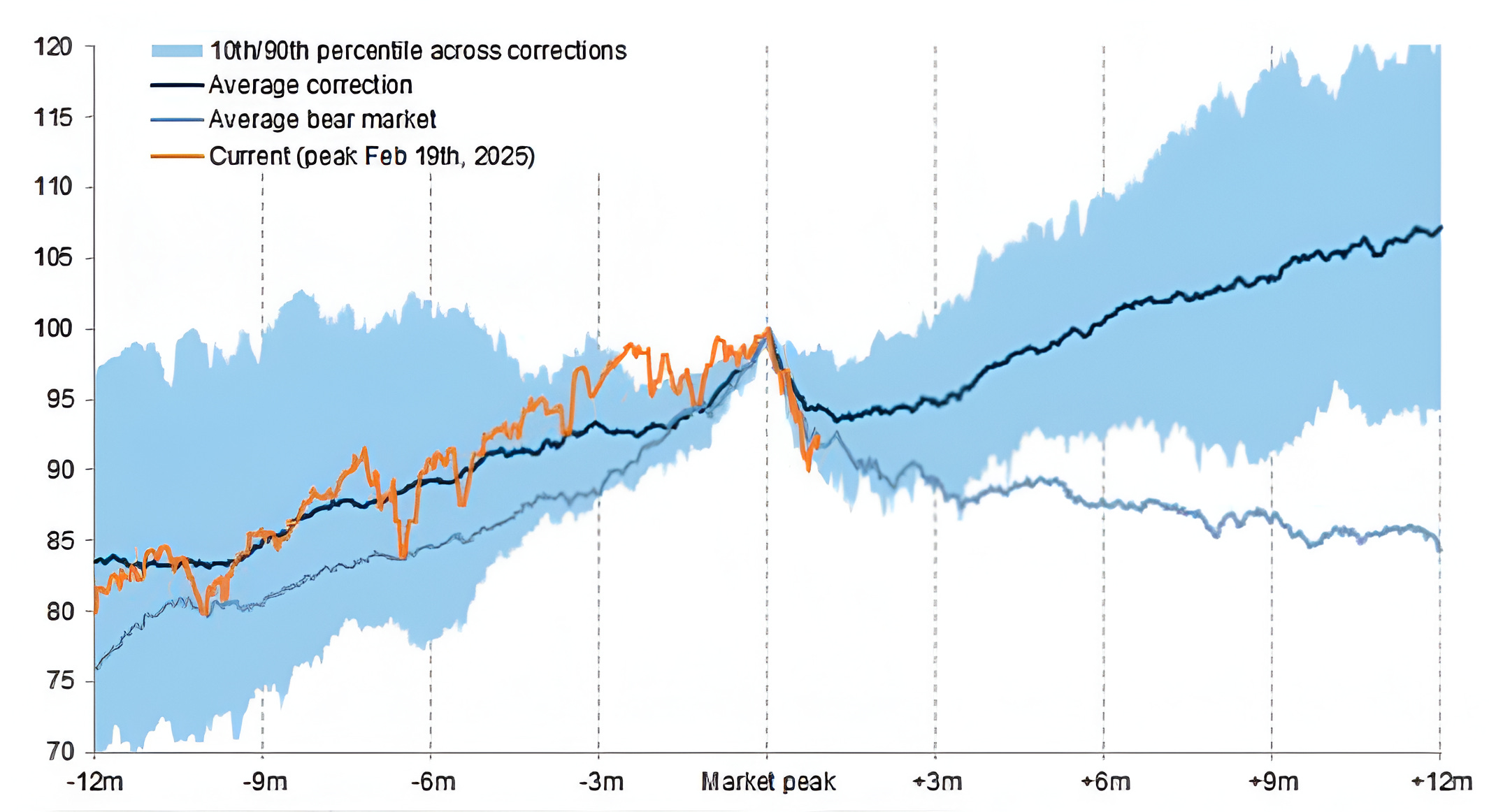
Source: Goldman Sachs Investment Research, Haver Analytics, Datastream. Through year-to-date 2025.
The chart above shows the average path of the S&P 500 during corrections (dark blue), bear markets (light blue) and the current period (orange).
Looking at the current path of the S&P 500 - since its February peak - it aligns more with the recessionary path than a correction.
However, it’s early and both of the blue lines are smoothed averages which are far apart at this point in the cycle.
As a result, any somewhat meaningful equity recovery would likely put the current period back on the correction path.
We showed a similar chart around rate cuts in chart 5 (here) in late January.
At the time, it was tracking along the lines of a normalization / soft landing. However, given the sell-off from mid-February, it likely tracking closer to the recessionary path.
We will continue to follow both of these.
(Past performance is not indicative of future results. This is not a recommendation to buy or sell any security and is not investment advice. Please do your own research and due diligence).