


Baby, We Were Born to Run!
With the impressive reversal rally in US equities (and record close in the S&P 500 today), we want to look at what is going right and what could continue to add fuel to the rally. Let's dig in...

As I wrote on Tuesday, I recognize that I started this year more cautious than I was at any time during 2024.
When I look at the current risk / reward in US equities, while noting the possibility (target) of 615 (or potentially slightly higher) on the S&P 500 ETF (which is roughly equivalent to 6150 on the index), I continue to question whether the S&P 500 can climb in a straight line towards 6600.
At 6600, the S&P 500 would be trading at 22x 2026 estimated earnings of $300. We haven’t finalized 2024 earnings yet and 22x is, as we have highlighted, historically expensive.
On the other hand, on average, the S&P 500 experiences a 10% drawdown once every two years.
While there is no set schedule and there is no reason that a 10% drawdown must occur, the last 10%+ drop was from July to October 2023.
If we were providing odds, we would favor a 10%+ sell-off prior to a 10%+ climb (65/35).
In other words, we continue to be slightly more cautious than last year and we see the struggle between fundamentals and technicals continuing.
That said, the ascent of the US equity markets continues to be stronger than we expected.
We believe that one of the reasons that equities have remained resilient has been the continuation of stealth stimulus. (See here, here, here, here, here, here, here, chart 4 here and here). We will review this next week.
However, with that in mind, today, we we believe is going right and what could continue to go right (mainly from a technical perspective) to lead US equities higher.
For the time being, it seems:
“Baby, We Were Born to Run.”
(Photo of Bruce Springsteen and the Bigman, the late Clarence Clemons, from the photo shoot of the cover of the Born to Run album, Courtesy of Columbia records).

1. The Nasdaq 100: Exiting a “Bull Flag”
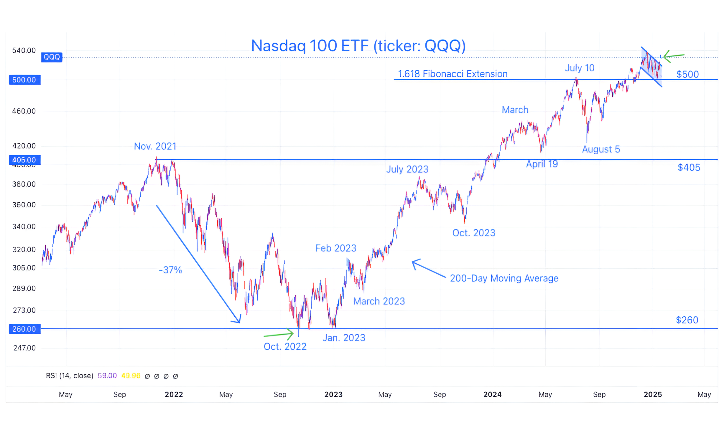
Source: TradingView. Through year-to-date 2025.
The chart above shows the Nasdaq 100 ETF (ticker: QQQ).
When we showed this chart two weeks ago (here), we wrote “we expect the real battle to occur (once again) at the 1.618 Fibonacci extension level.”
We were wrong and right.
How were we wrong? The 1.618 Fibonacci extension level that we have been showing since early July (here) at $496 was a little lower than maybe it should have been.
We’ve moved it to $500.
Why did we get this wrong?
Fibonacci retracement and extension levels are often better shown as areas or zones. They are based on the beginning and end of a rally and sell-off.
If you look closely at the chart above, the peak in November 2021 was slightly higher than the closing level of $405 and the bottom was slightly lower than the closing level of $260 in October 2022.
Using the close vs. the “wick” on each of the candles leads to slightly different Fibonacci levels.
It is clear, based on the trading action in the Nasdaq 100 ETF that $500 is closer to the battle level that is consistent with the 1.618 Fibonacci extension of the 2021 to 2022 sell-off. It is a little higher than we had originally estimated.
Where were we right?
We said the real battle would occur at the 1.618 Fibonacci extension level.
The Nasdaq 100 bounced off the $500 level like a cat hitting an electrical wire.
While it wasn’t much of a battle, there was information in the reaction.
Last week, we hypothesized that there might be a bearish “head and shoulders” pattern developing in the Nasdaq 100 (here).
We continue to come up with these hypotheses so that we know how to react and to manage risk within our portfolios. We rarely prematurely react and always highlight that we are awaiting confirmation / retests.
Within the Nasdaq 100 chart, unlike S&P 500 chart (chart 1 here), the right shoulder of the “head and shoulders” pattern never formed.
Instead, with the bounce off of the (revised) 1.618 Fibonacci extension level, it appears that a “bull flag” pattern developed.
A “bull flag” is a short downtrend channel after a long uptrend and is seen as a continuation pattern that when confirmed suggests continuation in the direction of the longer-term uptrend. (A better definition is here).
The Nasdaq 100 has now moved above the bull flag (green arrow) - which is bullish!
(This is not a recommendation to buy or sell any security and is not investment advice. Past performance is not indicative of future results. Please do your own research and due diligence).
2. The Financials: Heading Towards its “Symmetric” Target
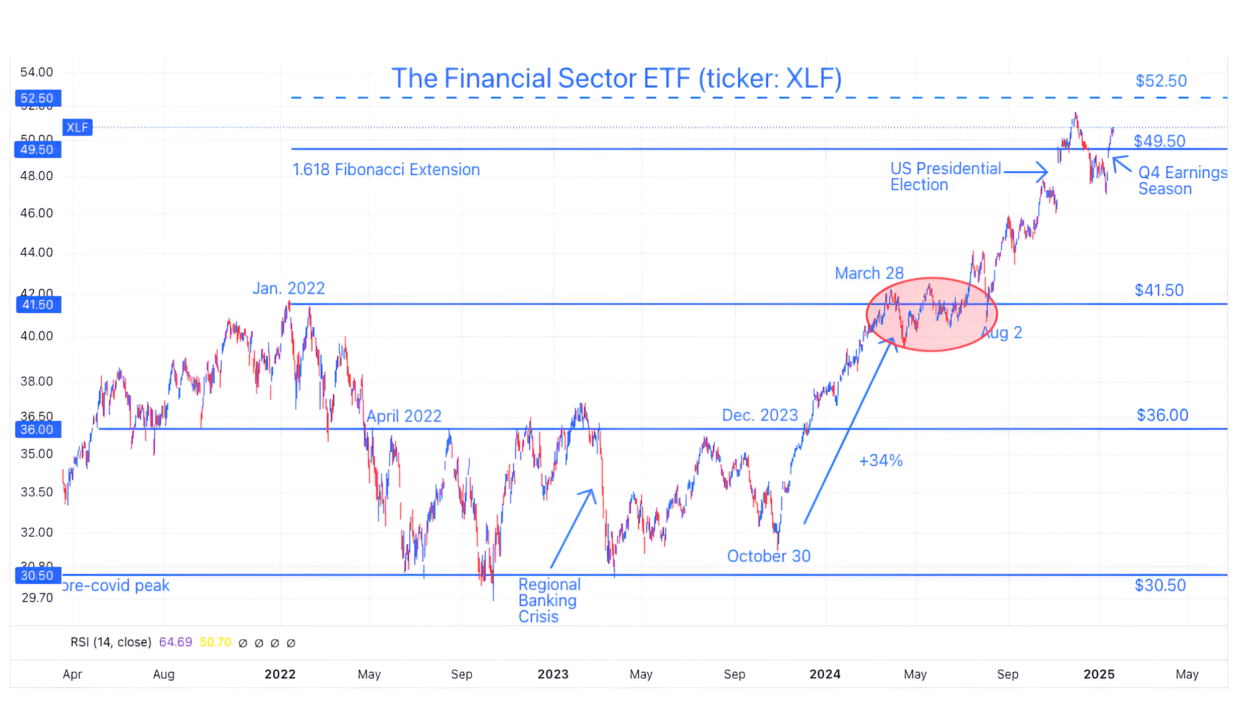
Source: TradingView. Through year-to-date 2025.
The chart above shows the Financials Sector ETF (ticker: XLF).
We wanted to show the Financials as they are a “value” sector in contrast with the growth-oriented Nasdaq 100.
In order to build a bullish narrative, we want to see broad participation, not just the AI / Data Center cohort driving the market higher.
We last showed the Financial Sector ETF right after the election (chart 2 here). At the time, we said:
“We would not be surprised to see the Financial Sector ETF move towards $52.50.
$52.50 is a target established considering symmetry of the 3-year sideways move between the pre-covid peak of $30.50 and the January 2022 high of $41.50. ($41.50 + ($41.50-$30.50)).
So our view with respect to Financials is: a) pause; b) may sell-off a little; c) move sideways; d) re-attack the $49.50 area; and e) eventually hit $52.50.”
The battle around the $49.50 area was a little more dramatic and volatile than we envisioned, however, with earnings season, it seems to have resolved in favor of the north.
In our view, the Financials can keep moving higher to their symmetric target of $52.50 which is constructive.
(Past performance is not indicative of further results. This is not a recommendation to buy or sell any security and is not investment advice. Please do your own due diligence).
3. Nvidia: Ready to Launch?
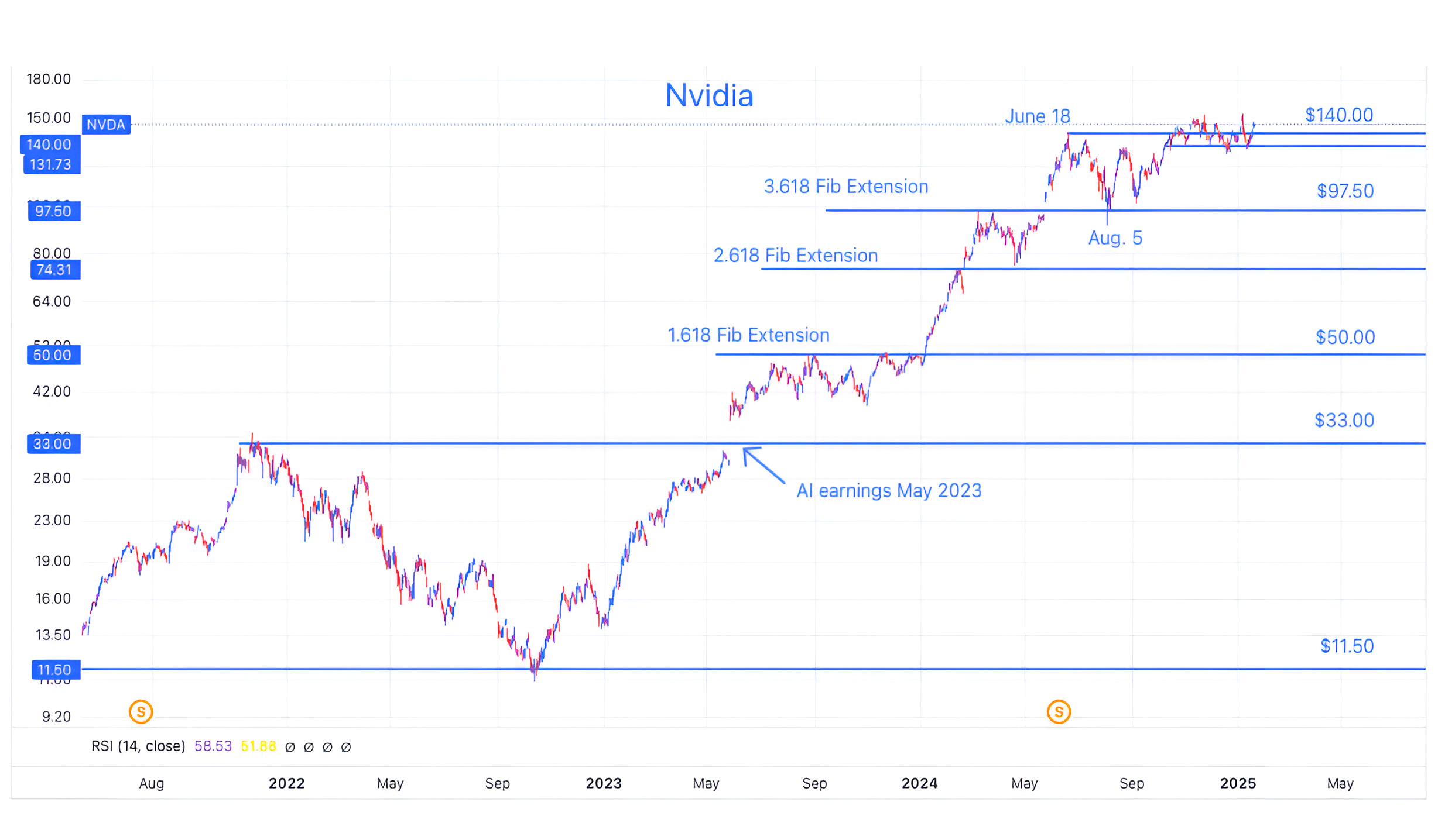
Source: TradingView. Through year to date 2025.
The chart above shows Nvidia’s share price (ticker: NVDA). (This is not a recommendation to buy or sell Nvidia shares).
We’ve shown and written about Nvidia several times. (Most recently after Q3 earnings in chart 2 here; after Q2 earnings in chart 3 here; after Q1 earnings here and in chart 2 here; here; and in February here).
When we last wrote about it - we said that Q3 earnings had seemed slightly disappointing, however, the chart looked good and “Nvidia shares - based on our estimates and the chart - look to be headed to $175.”
Since that time, Nvidia shares have been dancing with the $140 level - a level they first hit seven months ago.
In our view, when Nvidia reports earnings in a month, if the results and outlook are seen as positive, shares will resume their longer-term move higher.
Given Nvidia’s 6.6% weight in the S&P 500 and 8.5% weight in the Nasdaq 100 (second largest position in each behind Apple) as well as its ceremonial position as the symbol of all things AI, a move higher in Nvidia shares would be bullish for the market overall.
(Past performance is not indicative of future results. This is not a recommendation to buy or sell any security and is not investment advice. Please do your own due diligence).
4. 10-Year US Treasury Yields

Source: Trading View. Through year-to-date 2025.
The chart above shows a short-term view of the 10-Year US Treasury Yield.
There is no other non-equity chart that we have shown more.
(See chart 3 here; chart 3 here; chart 4 here; here; in chart 5 here; in the introduction here; chart 2 here; and chart 2 here).
We were early with the view that 10-Year Treasury yields would trend higher.
Although we were directionally correct in terms of yields, one of the reasons we presented our view was because we believed that higher Treasury yields would present a headwind to equities.
This was clearly not the case.
According to a recent survey I saw (I think from Bank of America), there are no longer any 10-Year Treasury Bond bulls (meaning those that believe yields will go lower).
In other words, the view of higher yields that we began to espouse 6 months ago of higher yields has now become a consensus / crowded view.
As a result, we wanted to review the chart.
The last time we showed the chart (chart 3 here), we highlighted the “bull flag.”
Similar to the chart of the Nasdaq 100 in chart 1, 10-Year US Treasury Yields had moved above their flag, which, typically, suggests a continued move higher.
However, upon closer inspection, it is possible that a bearish “head and shoulders” in yields is forming (3 arcs on the chart).
If this pattern were to be confirmed, it would suggest a target of 4.20% (light blue dashed line on the chart).
Although, the move higher in yields was not bearish for equities, our best guess is that a move lower in yields would be bullish.
(Past performance is not indicative of future results. This is not a recommendation to buy or sell any security and is not investment advice. Please do your own due diligence).
5. A Very Normal Non-Recession Rate Cut Cycle
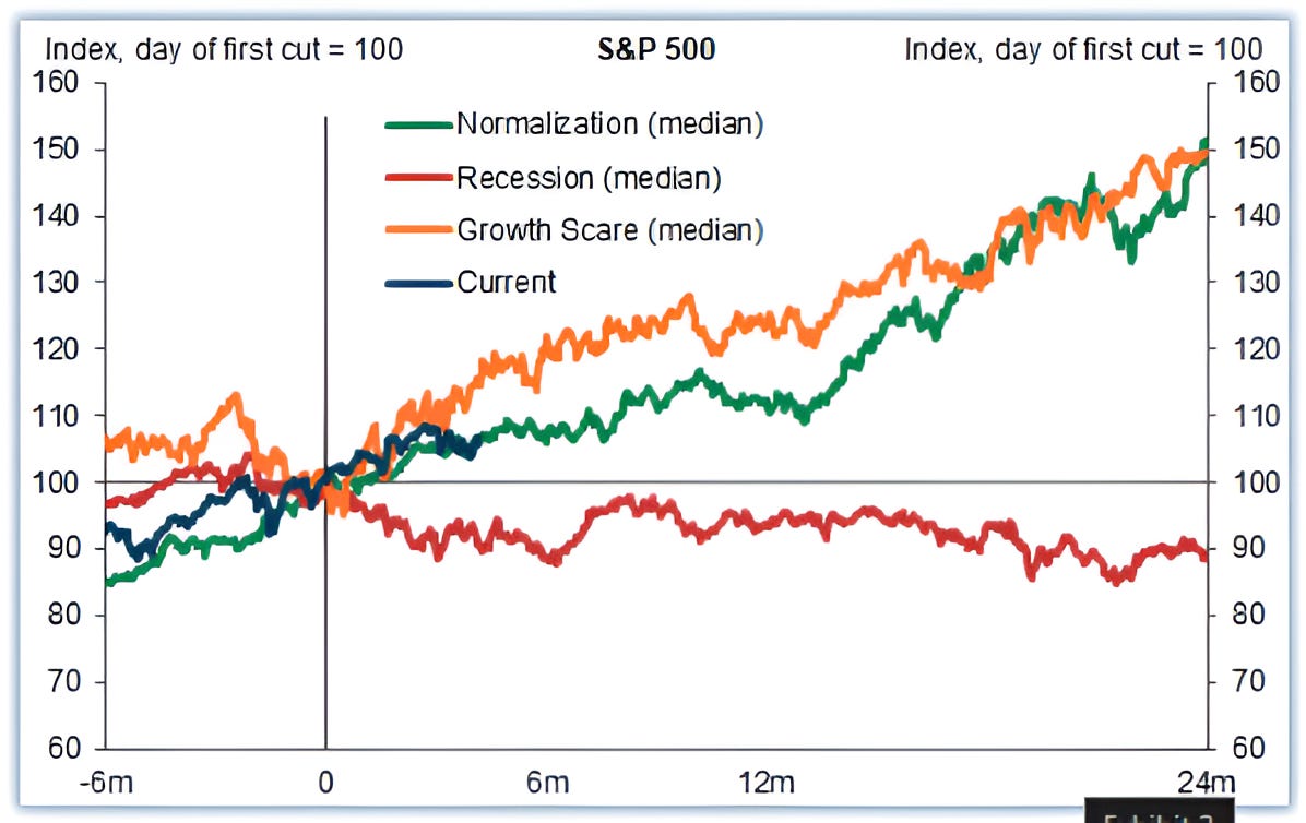
Source: Goldman Sachs. Through year-to-date 2025.
The chart above from Goldman Sachs shows the median path of the S&P 500 around US rate cuts.
The chart divides US rate cuts and S&P 500 performance around them into three categories: normalization (green); growth scare (orange); and recession (red).
The current period is somewhat consistent with the path around a “normalization” cut.
If this were to continue, it would suggest strong returns over the next 18 months.
That said, it needs to be stated that the chart above is a median so it is smoothed - the current period could be more volatile (in either direction).
(Past performance is not indicative of future results. This is not a recommendation to buy or sell any security and is not investment advice. Please do your own research and due diligence).