


Stop Me If You Think You've Heard This One Before...
Today, we're establishing a baseline for 2025. Where do we start the year - in terms of market levels, views and outlook? Although the calendar has changed, our views haven't. Let's dig in...

As it’s the first week of the year, we wanted to establish a baseline.
On Tuesday, we showed the chart of the S&P 500. Today (chart 1), we are showing the Nasdaq 100.
We have continued to highlight our view that there is an above average chance (30%+) of a significant drawdown (~20%) in equities.
The combination of top-decile valuation; questionable earnings (we will cover these next week); higher 10-Year US Treasury yields (chart 3, below); investor complacency (chart 4 here); and a transition in the fiscal and liquidity regime (both traditional and stealth) has us increasingly “vigilant.”
On December 17, citing several of these conditions and the prior weekend’s Barron’s cover, in our introduction on December 17 (here), we wrote: “While nobody rings a bell at the top…ding, ding.”
December 16 remains the all-time closing high in the Nasdaq 100 and is within 0.25% of the peak in the S&P 500.
If my message at that time, with the reference to Rocky 3 was too subtle, I apologize.
We enter this year with two main risks. Both “rhyme” with events that have taken place over the past 15 years:
The first risk, in our view, is macro.
Will the Fed be forced to shift its stance from an easing bias to a pause or tightening?
This risk has to do with inflation and 10-Year yields (charts 2 and 3, respectively below).
We have seen the Fed pivot to tighter policy in the “taper tantrum” of 2013 and in November 2021.
Very simply, changes in Fed policy from an easing regime to a tightening stance often lead to market volatility. (We cited this risk in the December 17 introduction).
Alternatively, and this may be even worse, if the Fed is too loose and loses market credibility in its fight against inflation, regaining credibility can be an uphill battle that will require tightening similar to that of 2022.
We have consistently written that higher 10-Year US Treasury yields are a risk to equity markets - both of these scenarios may lead to higher 10-Year US Treasury yields.
We will see if the Fed can navigate this challenge.
The second risk, in our view is micro.
What if a the hyper-scalers that are spending $250 billion on AI capex announce or are forced by the market to announce that they are slowing spending?
With one hiccup in the spending cycle, we could see a re-rating of the whole data center eco-system from chips, to modular nuclear power infrastructure, to cooling systems to data center REITs.
As a reminder, the AI trend and the adjacent beneficiaries represented a disproportionate portion of US equity returns in 2024.
This is not a prediction, but a risk. And it is a risk that we identified through recent experience.
It was not that long ago when Wall Street began to question Facebook / Meta’s profligate spending on the metaverse which seemed to have little to no profit potential.
While some are able to use AI like Google on steroids or to write a paper, the killer app (in terms of revenues, profitability etc.) so far seems to be elusive.
Currently, AI could be viewed as an arms race without a destination
In line with our “vigilant” view, we have trimmed our equity exposure by 10-15% (not just puts this time) and have taken some of our 2024 gains off of the table.
1. Nasdaq 100: Temperature Check
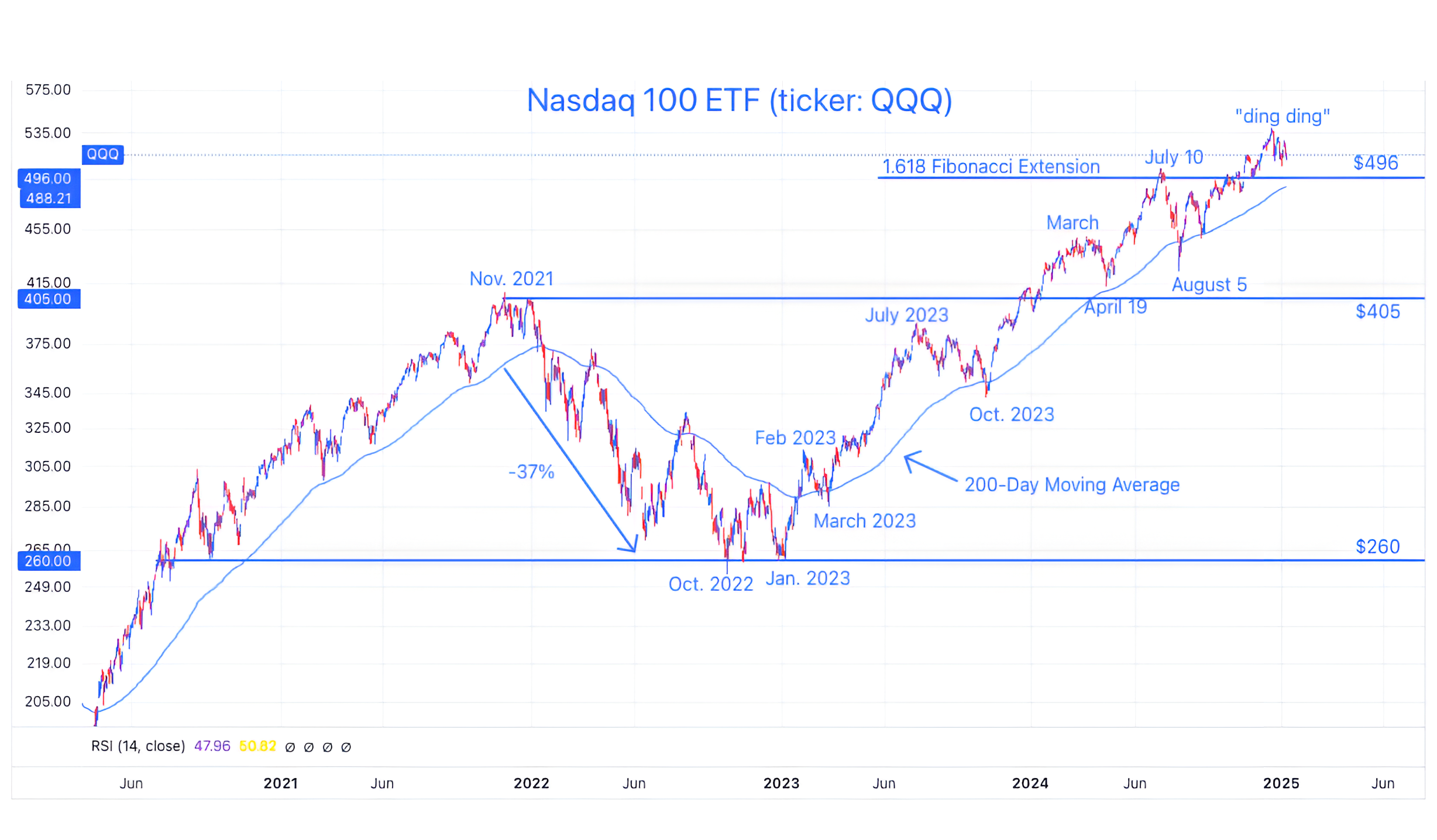
Source: TradingView. Through year-to-date 2025.
The chart above shows the Nasdaq 100 ETF (ticker: QQQ).
We last showed the Nasdaq 100 about a month ago (here) and listed our concerns in the market, but noted that the chart of the Nasdaq 100, at the time, looked “picture perfect.”
Some of the concerns that we highlighted included semiconductor and value shares both moving lower.
The Nasdaq 100 peaked about a week later.
This is a reminder to us that narrow leadership - few shares leading the market higher - will eventually reach its limit and broader participation is required for a healthy ascent .
At this point, we are watching to see if the Nasdaq 100 “checks back” to its 200-day moving average (curved light blue line).
Since crossing above its 200-day moving average in early 2023, the Nasdaq 100 ETF has revisited four times (I’m including March - April 2024).
Notably, the 200-day moving average is moving higher and if the Nasdaq 100 ETF “checks back” to it, it will likely be in the neighborhood of the 1.618 Fibonacci extension that we have been citing as an important level since July 1 (here).
As we wrote with respect to the S&P 500 on Tuesday, we expect the real battle to occur (once again) at the 1.618 Fibonacci extension level.
(This is not a recommendation to buy or sell any security and is not investment advice. Past performance is not indicative of future results. Please do your own research and due diligence).
2. Don’t Look Now, But Inflation May be Coming Back

Source: Apollo Economist / Torsten Slok. Through year-to-date 2025.
The chart above shows the ISM Services: Price Index (with a 3-month lead) and Headline CPI.
At the very least, inflation looks to have stopped moving lower; at worst it has begun to move higher once again.
We noted in chart 4 here that inflation comes in waves once it moves above 6% (as it did in 2022).
We wrote at the time:
“According to Don Rissmiller, the Chief Economist as Strategas, once an economy sees a wave of inflation over 6%, historically, across different economies, the occurrence of a second wave over 6% has been about 85%.”
However, yesterday, Fed Governor Christopher Waller, the most influential voice on the committee aside from Chair Powell said:
“Minimal further progress” on 12-month inflation readings “has led to calls to slow or stop reducing the policy rate. However, I believe that inflation will continue to make progress toward our 2% goal over the medium term and that further reductions will be appropriate.”
A month ago, the market was pricing in four Fed rate cuts (100 basis points) for 2025, it is now pricing in only one.
In my opinion, too much of an easing bias at this point, given the uncertainty around inflation, could damage the Fed’s credibility as inflation-focused and would lead to a spike higher in 10-Year Treasury yields and a significant sell-off in equities.
[This view is based off of my experience observing markets, listening to Fed Chair Bernanke who recognized the value of the Fed’s credibility and studying the history of Latin American central banks and policy - the home of fiscal dominance].
(Past performance is not indicative of further results. This is not a recommendation to buy or sell any security and is not investment advice. Please do your own due diligence).
3. 10 Year Yields and the Bond Vigilantes
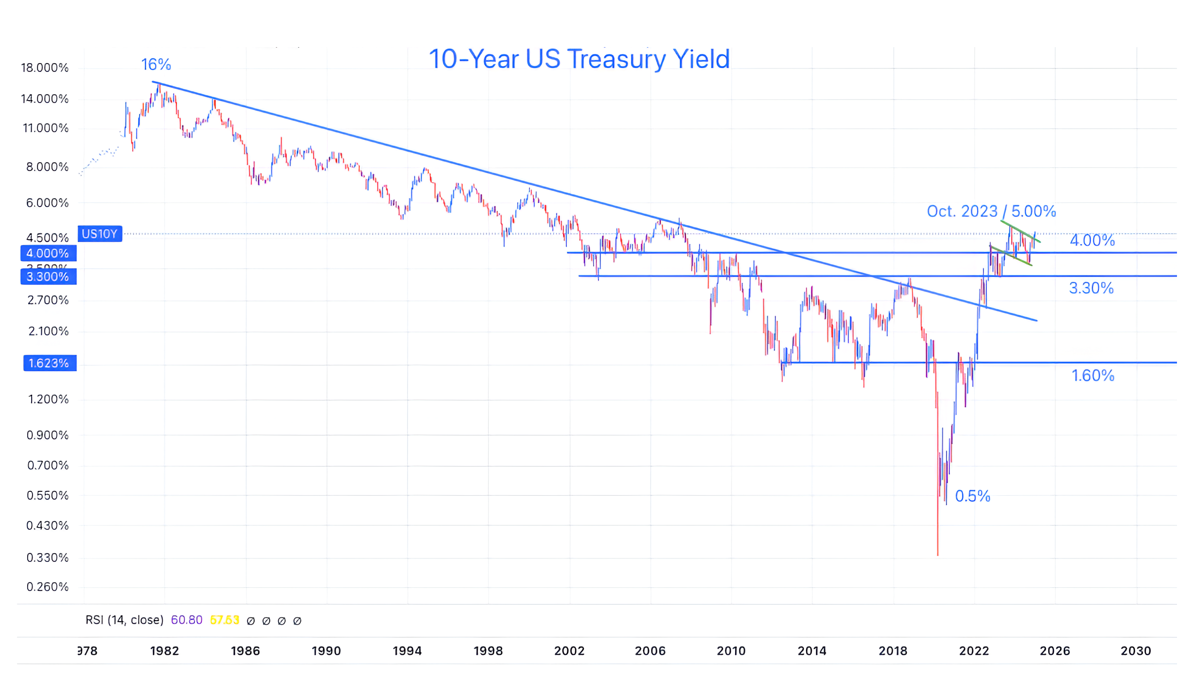
Source: TradingView. Through year to date 2024.
The chart above shows a long-term view of the 10-Year US Treasury Yield.
We have consistently argued that the 40-year bull market in 10-Year Treasuries that led yields from 16% in 1981 to below 1% in 2000 is over.
(See chart 3 here; chart 4 here; here; in chart 5 here; in the introduction here; chart 2 here; and chart 2 here).
From a fundamental perspective, the US now has a budget deficit of nearly 7% of GDP.
While the upcoming Department of Government Efficiency (“DOGE”) promises to reduce spending, the President has established cutting taxes as a priority.
Although the goal is to off-set the tax cuts with tariffs, we have argued that the transition to this new regime may not be as smooth and seamless as the market would like. We believe that any questions or doubts will be answered with higher yields.
In addition to the fiscal budget deficit, the US has over $36 trillion in debt outstanding. Over half of this needs to be refinanced in the next 3 years. That’s a lot of supply at a time when Asian demand (China and Japan) is lower than it used to be.
In addition, we need to consider the pick up in inflation cited in chart 2 along with the possible fed mis-step (in our opinion) that we have highlighted.
From a technical perspective (looking at the chart above), the path of less resistance seems higher.
We have drawn in two green lines on the chart.
It is easy to see in the earlier instance that when the 10-Year Treasury yield moved above the green line at around 4.00%, it immediately moved to its peak level of 5.00%.
Recently, the 10-Year Treasury yield has moved above the second green line that we have drawn. We will see if it exhibits another spike higher.
One of our out of consensus views for 2025 is that 10-Year yields will continue to move higher, equity volatility will follow and the Fed will implement some sort of QE (they might try to call it something different).
(Past performance is not indicative of future results. This is not a recommendation to buy or sell any security and is not investment advice. Please do your own due diligence).
4. A Fun Fact from 2024: the S&P 500 Spent No Time Under its 200-Day Moving Average. What’s Next?
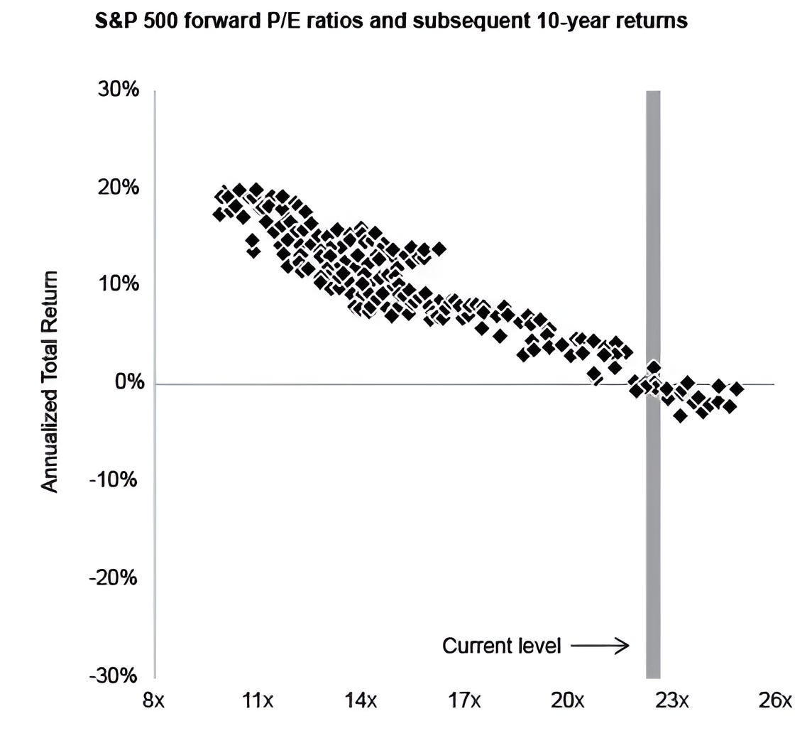
Source: JP Morgan / Howard Marks, Oaktree. Through year-to-date 2024.
The chart above from JP Morgan and re-printed by Howard Marks in his monthly note (On Bubble Watch) shows the relationship between forward price to forward earnings (PE) and annualized total returns over 10 years.
Howard Marks described the graph:
“The graph, from J.P. Morgan Asset Management, has a square for each month from 1988 through late 2014, meaning there are just short of 324 monthly observations (27 years x 12).
Each square shows the forward p/e ratio on the S&P 500 at the time and the annualized return over the subsequent ten years.
The graph gives rise to some important observations:
There’s a strong relationship between starting valuations and subsequent annualized ten-year returns.
Higher starting valuations consistently lead to lower returns, and vice versa.
There are minor variations in the observations, but no serious exceptions.
Today’s p/e ratio is clearly well into the top decile of observations.
In that 27-year period, when people bought the S&P at p/e ratios in line with today’s multiple of 22, they always earned ten-year returns between plus 2% and minus 2%.”
While I don’t like the overlapping data in the statistical analysis (I think I remember my former analyst, Andrew Zhang, a math major warning me about this), we’ve shown similar analyses from Bank of America (chart 4 here) and Apollo (chart 3 here) (and Andrew did a lot of work around this topic) that led to the same conclusions.
(Past performance is not indicative of future results. This is not a recommendation to buy or sell any security and is not investment advice. Please do your own due diligence).
5. Global Equities ex-US

Source: TradingView. Through year-to-date 2025.
The chart above shows the MSCI All Country World ex-US ETF (ticker: ACWX).
In an effort to establish our 2025 baseline and given our “vigilant” view of US equities, we wanted to take a quick look at global equities.
Unfortunately, nothing good is happening here.
After moving higher from early August to late September, presumably somewhat based on the expectation of the US easing cycle, Global Equities ex-US dropped.
At first they moved straight down to their 200-day moving average and bounced. However, the bounce soon failed and we find the MSCI All Country World ex-US ETF starting the year below its 200-day moving average.
As my mother has consistently told me, rarely does anything good happen after midnight or below the 200-day moving average.
Our best guess is that the MSCI All Country World ex-US ETF has a date, once again, with its pre-covid high. Hopefully, it will hold.
(Past performance is not indicative of future results. This is not a recommendation to buy or sell any security and is not investment advice. Please do your own research and due diligence).