Under Pressure
Although the catalyst for today's market reversal was tension in the Middle East, market imbalances have been building for some time. We're continuing to watch a number of indicators. Let's dig in...
I have spoken with many of you about how I view the US equity market at current levels.
In a word - fragile.
While we have continued to participate respecting momentum and an economy that almost feels as if it is coming out of a recession, we have advocated defense in portfolios through put spreads and some extra cash. (Not investment advice).
The core of our process is based on fundamentals and valuation. We continue to be concerned with earnings estimates that are continually pushed into the future with equity valuations that are elevated and that we consider to be demanding.
That said, we have learned to appreciate that equity markets seem not to care about certain issues until they’re overly apparent. As we often write, valuation is not a catalyst but, in our view, a measure of market risk.
While a number of charts we follow looked stretched or at areas that have, in the past, been meaningful levels of support (floors), resistance (ceilings) or just battlegrounds (a lot of buying selling activity), it is clear that market participants are increasingly uncertain with the near-term outlook.
Macro issues in Ukraine and the Middle East have created a complicated backdrop and with higher treasury yields and oil prices, the story has become more complex.
That said, over the past 15 months, both the economy and the market have defied expectations.
1. Round Trip: S&P 500 vs. Equal Weight S&P 500
The chart below shows the comparison between the market-cap weighted (traditional) S&P 500 and the Equal Weight S&P 500.
While the S&P 500 is market cap weighted, within the Equal Weight S&P 500 Index each share represents 0.2%.
What this chart shows is whether the largest cap companies such as Nvidia, Apple, Amazon, Microsoft and Alphabet that, due to their total market value (capitalization) represent 24% of the S&P 500, are outperforming more average S&P 500 companies with lower market capitalizations such as Goldman Sachs, Caterpillar and Starbucks which combined represent 1% of the Index.
From October 2020 to January 2023, the Equal Weight Index outperformed the S&P 500 and over the past 15 months the traditional S&P 500 has outperformed.
Notably, during the 2023 August to October S&P 500 sell-off, the Equal Weight Index dramatically outperformed.
The relationship is now back at its prior peak level.
Looking at the chart, we can see that in late 2020 there was a lot of indecision around this area.
In our view, if the relationship can break meaningfully above its 2020 peak, we want to continue to emphasize mega-cap shares in our portfolio.
If on the other hand, the relationship fails at the current level, there is a risk of a correction similar to the one from August to October 2023.
(This is not a recommendation to buy or sell any security and is not investment advice.)
Source: TradingView. Through year-to-date 2024.
2. Another Look at US Debt Outstanding
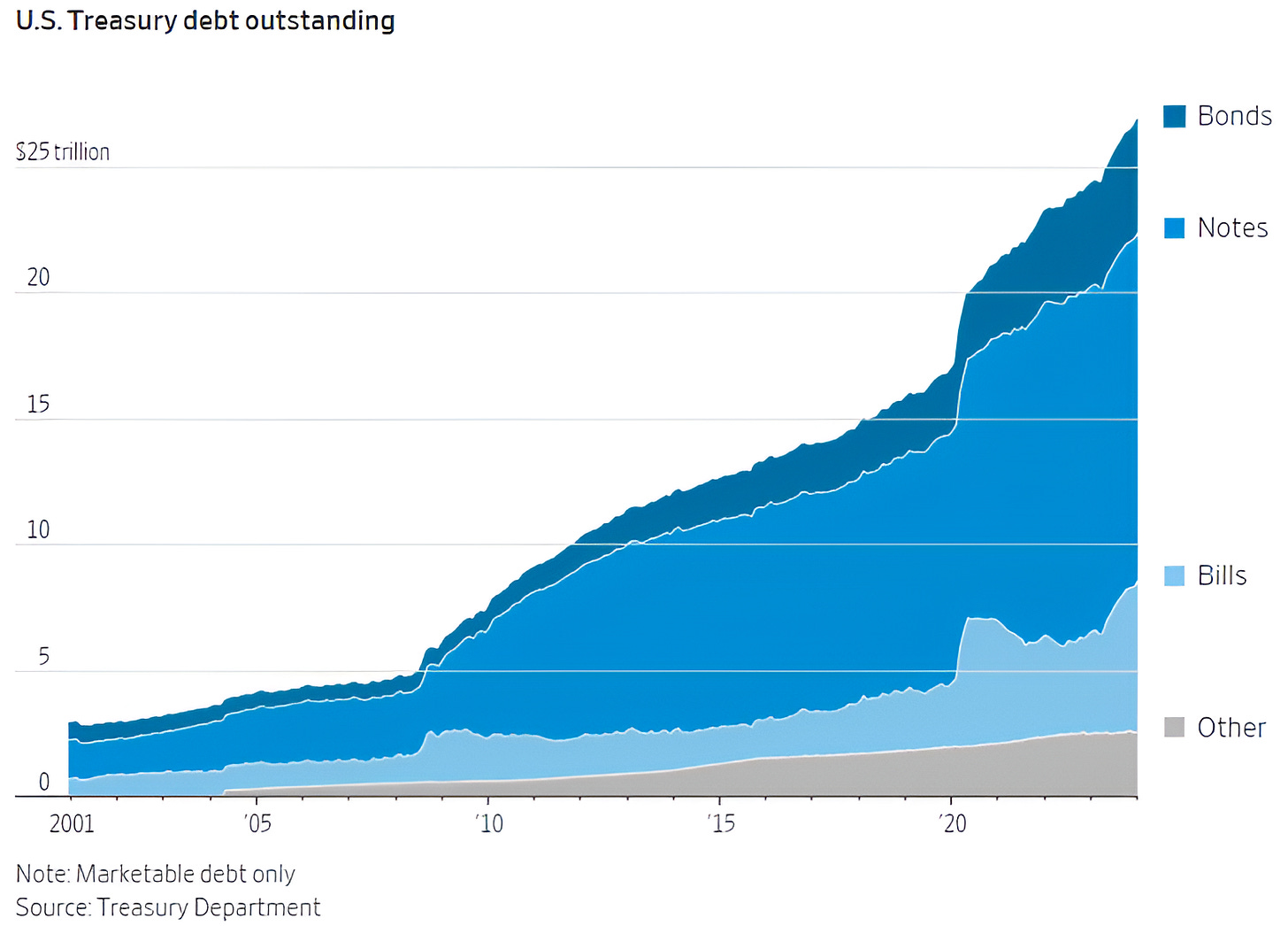
The chart below shows the amount of US debt outstanding broken down by type and duration.
As a reminder, Bonds typically mature in 20-30 years; Notes mature anywhere between 2 and 10 years; and T-bills mature from 4 weeks to 1 year.
We reflected on this in chart 5 on Monday (here) and chart 2 on Tuesday (here).
The US, historically has financed the majority of its deficit with 2 to 10 year Notes.
The challenge at this point is not only the additional issuance required to finance the growing fiscal deficit but also the refinancing.
From 2011 to 2020, 10-Year US Treasury yields were hardly ever above 3%.
As Bonds issued during that period mature, they will need to be refinanced at yields (currently) above 4%.
The Treasury has recently been refinancing a disproportionate number of T-bills due to their short maturities.
From December 2008 through December 2015 and again from March 2020 until March 2022, the US had a zero percent interest rate policy (“ZIRP”). Refinancing short-term debt was inexpensive. Today, it is much less so.
As we highlighted earlier in the week, there is a risk that the US has entered a fiscal dominance regime.
Fiscal dominance is an economic condition that arises when debts and deficits are so high that monetary policy loses traction.
In a fiscal dominance regime, the central bank is forced to lower rates to help fund the government deficits.
Given the debt outstanding, continuing growing budget deficits and fiscal dominance, there is a risk that “bond vigilantes” force longer-maturity Treasury security yields higher and demand discipline in the form of higher taxes and / or spending cuts on the Federal government.
With higher yields, tighter fiscal policy (higher taxes and / or spending cuts) will likely present a headwind to economic growth.
While there are a lot of possible outcomes, the key, in our view, is to consider the risks and prepare accordingly.
(This is not a recommendation to buy or sell any security)
Source: US Treasury Department. Through year-to-date 2024.
3. Nvidia - A Rare Trip Below its 20-Day Moving Average
Below is a chart of Nvidia with its 20-day moving average (green curved line).
Nvidia’s shares are trading below their 20-day moving average for only the third time since US equities bottomed in October 2020.
We see this as a change in character not only for Nvidia shares but possibly for the market overall.
In December 2022, Nvidia shares fell below their 20-day average (first blue arrow).
When Nvidia shares dramatically recovered, it should have been seen as a signal to the 2023 economic and market skeptics (I include myself in that group) that the backdrop was stronger than considered.
Nvidia next fell under its 20-day moving average at the beginning of August 2023 (middle blue arrow). This time, the drop in Nvidia shares was a signal of overall equity discontent.
Once again, Nvidia’s move back above 20-day, in retrospect, was an “all clear” signal for the market.
For the first time in 2024, Nvidia has dropped below its 20-day moving average.
Given our view of a fragile market that is likely in need of a pause or correction after an historically strong start to the year, Nvidia’s visit to the south side of its 20-day moving average may be a signal that the pause is here.
If there is a correction, we will watch Nvidia’s relationship with its 20-day moving average as one of our signals to determine if the correction has run its course.
(This is not a recommendation to buy or sell any security and is not investment advice).
Source: TradingView. Through year-to-date 2024.
4. A Different Way to Think About Inflation
Inflation, as reported, is a rate of change.
How much did prices increase or decrease from one period to another.
That rate of change is based on the prices of a basket of consumer goods.
While we can debate the composition of the basket, price collection methodology or “hedonic” adjustments that are made to compare prices of goods that change in quality, for now, we will take the price index at face value.
US inflation for the most part from 2010-2020 averaged around 2%; in the prior decade the average was higher around 2.5%.
The chart below considers the difference in price index if at had continued to grow at 2% from January 2020 rather than having experienced the spike followed by the recent moderation.
(This is not a recommendation to buy or sell any security)
Source: Charlie Bilello. Through year-to-date 2024.
5. Indecision in Consumer Discretionary Relative to Staples
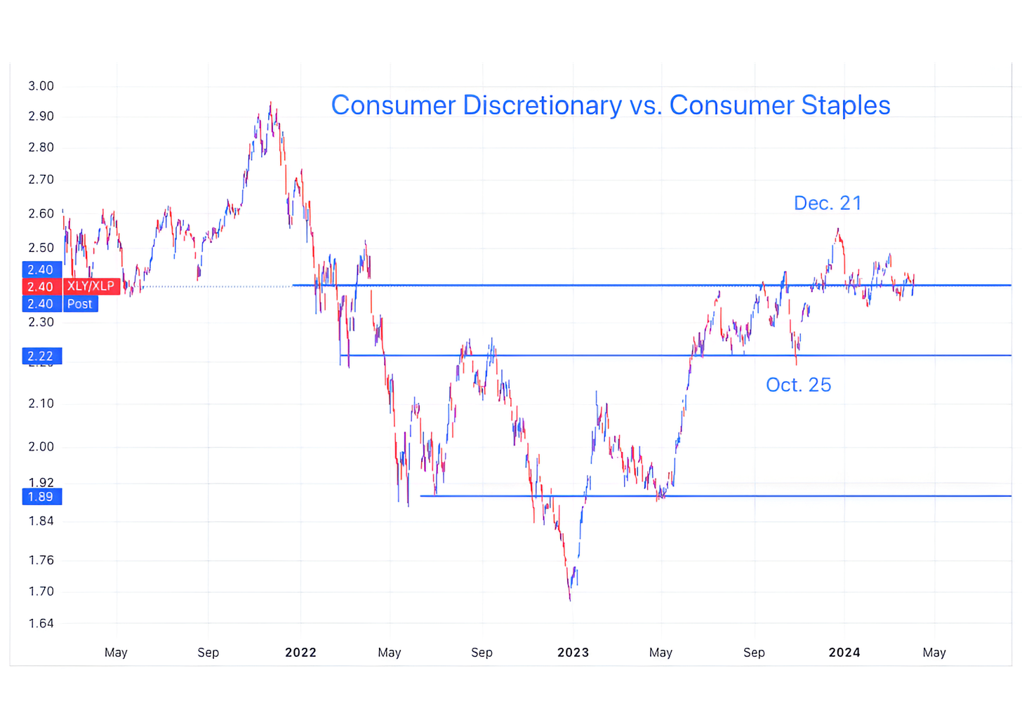
Whenever we want a barometer for near-term market direction, one of the indicators we observer is the relationship between the Consumer Discretionary and the Consumer Staples sectors.
At a very basic level, it makes sense: Consumer Discretionary shares do well when consumers are feeling flush, while Consumer Staples shares outperform when insecurity increases and people are more risk averse.
As can be seen on the chart below, this relationship peaked in November 2021 about 6 weeks before the S&P 500. It has also been a signal on other major sell-offs in the past.
(Like any of our indicators, we would not solely rely on this without confirmation from others).
More recently, this relationship peaked in December, 2023. However, it has not yet dropped below its Q3 2023 ceiling area (top blue line).
A meaningful drop below the top blue line would mean that Staples outperformance over Discretionary shares is accelerating and this would have our attention.
In our view, this is another indicator to keep on our radar.
(This is not a investment advice and is not recommendation to buy or sell any security).


