Welcome to the Jungle!
With the S&P 500 at a record high, valuations elevated, the Fed apparently less dovish than indicated in their recent statement, it's a complicated backdrop. Let's dig in...
1. What Worked in Q1 - A Little Surprising
Technology underperformed in Q1!
Taking all of the Technology shares in the Russell 1000, not weighting them by their market capitalizations and looking at the “average” performance, the sector returned 4.9%, underperforming the average return (equally weighted) of the entire Russell 1000 of 6.6%.
The best performer during the quarter based on the equally-weighted average performance was the Energy sector (we will take a look tomorrow).
In our first note on this platform, we highlighted the possibility of a rotation from the Magnificent 7 (chart 4 here) that dominated the market in 2023 to more value-oriented sectors like Financials (chart 5 of that note) and Energy (chart 5 of our second note here).
While this performance is not consistent with the sector performance of the (market-cap weighted) S&P 500, it is indicative of a) the changing character of the market taking place “under the surface,” and b) that the equity market in 2024 is not like the equity market in 2023.
(This is not investment advice. Past performance is not indicative of future results).

Source: Bespoke Investment Group. Through year-to-date 2024.
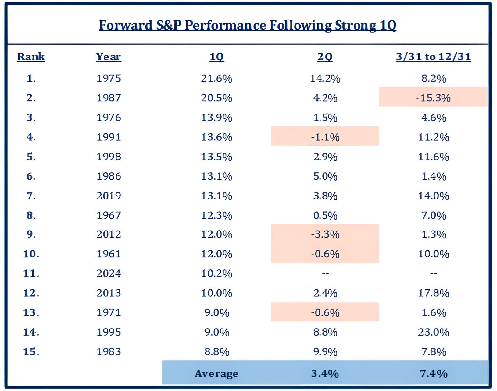
2. A Strong Q1 = Positive, but More Muted Returns for the Rest of the Year*
The first quarter of 2024 had the 11th strongest S&P 500 performance of a Q1 since 1950.
In the 14 other strongest starts to a year, the average Q2 return has been 3.4%.
Q2 has only outperformed the strongest first quarters one time - in 1983, which is the 15th best Q1 performance.
Furthermore, while the rest of the year has only had a negative return once after an exceptionally strong Q1, the 7.4% average return from March 31 to December 31 in the years with the 14 other best S&P 500 Q1 performances reflects a deceleration in performance.
Since 1945, there have only been eight “back to back” quarters with double digit (greater than 10%) gains including Q4 2023 and Q1 2024.
The average 1-month returns after two consecutive quarters of double digit gains has been -0.9%; while the average return of the quarter following two consecutive quarters of double digit gains has been 0.4%.
We will see what April and Q2 have in store.
*(Past performance is not indicative of future results).
(This is not a investment advice).
Source: Strategas. Through year-to-date 2024.
3. “We don’t need to be in a hurry to cut." Jerome Powell, Friday, March 29
Less than two weeks ago, the Fed released its summary of economic projections (the SEP) that included its “dot-plot” of future Fed Funds rate expectations.
After the release, Fed Chair Powell had his usual press conference.
The market interpreted both the dot plot and Chair Powell’s comments at the press conference as a confirmation that the Fed would likely begin cutting rates in June.
We summarized our confusion around the data, the Fed’s stance and market interpretation (here):
The majority of Fed board members project that thru the end of 2025:
Growth will remain above potential;
Unemployment will remain at secular lows;
Core PCE will remain above the mandate (for the 5th year);
and the Fed will cut 1.75% or more.
We also reminded readers that at the beginning of January, there was a near certainty priced into markets that the Fed would have started cutting rates at their last meeting. A lot can happen in two months.
Apparently, a lot can also happen in less than two weeks.
Last Wednesday, Fed Governor Waller, whom I believe is the most influential on Fed Policy other than Chair Powell, said:
“There is no rush to cut the policy rate. Indeed, it [recent data] tells me that it is prudent to hold this rate at its current restrictive stance perhaps for longer than previously thought to help keep inflation on a sustainable trajectory toward 2%.”
On Friday, Fed Chair Powell, seemed to have changed his posture.
Speaking at a conference at the Federal Reserve Bank of San Francisco, he said:
“We don’t need to be in a hurry to cut…We can hold rates where they are for longer, and that’s what we would do, of course, if inflation doesn’t come down, if we don’t see the progress we’re looking at.”
The Fed seems to be moving closer to our view that the current data doesn’t necessarily warrant a cut.
The chart below shows the Fed’s favored measure of inflation - the Core Personal Consumption Expenditure (PCE) Index - on a 3-month and 6-month annualized basis as well as year-over-year.
Whereas the year over year data still looks like it is coming down, the more recent data is reflecting a pick-up in inflation.
Not only is it a pickup, but outside of the last 3 years, the shorter-term inflation measures are near their highest levels of the last 20 years (white dashed lines).
We have consistently questioned why the Fed would be cutting given elevated inflation and full employment.
In addition to our piece the day after the Fed meeting, “Here Comes the Hotstepper” (here); on January 5th, we wrote, “Yellen Declares Mission Accomplished. Why Does this Scare Me?” (here) and on March 1, the theme of the day was “Will the Fed's Next Move Be a Hike?” (here).
(This is not a investment advice).

Source: Pinecone Macro. Through year-to-date 2024.
4. We are Continuing to Watch 10-Year Treasury Yields
Below is an update on 10-Year US Treasury yields.
When we looked at this chart 10 days ago (here), 10-Year Yields were at the bottom of the furthest right arc we had drawn in. (The right shoulder of a potential head and shoulders bottom).
At the time, we called 10-Year Yields and inflation barometer.
While we didn’t know if 10-Year Treasury yields would once again move higher, we had a suspicion.
In response to Fed Chair Powell’s comments, the PCE data (released last Friday) and / or other economic data (see chart 5), 10-Year Yields are once again knocking against the 4.34% level that we have recognized as important.
We continue to show this chart as we believe it is one of the most important for global markets overall and US equities specifically.
As we recently wrote, we see the risk that 10-Year US Treasury yields move above the 4.34% level.
If they do (in a meaningful way), we believe they will trend towards 4.65%.
In our view, this could lead equities to retrace some of their recent gains.
While we do not view equity valuation as a catalyst, higher inflation and higher 10-Year Yields can be.
(This is not a investment advice).

Source: TradingView. Through year-to-date 2024.
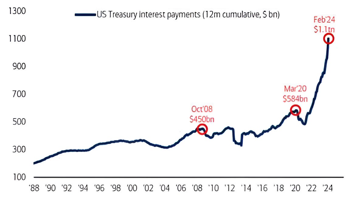
5. This is Becoming Serious
The chart below shows the US Treasuries Interest rolling last 12 months interest payments on borrowing to fund the fiscal deficit.
As a reminder, in Q1 2023 the US had $31.4 trillion of debt outstanding when it hit its “debt ceiling.”
The debt ceiling agreement was that there would be no debt ceiling for two years and the current debt outstanding (as of February) is $34.5 trillion (up nearly 10% in less than a year).
The combination of more debt outstanding and higher interest rates has let to a significant move higher in US Interest Payments (chart below).
To put the US Interest Payments in perspective, the US defense budget in 2023 was $817 billion and social security (21% of the 2023 budget) was $1.4 trillion.
There are currently no talks that I am aware of that would meaningfully reduce the US deficit or debt outstanding.
In other words, the US government needs lower interest rates as much as if not more than any mortgage borrower or credit card user.
Could this be one of the reasons why the Fed is considering shrinking its balance sheet (discussed here) or lowering short-term rates despite the conditions not necessarily warranting it.
(This is not a investment advice and is not recommendation to buy or sell any security).