


Should I Stay or Should I Go Now?
As we enter 2025 after two consecutive 20%+ years in the S&P 500, the backdrop has become more complicated. While equities may deliver gains, volatility will likely be a major factor. Let's dig in...

One of our key themes throughout 2024 was that “stealth” liquidity had helped support the economy and markets.
Specifically, Treasury Secretary Yellen used non-conventional measures such as accessing the Treasury General Account; using reverse repo agreements; and funding the government using short-term debt to provide liquidity and stabilize the economy. (See here, here, here, here, here, here, here, chart 4 here and here).
Combined with the $460 billion+ (total) of capex spending on AI in 2024 and expected in 2025 (see chart 3 here) and robust fiscal spending, these non traditional stimulus measures, in our view, helped lead equity markets higher.
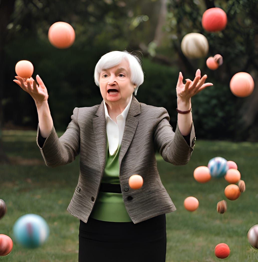
As we enter 2025, we view Yellen handing off the Treasury responsibilities to Scott Bessent almost like a juggler giving way to a replacement with multiple balls in the air.
While there is the possibility that the hand-off goes smoothly, there’s also the risk that one or more of the balls drop. Adding to this potential complication is the fact that the Biden and Trump administrations clearly have different priorities and policy initiatives.
This transition will occur with US equities at historically elevated valuations (see chart 3 here).
We always consider valuation as a measure of risk rather than a catalyst. Within the current macro-scenario, valuations at top-decile levels, in our view, present a heightened risk.
Furthermore, sentiment seems complacent (if not overly bullish). The average Wall Street strategist sees about 10% upside in the S&P 500 during 2025 (see chart 3 here and here) with the consensus tightly grouped together.
None of this is to say that equity markets must go lower, but we believe the path to another year of double digit (10%+ upside) is a challenging one. At the very least, after a year with no 10%+ drawdown, we expect more volatility this year.
Combined with heightened Treasury Yields (in line with a view that we have consistently espoused - see chart 3), we see valuation (too high) and earnings (overly optimistic) as constraints (chart 4 here; see chart 3 here; chart 3 here; here; here; here; here; chart 3 here; chart 3 here; charts 2, 3 and 4 here; chart 3 here; and chart 3 here) on significant equity upside.
Beginning early last June (here), we highlighted our concern of a significant Q4 2024 or Q1 2025 correction.
In mid-November (here), we wrote:
“We see a 30% probability of a significant sell-off (probably around 20% down) in the first half of 2025. This would bring the S&P 500 from its recent peak of 6000 to a level below 5000.
We believe this volatility will be met with liquidity including some form of Quantitative Easing / Fed balance sheet expansion that will drive an equity recovery.
As a result, we see muted gains in 2025 to a level of around 6200-6300 as a combination of liquidity and the expectation of a better 2026 helps US equities to recover from a first half sell-off.”
We still hold to that view. (A good summary of the evolution of our view is in the introduction here).
While the Equal Weight S&P 500 dropped 7% in December and the (market cap-weighted) typical S&P 500 fell 4% peak to bottom during the month, both have recovered some of their losses.
As always, we don’t want to prematurely react, but aim to remain vigilant.
Unlike some, we prefer not to “ride out” significant drawdowns and, as we did in December, we will try to identify periods when, in our view, the risk / reward is not in our favor.
At this point, the question is “Should I Stay or Should I Go Now?”
1. The S&P 500: The 1.618 Fibonacci Extension is Still in Play

Source: TradingView. Through year-to-date 2025.
The chart above shows the S&P 500 ETF (ticker: SPY).
We last showed the S&P 500 (not the ETF) two months ago, on election day, here.
At the time, the Index looked like it was moving back down to the 1.618 Fibonacci extension level which equates to 563 on the ETF ( 5630 on the Index).
However, that reversed with the post election rally and the date with the 1.618 Fibonacci extension did not occur.
Instead, the index moved to 6100 (610 on the ETF) during November and traded sideways to down during December.
It is possible that the S&P 500 has now formed a bearish “head and shoulders” pattern (the three arcs on the chart).
If the pattern were to be confirmed, the downside target (the neckline minus the difference between the top of the head and the neckline) would measure almost exactly back to 563 (5630 on the index).
In other words, if the bearish “head and shoulders” pattern were to fully develop, the S&P 500 would once again be reunited with the 1.618 Fibonacci extension of its January to October 2022 sell-off.
This, in our view, is where the real battle will take place.
(This is not a recommendation to buy or sell any security and is not investment advice. Past performance is not indicative of future results. Please do your own research and due diligence).
2. Looking for Clues from the Small Caps
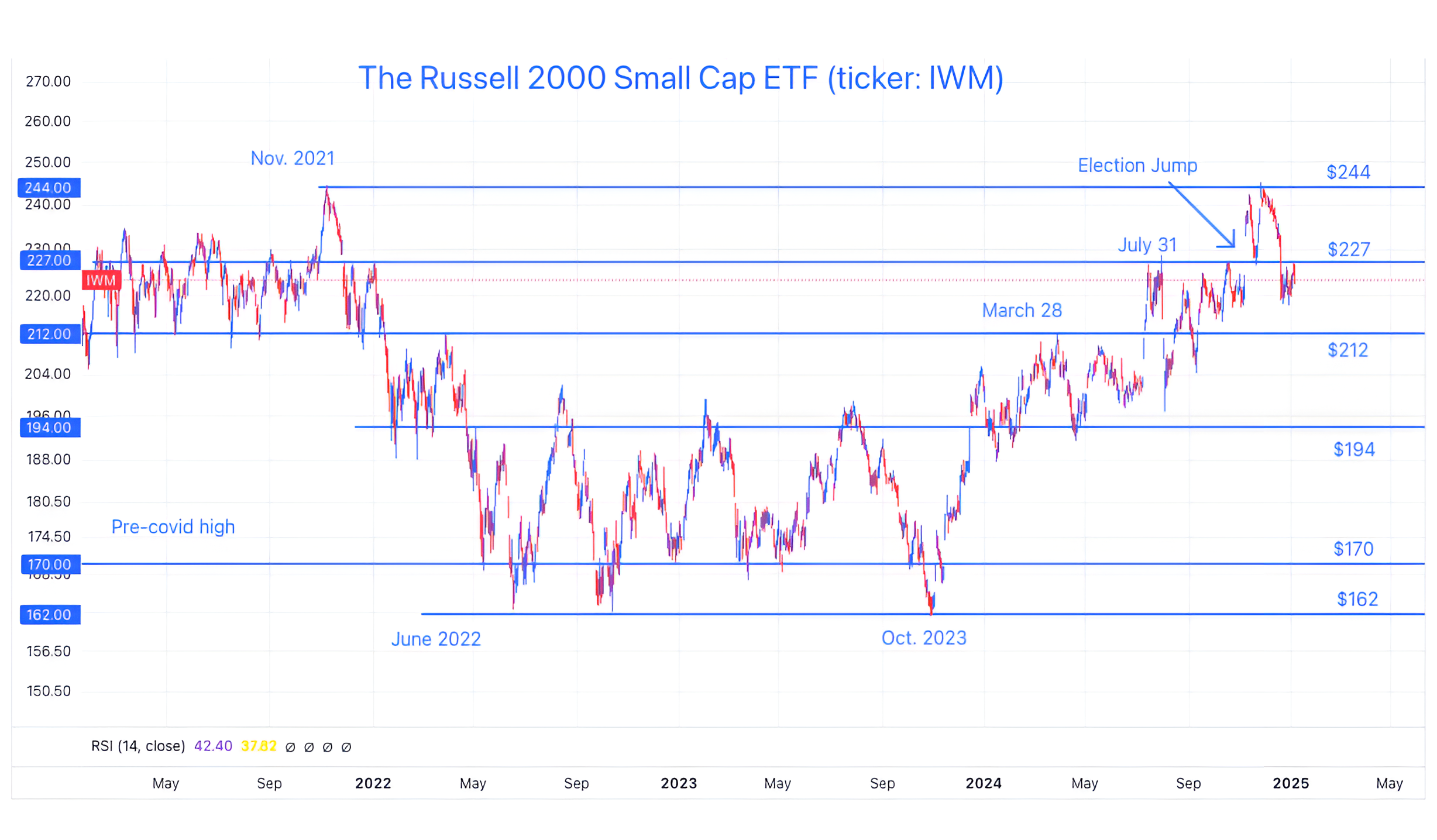
Source: TradingView. Through year-to-date 2025.
The chart above shows the Russell 2000 Small Cap ETF (ticker: IWM).
Small Caps were not able to surpass their 2021 (post-covid) high and have lost all of their post-election gains.
Furthermore, Small Caps are now below their July 31 high and below the level when the Fed began cutting rates.
We always consider the Small Caps as a reflection of the health of the US economy.
While Small Caps can recover, for the time being, their performance may raise questions about the economic outlook.
(Past performance is not indicative of further results. This is not a recommendation to buy or sell any security and is not investment advice. Please do your own due diligence).
3. 10 Year Yields and the Bond Vigilantes
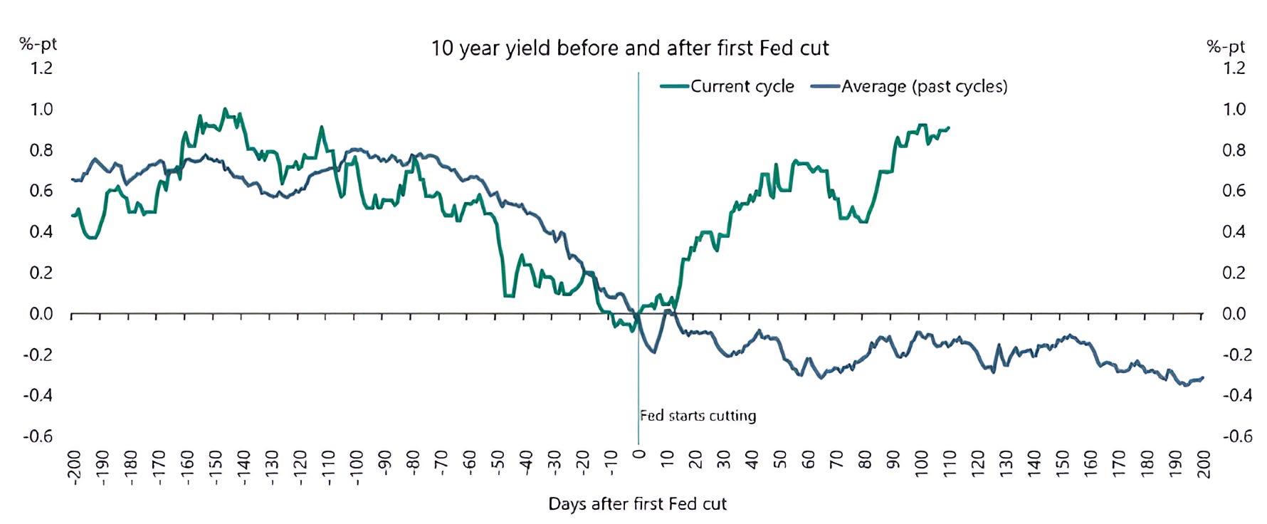
Source: Apollo Economist / Torsten Slok. Through year to date 2024.
The chart above shows the average path of 10-Year US Treasury Yields during past Fed cutting cycles (blue line) and the path of the 10-Year US Treasury Yield in the current cycle (green line).
Typically, 10-Year Treasury yields move lower when the Fed cuts rates, however, over the past four months, it has moved higher.
While one theory might be that the typical pattern is due to the fact that the Fed generally cuts rates as the economy is slowing and there are recessionary fears while the 10-Year yield prices in growth, inflation and a term premium that during slowdowns each move lower.
Another theory - a theme of ours that we have highlighted for some time - is that we are in a fiscal dominance regime where the Fed is cutting rates, not because it is economically necessary to do so, but to lower borrowing costs.
While noting this, we have espoused our view that there was a risk that “bond vigilantes” would require higher yields to invest in Treasuries given a) the total debt outstanding (now over $36 trillion); b) the near-term refinancing need (over $7 trillion in 2025 and nearly $20 trillion by 2027); and the budget deficit (nearly 7% of GDP).
(See Chart 4 here; here; in chart 5 here; in the introduction here; chart 2 here; and chart 2 here).
Finally, when we look at the chart of the current 10-Year yield (either above or on an isolated graph), it exhibits a pattern of a price that has paused while on a path of moving higher.
One of our out of consensus views for 2025 is that 10-Year yields will continue to move higher, equity volatility will follow and the Fed will implement some sort of QE (they might try to call it something different).
In other words, who will buy all (or at least a portion) of the Treasuries that need to be issued - the Fed.
This may be why Gold and Bitcoin are both near record prices.
(Past performance is not indicative of future results. This is not a recommendation to buy or sell any security and is not investment advice. Please do your own due diligence).
4. A Fun Fact from 2024: the S&P 500 Spent No Time Under its 200-Day Moving Average. What’s Next?
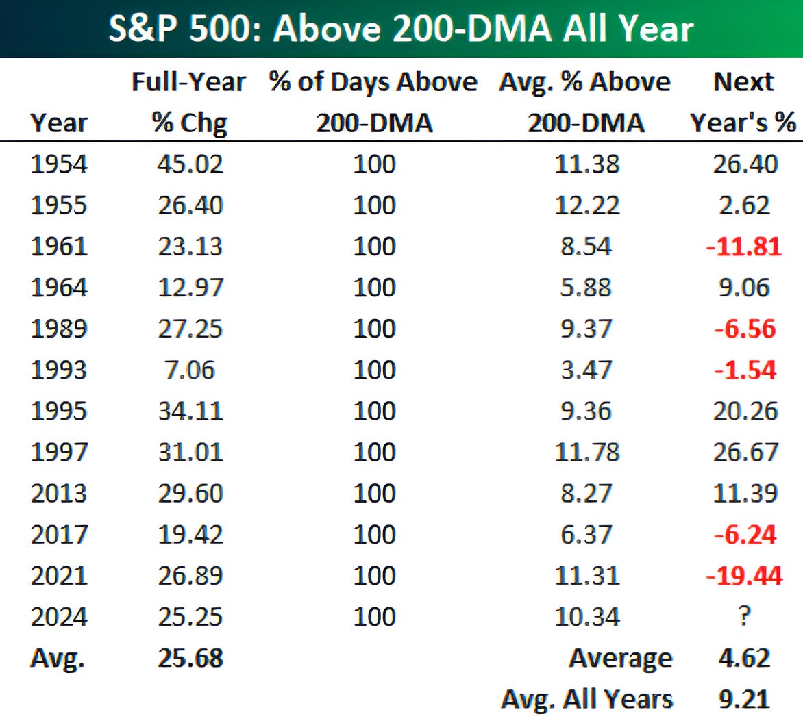
Source: Bespoke Investment Research. Through year-to-date 2024.
The chart above shows the years since 1950 that the S&P 500 has spent 100% of the time above its 200-day moving average as it did in 2024.
Historically, the average S&P 500 return in those years has been 25.7% which is consistent with the return in 2024.
The year following those years when the index has spent 100% of the time above its 200-day moving average, the S&P 500 has spent around 7% of its time above its 200-day moving and the return in those years has averaged 4.6%.
Interestingly, in around two weeks, the 200-day moving average on the S&P 500 will move up to converge with the 1.618 Fibonacci extension (5630) which, we stated in chart 1, is where we expect the next real battle to occur.
(Past performance is not indicative of future results. This is not a recommendation to buy or sell any security and is not investment advice. Please do your own due diligence).
5. The US Presidential Cycle and Equities

Source: Carson Investment Research / Ryan Detrick. Through year-to-date 2025.
The chart above shows the average quarterly return of the S&P 500 for each of the four years of the US Presidential cycle.
As we enter the first quarter of the first year of the cycle, it is interesting to note that this has historically been one of the weaker quarters.
In general, the first seven quarters of the US Presidential have been weaker than the final 9.
That said, since the implementation of QE in 2008, the first year of the US Presidential cycle - which prior to QE had been consistently weak - has been one of the stronger years.
As the final three years of the Biden administration were consistent with the Presidential cycle trend, we will see what the first year of the Trump administration delivers.
(Past performance is not indicative of future results. This is not a recommendation to buy or sell any security and is not investment advice. Please do your own research and due diligence).