


Waiting on a Friend
With the inflation report and Fed decision both coming tomorrow, US equities are at all-time highs but cracks persist under the surface. Let's dig in...
1. US Equities Hitting All-Time Highs

Source: TradingView. Through year-to-date 2024.
Similar to the S&P 500 that we showed here and the Nasdaq 100 that we showed here, the S&P 1500 (the S&P 500 + the next 1,000 largest US companies) is hitting all-time highs.
At the same time, as we showed yesterday (here), neither the average S&P 500 stock nor the average Nasdaq 100 are doing as well.
Additionally, as we show in chart 2 below, few shares are hitting recent new highs.
This is, of course, a symptom of the narrow breadth (low participation) that we have been seeing during the equity markets ascent.
As we have noted over, 40% of the 2024 gains in the S&P 500 have come from Nvidia and largest 10 shares in the S&P 500 have accounted for 77% of the performance. (In 2023, the largest 10 shares in the S&P 500 accounted for 68% of the overall index performance).
Although we view this as a sign of fragility as fewer and fewer shares are carrying the S&P 500 (and Nasdaq 100) higher, it is not a negative catalyst.
In other words, while this narrow leadership is not a sign of strength, it is also not necessarily a sign of an upcoming sell-off.
In our view, tomorrow’s inflation report and the Fed announcement will set the tone for equities over the next month.
Our expectation is that there will be near-term equity market weakness.
That said, the current equity environment has consistently defied any type of bearish expectation.
Rather than prematurely react, we have selectively added puts and put spreads to our portfolios while continuing to emphasize our highest conviction individual equity ideas, sectors and themes.
(This is not a recommendation to buy or sell any security and is not investment advice. Please do your own research and due diligence).
2. Another Indication of Weak Breadth

Source: All Star Chart. Through year-to-date 2024.
The chart above shows the percent of S&P 1500 companies by sector and in aggregate making highs based on different periods.
As the index itself hit a new all-time high, 3% of the shares of the index are at a 1-month (20-day) high; 2% are at a 3-month (63-day) high; and 1% are at a 6-month (126-day) or 1-year (252-day) high.
This is another sign of the lack of breadth in the current market environment.
(This is not a recommendation to buy or sell any security and is not investment advice. Please do your own due diligence).
3. Inflation Forecasts

Source: Wall Street Journal. Through year-to-date 2024.
The chart above shows the Wall Street economist expectations for May’s inflation report which will be released tomorrow.
The left column for each series is the month over month expectation and the right is year over year.
As the year over year figures for both series seem consistent across forecasters, there will be a focus on the month over month figures and the momentum in the recent inflation readings.
Typically, we would consider the framework of higher than expected inflation leading to tighter Fed expectations and resulting in lower equities.
However, after last week’s employment report that, despite some questionable internals (chart 2 here), led to a “higher for longer” reaction in Fed Funds futures, the S&P 500 went on to make a new all-time highs.
In other words, predicting the equity reaction function to economic releases or assuming a typical framework in the current environment has been challenging.
Furthermore, tomorrow afternoon, the Fed will announce its policy decision around interest rates. While the consensus is for no move, the announcement will be accompanied by the Fed’s “dot plot.”
As a reminder, the “dot plot” visual representation of the path of Fed policymakers Fed Funds rate expectations.
Finally, Fed Chair Powell will hold his typical press conference shortly after the release.
As always, economists and reporters will try to parse his responses and body language to gain an edge in their expectation of US monetary policy.
Should be interesting!
4. Recovery in the Multi-Family Sector
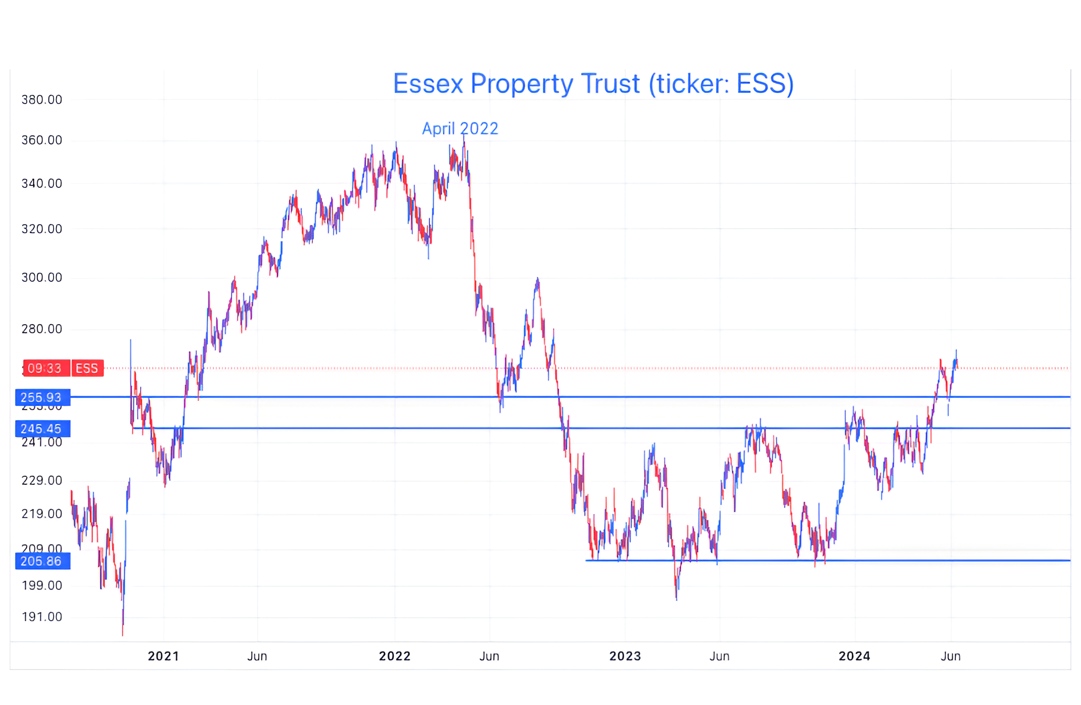
Source: TradingView. Through year-to-date 2024.
Although we are showing the price chart of a single multi-family property company, Essex Property Trust (ticker: ESS), we are using it as an example of what we are seeing across the multi-family apartment sector.
Essex Property Trust (website here) is a $17 billion market cap residential property owner with apartments for rent in northern California (around San Francisco); Souther California (Los Angeles and San Diego); and Seattle.
According to my X- (formerly Twitter) feed, none of those areas are currently booming.
However, Essex Property Trust shares are definitely recovering.
Since mid-November (when shares hit the lowest blue horizontal line), shares are up 31% vs. the S&P 500 which is up 20% over the same period.
However, it is not just Essex Property Trust.
Other multi-family residential REITs have been performing well as well - including Avalon Bay (ticker: AVB), UDR (ticker: UDR) and Mid-America (ticker: MAA).
Between the four of them, these companies own and lease apartments across the US.
What has likely happened?
As renewals have come in, rents have increased to off-set costs and the businesses that had been impacted by a combination of higher interest rates and higher operating expenses are recovering.
Furthermore, given the lack of adjustment in the purchase price for homes, home ownership has become more expensive leading to increased demand (and therefore higher prices) for rentals.
Why are we showing this?
It is something we noticed that was not on our radar.
It may be an interesting diversification theme for portfolios that are over-exposed to tech / growth shares.
(This is not a recommendation to buy or sell any security and is not investment advice. Please do your own due diligence).
5. What’s Happening with Regional Banks?
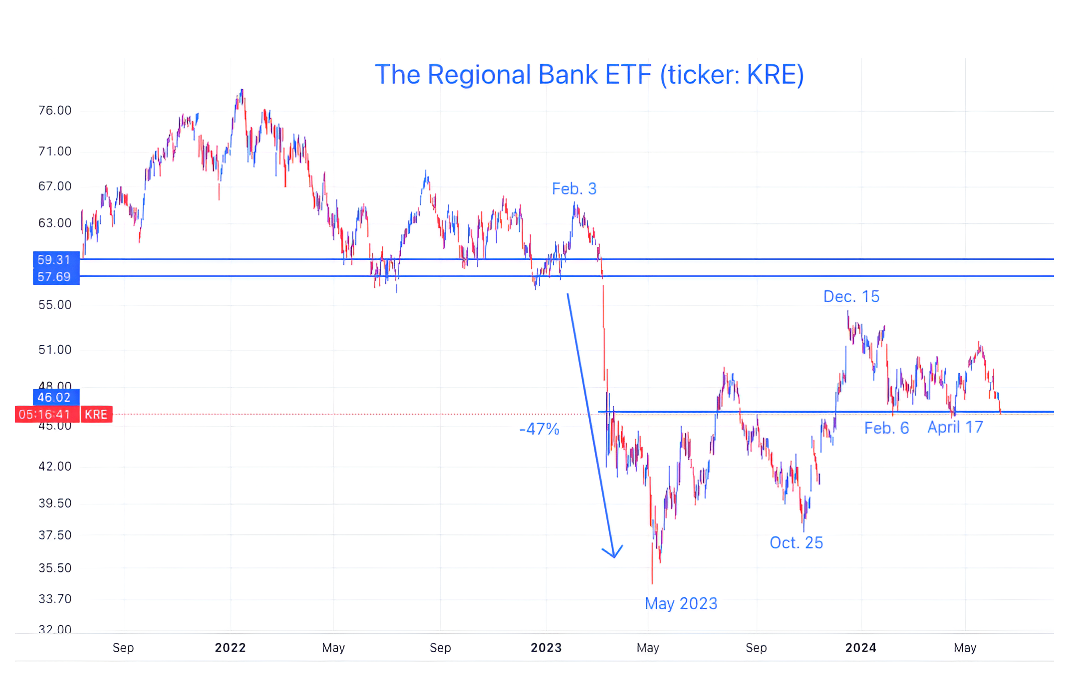
Source: TradingView. Through year-to-date 2024.
The chart above shows the Regional Bank ETF (ticker: KRE).
From February to May 2023, the Regional Bank ETF fell 47%.
As the Fed and Treasury designed policies to help curtail the Regional Banking crisis and to limit contagion, the ETF recovered.
After peaking in mid-December, the Regional Bank ETF dropped once again.
It is now visiting the floor area (lowest light blue horizontal line) that it established in February for the third time.
As the regional banks are often seen as a barometer economic health outside of the large cities, we want to see if the floor level can hold.
If not, it may be a foreshadow of some of the possible economic challenges that we have been highlighting.
(This is not a investment advice and is not recommendation to buy or sell any security. Please do your own research).