


Motown Philly, Back Again
From hard landing, to no landing and back to hard landing again - after last week's US economic data (thus the title). The good news is Powell sees neither "stag" nor "flation." Let's dig in...
In light of what was considered a disappointing employment report on Friday, we wanted to reiterate what we wrote on last Thursday (here):
“Although Powell said it is very unlikely the next move would be a hike (there is a high bar), he said a cut could occur either from inflation moving towards the Fed’s 2% target or surprise weakness in the labor market.
It is believed that the Fed has early access to tomorrow’s employment report and, as a result, some investors viewed the mention of the labor market as possible knowledge of a weak jobs number that would allow the Fed to cut.
As we wrote on Monday (chart 5 here), the Fed wants to lower the Fed Funds rate, not because economic or market conditions warrant it (in our view), but because the US debt outstanding and interest expense necessitate it.
It has been our view that the Fed would find a way to either explicitly ease or continue with its stealth liquidity program in conjunction with the Treasury. This is why we have maintained our 5500 S&P 500 year-end target despite the imbalances and market fragility that we often cite.
For us it is a matter of when, not if, the market will price in the liquidity.”
Last Wednesday, I referenced a conversation that I had with one of the largest Small Cap Portfolio managers in the country:
“The Portfolio Manager referenced accelerating credit card delinquencies and sub-prime auto defaults as possible reasons for a cut.
In other words, his arguments for a cut (or at least not a hike) were that economic storm clouds were on the horizon.
A couple of weeks ago, we wrote that two words that we had not heard lately from investors were valuation and recession. (here).
This conversation put recession back on my radar at a time when many have taken a soft or no-landing for granted.”
It seems that both of these scenarios have played out.
While the weaker than expected employment number accelerated the possibility of a fed cut (some have likened equity market investors to addicts looking to the Fed for their “fix”), in conjunction with other economic data last week (the Services PMI), some are questioning the strength of the economy.
At his press conference last week, when a reporter asked if the US economy was entering a period of stagflation (low growth / high inflation), Powell said, “I don't see the stag or the 'flation.”
In our view, equity markets are digesting all of this news along with increased liquidity expectations and earnings (and buybacks in the case of Apple) and remain in purgatory - moving sideways after the early April correction.
We are open to the idea of both a higher and lower resolution from the current sideways move.
1. The Battle Line at the 50-Day Moving Average

Source: TradingView. Through year-to-date 2024.
We see the 50-day moving average (green line on the chart above) as the test for the S&P 500 to provide an “all-clear” signal that the correction that began on March 28th is officially over and the ascent towards new highs has un-officially resumed.
While the S&P 500 has moved above the 50-day moving average, we often write about “meaningful” moves.
When we highlighted the 5000 level (0.236 Fibonacci retracement of the October 27 - March 28 climb) on the S&P 500 as sell-off destination (here), and the S&P 500 moved down to 4960, it did not “invalidate” the level as the move below 5000 was not “meaningful” in our view.
There was not enough time spent below 5000 and when the index moved back to 5000, it immediately went above, tested the level from the north and bounced .
Although the S&P 500 has surpassed its 50-day moving average today, our definition of “meaningful” is once again at play.
We want to see a) how much time the index spends above the 50-day moving average and, b) if the S&P 500 can remain above if it moves down to revisit in the near future.
Since October, the “buy the dip” strategy has been correct.
Investors have become conditioned over the past 6 months, that even through the largest (5%) correction, there is not significant risk in US equity markets.
Often, when investors become over-confident in the likelihood of further upside, that more significant corrections occur. (Past performance is not indicative of future results).
The break above the 50-day moving average might embolden investors and, counter-intuitively, set the market up for a fall.
As we highlighted last week, to reconcile the competing scenarios within our portfolios and to acknowledge the fragility of the current environment, we have remained invested, but have added put spreads in our portfolios.
(This is not a recommendation to buy or sell any security and is not investment advice).
2. Cracks in the Economic Data

Source: Nick Timiraos, the US Labor Department. Through year-to-date 2024.
The chart above tracks what’s known as the Sahm Rule. The grey shaded areas are US recessions.
Essentially, the Sahm Rule tracks the momentum of changes in employment as a recessionary indicator.
The Sahm rule is calculated by comparing the lowest unemployment rate from the past year to the average unemployment rate of the past three months.
Historically, when the average unemployment rate of the past three months has moved significantly above the lowest unemployment rate of the past year, it has been a recessionary signal. (Past performance is not indicative of future results).
Currently, the unemployment rate over the last three months is 0.36 percentage points higher than the lowest it was at any point in the last year.
While it is elevated and at the the highest level of the post-covid recession cycle, it is, in our view flashing yellow (has our attention) rather than red (run!).
In our view, the Fed and Treasury will continue to work together to avoid a significant economic slowdown in the near-term. We are less certain of their ability to mask imbalances over longer-horizons.
(This is not a recommendation to buy or sell any security and is not investment advice. Please do your own due diligence).
3. Sell in July?
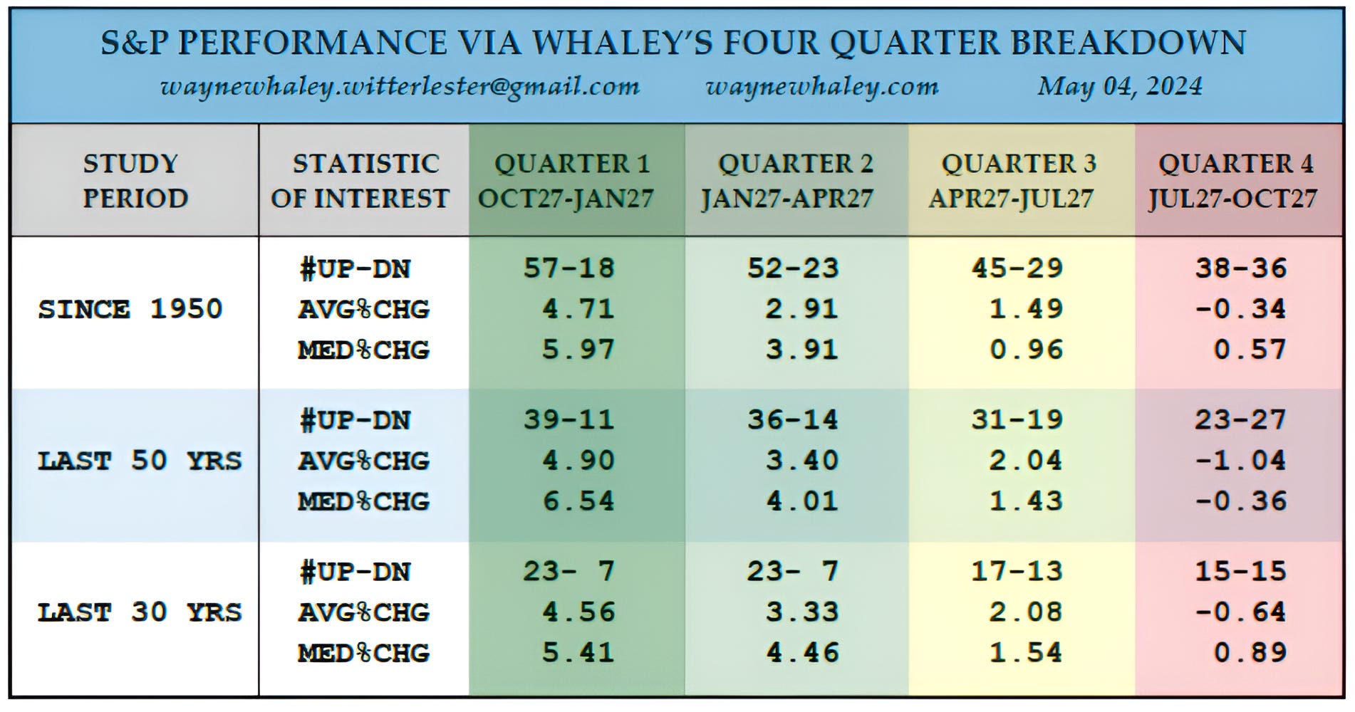
Source: Wayne Whaley. Through year-to-date 2024.
While it is often said “Sell in May and Go Away,” the quarterly S&P 500 performance data from 1950 suggests that selling in July has been the better strategy. (Past performance is not indicative of future results.)
To be fair, the “Sell in May” crowd has typically suggests being out of the market through early September. In other, words, the “Sell in May” argument has not been a quarterly one.
One additional element to the chart above is that when December, January and February are all positive (as they have been currently), historically, the market performance statistics on the chart have improved.
As an example, Q4 (of the analysis), in years with a positive December, January and February, has had 15 positive instances and 7 negative (from 38-36), with an average change +1.92% (from -0.34%) and a median gain of 2.44% (from 0.57%).
(This is not a recommendation to buy or sell any security and is not investment advice. Please do your own due diligence).
4. A Longer Look at 10-Year Treasury Yields

Source: TradingView. Through year-to-date 2024.
While we have consistently been showing very near-term charts of the 10-Year US Treasury Yield (most recently here, here, here and here), today, we are taking a step back and looking at the path of 10-Year Treasury Yields from 2010.
As we noted last week, the 10-Year Treasury Yields had hit our near-term target of 4.65%.
In our view, the move above 4.34% opened the door for a move back up to 5.00%.
As we wrote a week ago, “With 10-Year Treasury Yields fighting with our “head and shoulders” target level of 4.65%, we see the possibility of a pause or even slightly lower yields. However, in our view, 5.00% continues to be a possible likely destination.” (slightly edited for clarity out of context).
Looking at the longer-term chart, in line with our view of a possible pause or slightly lower yields, we wouldn’t be surprised to see 10-Year Treasury yields trend back down towards 4.34%.
Consistent with the higher bias for 10-Year yields that we have highlighted since early in the year (here), we would expect an upwards resolution if yields were to re-test the 4.34% area.
At this point, a move below 4.34% in 10-Year Treasury yields might be an indication of slower growth expectations or a different risk from which investors were seeking security.
While higher 10-Year Yields might put pressure on valuations as we’ve described multiple times, lower 10-Year Yields may be an indication of slower economic activity and a possible challenge to the current view of strong earnings growth.
We will watch closely.
(This is not a recommendation to buy or sell any security, please do your own research).
5. Momentum is the Most Persistent Factor in Markets
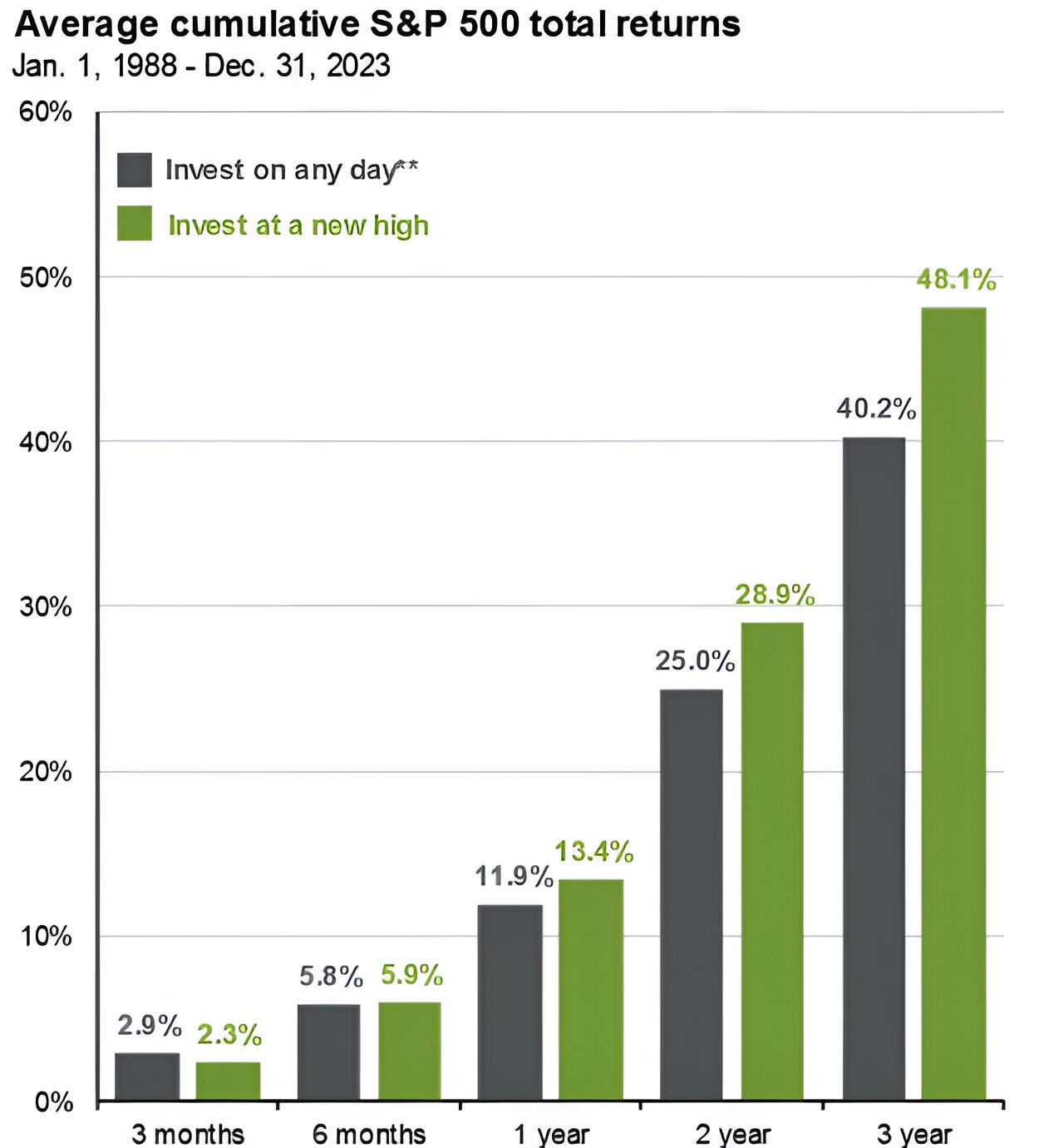
Source: JP Morgan. Through year-to-date 2024.
The chart above compares buying the S&P 500 at “All time highs” vs. buying at “all other times.”
Contrary to intuitive belief (at least my intuitive belief), investing at “All time highs” has historically been a better strategy (for those looking for return) than investing at other times. (Past performance is not indicative of future results).
Although the chart above is from JP Morgan and uses data from 1988, at one point, I did a similar analysis using a longer time period and came to the same conclusion.
Why does this work?
Momentum is the most persistent factor in equity markets.
It is a more relevant than valuation (cheap doesn’t lead to gains); revenue growth; return on equity (“quality”); and / or size.
It is often said, that bull markets will go higher than you think and bear markets will stretch lower.
This is one of the reasons why we show the charts!
(This is not a investment advice and is not recommendation to buy or sell any security).