


Welcome to the Machine*
After the bounce, drop, bounce reaction to yesterday's Fed meeting, several indexes are at key levels. Tomorrow's employment report could set the tone for the next month. Let's dig in...
*For the most part, each day, the top headline of these reports are song titles.
I always try to make it relevant to what I’m seeing across the economy, in markets and the charts and analysis of that day.
Today’s headline is a Pink Floyd song from the album Wish You Were Here.
With the interplay of the Fed, Treasury, politics, Middle East affairs, the economy and markets this week - I though Welcome to the Machine was an appropriate title.
If anyone has any “requests” or is seeing a song title that they feel captures the environment, please don’t hesitate to share it.
I will work on a Spotify playlist of Charting Alpha titles and share the link.
Shine on you crazy diamonds!
1. Stealth Liquidity / Stimulus: Updated and Revisited
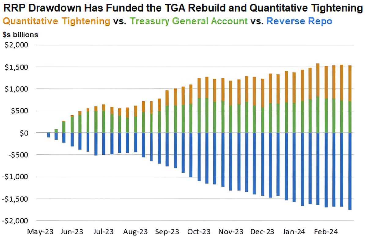
Source: GLJ Research, Bloomberg. Through year-to-date 2024.
We showed the chart above on March 5 (here) and still think it may be the best summary of what we have been calling Stealth Stimulus and Liquidity.
(Stealth stimulus / liquidity has been one of our themes (here) and we have written about it in chart 1 here, chart 3 here and chart 2 here).
Let’s start with the fact that since 2008 (the financial crisis), the Fed has expanded its balance sheet from less than $900 billion to nearly $9 trillion through a process called Quantitative Easing (QE).
Why did they do this?
They expanded the balance sheet to buy a combination of Treasury and Mortgage backed securities to reduce long-term yields (remember the Fed Funds rate only dictates short-term yields).
Ben Bernanke (Fed Chair in 2008) claimed the expansion of the balance sheet would be temporary. However, each time the Fed has tried to shrink the balance sheet, equity sell-offs have occurred - until the last year.
Since mid-2022, the Fed has been reducing the size of its balance sheet through Quantitative Tightening (QT) (orange bars above).
When we tried to understand why / how the equity market was rallying despite this monetary tightening measure (that the Fed doesn’t specifically acknowledge is a tightening), we recognized that Quantitative Tightening was being offset first by spending from the Treasuries General Account (TGA) (green bars) (the spending is not seen on the chart, but discussed below) and later by the use of the Reverse Repo (RRP) facilities.
In late March 2023 (before the start of the chart), the US hit its “debt ceiling.”
As an increase to the “debt ceiling” was debated in Washington, the Treasury used its General Account (TGA) to provide liquidity.
By May 2023, when an agreement was reached on the debt ceiling (the new debt ceiling is no debt ceiling), the TGA was essentially drained and needed to be refilled.
Refilling the TGA and Quantitative Tightening (the upper portion of the chart) would drain liquidity from the US economy.
Since May 2023, the Treasury has used excess reserves from money it printed in 2020 / 2021 in response to covid that was sitting dormant in the Reverse Repo (RRP) account (bottom of the chart) to offset the tightening impact from Quantitative Tightening and refilling the Treasury General Account.
As a result, while the Fed has talked tight, when combined with Treasury operations, the tightness has been offset.
The Reverse Repo account is now nearly drained which brings us to yesterday’s Fed statement.
The Fed said that it would taper is balance sheet reduction from $60 billion per month to $25 billion per month (we highlighted this likelihood in early March) beginning in July.
While this is a “tacit” easing (less tight = easier), this will be offset by the fact that the Treasury has run out of ammunition in its Reverse Repo account. It has however, reloaded its General Account and we will watch that carefully.
Although Powell said it is very unlikely the next move would be a hike (there is a high bar), he said a cut could occur either from inflation moving towards the Fed’s 2% target or surprise weakness in the labor market.
It is believed that the Fed has early access to tomorrow’s employment report and as a result, some investors viewed the mention of the labor market as possible knowledge of a weak jobs number that would allow the Fed to cut.
In other words, we are at that point in the cycle when bad economic data - lower employment - might be positive for the equity market as many believe this could accelerate the Fed cutting cycle.
After yesterday’s press conference, Goldman Sachs’ economics team maintained its view that the first of two Fed funds cuts this year would occur in July.
As we wrote on Monday (chart 5 here), the Fed wants to lower the Fed Funds rate, not because economic or market conditions warrant it (in our view), but because the US debt outstanding and interest expense necessitate it.
It has been our view that the Fed would find a way to either explicitly ease or continue with its stealth liquidity program in conjunction with the Treasury. This is why we have maintained our 5500 S&P 500 year-end target despite the imbalances and market fragility that we often cite.
For us it is a matter of when, not if, the market will price in the liquidity.
(This is not a recommendation to buy or sell any security and is not investment advice).
2. Mystery Chart

Source: TradingView. Through year-to-date 2024.
The chart above is like many others I’ve shown.
The technical pattern that I’ve drawn is a potential “cup” (the large arc) and “handle” (the smaller arc).
If the price were to move meaningfully above the lower light blue horizontal line, we would expect it to move to the higher horizontal light blue line.
Unfortunately, the chart is inverted.
What I’ve presented as a move up, would actually be a move down of 5%.
The chart is of the Dow Industrials Index - the 30 stock index which is often quoted alongside the S&P 500 and Nasdaq 100.
Essentially, in our view, the Dow Industrials Index is sitting on the edge of a 5% drop awaiting the employment report.
The S&P 500 and the Nasdaq 100 charts do not look significantly different than the chart of the Dow Industrials Index.
In our view, given yesterday’s Fed statement, with a weak employment report, the market would bring forward possible Fed cuts and the equity market would rally.
If, however, employment remains strong and the Dow Industrials were to fall below the line, it would likely foreshadow similar moves in the other major US equity indices.
(This is not a recommendation to buy or sell any security and is not investment advice. Please do your own due diligence).
3. Tell Me Something I Didn’t Know: Inflation Expectations are Coming Down

Source: TradingView. Through year-to-date 2024.
In early March, when we last showed this chart of 5-Year Breakeven Inflation (here), we were questioning whether the Fed’s next move would be a hike as inflation expectations had been moving higher for nearly three months.
As a reminder, the breakeven rate is seen as the market-based expected average inflation rate in the next 5 years.
Over the past 2 weeks, consistent with the drop in oil price that we have been noting (most recently yesterday), inflation expectations have been coming down.
If actual inflation follows expectations lower and / or there is surprise weakness in the employment data, the market will begin to bring forward Fed rate cuts and equities will likely rally.
(This is not investment advice or a recommendation to buy or sell any security).
4. Utilities

Source: TradingView. Through year-to-date 2024.
We have been highlighting the performance and, at times, outperformance of the Utilities sector for some time.
A month ago, we showed the chart (here) and questioned whether Utilities were rallying because:
The whole market was rallying;
The power requirements of AI were being priced in;
Investors were moving to the most defensive sector as they were worried about economic growth;
Expectations that long-term yields would move down as Utilities shares often move inverse to Treasury yields.
Bullets 3 and 4 above are often related because in economic slowdowns often longer-term yields move lower.
We find it interesting that Utilities have rallied to a level that has acted as a ceiling in the past just before tomorrow’s employment report.
(This is not a recommendation to buy or sell any security, please do your own research).
5. This is Going to Be Interesting…

Source: Strategas. Through year-to-date 2024.
Although it may be too early to begin writing about the US Presidential election, the chart above caught my attention.
I am not sure what’s behind President Biden’s recent drop in popularity among young voters, but presidential approval in the past has been very sensitive to inflation and employment.
The other thing I think when I look at this chart is that during Presidential election years, the equity market often trades sideways (a little up, a little down with not much net gain or loss) from June through October. (See chart 5 here).
This is mostly likely due to the uncertainty surrounding the election. Historically, 2 to 4 weeks before the election, US equities on average have begun to rally. (Past performance is not indicative of future results).
Given how tight and contentious this year’s race is and my belief that the market often does what will frustrate the majority of investors most, we need to consider if the S&P 500 rather than having the cathartic correction that I have called for, simply trades sideways for the next six months and frustrates both bulls and bears.
Should we be selling option premiums (sell call and put spreads and collect money) rather than buying put spreads?
This is something we may explore after the reaction to tomorrow’s employment number.
(This is not a investment advice and is not recommendation to buy or sell any security).