


Oh, Baby, It's a Wild World...
Since mid-2024, we've been highlighting the increasing possibility of a first-half 2025 drawdown. While it's been playing out mainly as we expected, there are always some nuances. Let's dig in...

Throughout the second half of 2024, we refined and reiterated our view of a likely significant (~20%) correction in US equities that we initially presented when the S&P 500 was at 5260 in early June (here):
In our view, the rally will continue for the next 3-9 months driven by technicals and seasonality and supported by stealth liquidity and the expectation of improving fundamentals.
That said, we are beginning to see possible cracks in the foundation of the market’s ascent that, in our view, could become more apparent either late this year or in early 2025.
Although it’s a fools errand to try to develop a 6, 12 and 18-month road map for the equity market, we see the possibility (10-15% likelihood) of a 30% sell-off that see the S&P 500 bottom around 4000-4200 in 2025 from a peak of 5500-5800 in 2024.
Shortly after the US election in November (here) we wrote:
Since that time (early June), we have increased the probability of a significant sell-off to 20-30% (here), but it is clear that we under-estimated the magnitude of the rally.
We would now call this a 30% chance of a 20-30% sell-off from a level of around 6000 in the S&P 500 leading the index back down to a range 4200-4800.
We see this occurring in the first half of 2025 and, in our view, it will most likely be met with a new round of quantitative easing (they may give it another name - but it will be Fed balance sheet expansion).
With the S&P 500 now down 10% from its mid-February all-time high, there are some interesting technical, macro, economic and fundamental considerations:
Technicals: Overall, the S&P 500 and Nasdaq 100 are now clearly broken and trading below their respective 200-day moving averages. This is not dire, but makes for a more difficult uphill climb. Interestingly, nine of the eleven S&P 500 sectors are outperforming the index and the only two sectors underperforming are Technology (Nvidia, Microsoft, etc.) and Consumer Discretionary (Amazon, Tesla, etc). In other words, while the indexes are challenged technically, there is strength beyond the headline.
Macro: rather than focus on the tariffs or any policy specifically, we would characterize the macro environment as uncertain. Markets don’t like uncertainty. We’ve seen this show up in some of the consumer data and surveys and it could transcend into corporate profits. (see chart 4 here).
Economic: Q1 growth will likely be slower than most initially considered. For the most part, Q1 activity will reflect an environment before the impact policy initiatives including government spending cuts (DOGE). Some economists are now increasing their odds a potential US recession. Will the Trump tax reform come to the rescue in time?
Fundamentals: We highlighted our view on fundamentals in chart 2 here, but we remain concerned that expectation for 2025 and 2026 remain too high (see chart 4, below). Over the past 15 years, as long as earnings projections have been slowly reduced (rather than experiencing large surprise earnings misses), this has had limited impact on the market. However, given elevated valuations, we see declining earnings outlooks as a constraint to significant index upside.
As always, the interplay of these factors and, importantly, investor psychology will drive markets from here.
We continue to be somewhat defensively positioned focusing on Dividends, Energy, Gold, China, Japan. We have maintained 10-20% cash in portfolios and have selectively traded puts and put spreads.
We characterize this market environment as “guilty until proven innocent.”
“Oh, baby, it’s a wild world. And it's hard to get by just upon a smile.”

1. The S&P 500: At the Battlezone
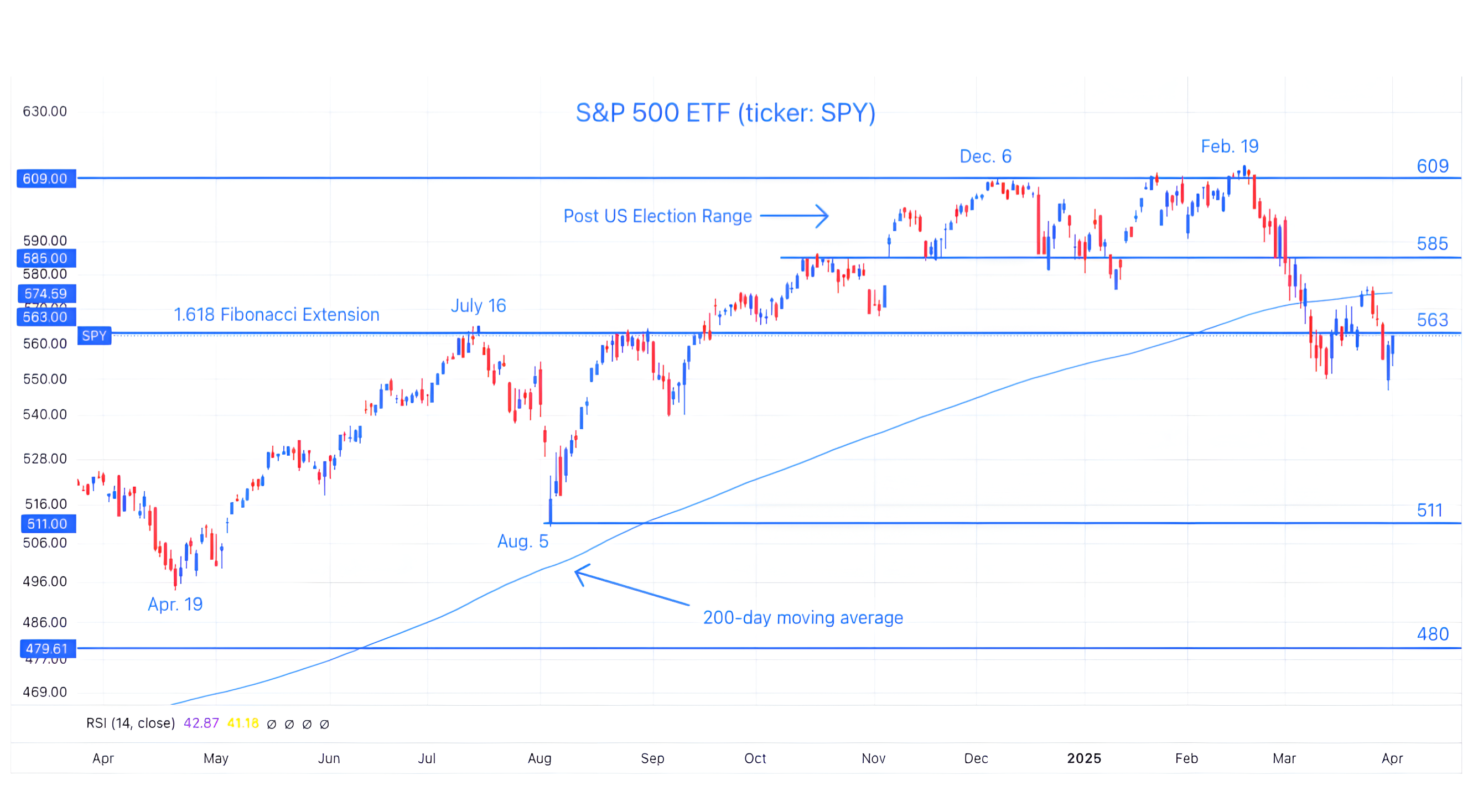
Source: TradingView. Through year-to-date 2025.
The chart above shows the S&P 500 with its 200-day moving average (curved light blue line) and the 1.618 Fibonacci Extension level of the 2022 sell-off.
We first highlighted the 1.618 Fibonacci Extension level as an upside target for the S&P 500 in the same early June note (here) where we presented our view of a likely correction (that we quoted in the introduction).
Many people have said to me that they don’t understand this Fibonacci level, why I use it, its significance or how its calculated.
While I have answers for some of these questions (reach out for the explanations you need), I don’t have the answer for the most important one: why does this work?
What does a mathematical sequence discovered by an Italian man in the early 1200s have to do with today’s markets? I have no idea, but it is clear that these levels are relevant.
It would be easy to say that if several large quant trading systems are focused on the same levels - whether those are prior highs, moving averages or Fibonacci target - those levels can become self-fulfilling.
While this might explain the last 30 years as computerized trading has become dominant, it doesn’t explain the identification of Fibonacci sequences across markets prior to the broad acceptance and use of computerized trading models. (As a reminder the “candles” that we show in our charts were developed by an 18th century rice trader).
All of that said, after highlighting the 1.618 Fibonacci Extension level in early June (for both the S&P 500 and Nasdaq 100), we have written several times that we expected a battle there.
Well here we are.
We can see the gravitational pull of 563 over the past three weeks.
While our bias over time remains lower, as always, we are watching other indicators and relationships to give us directional guidance.
As stated in the introduction, we consider ourselves defensively positioned, trying to play short-term bounces when they occur, but overall somewhat cautious on US equities.
(This is not a recommendation to buy or sell any security and is not investment advice. Past performance is not indicative of future results. Please do your own research and due diligence).
2. Keeping an Eye on Technology
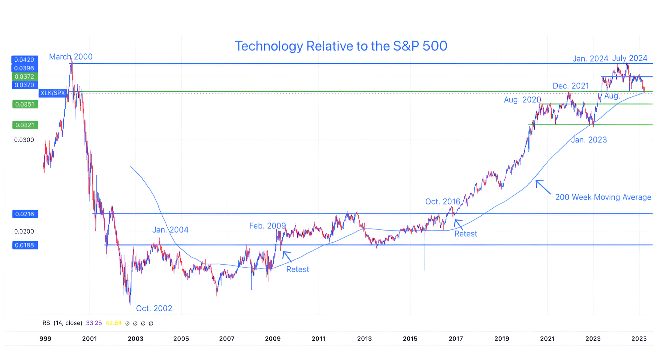
Source: TradingView. Through year-to-date 2025.
The chart above shows the Technology Sector ETF (ticker: XLK) relative to the S&P 500 since 1999 with its 200-week moving average.
We last showed this chart in October (here).
At the time, we wrote:
“If Technology falls below its December 2021 relative high, we want to be underweight / cautious.”
Here we are.
In addition to having fallen through its December 2021 relative high, Technology relative to the S&P 500 has now fallen through its 200-week moving average for the first time since January 2023.
In January 2023, the relationship was able to easily recapture the north side of the 200-week moving average and continue moving higher. We will see if it can do it again.
Why is this important?
The Technology Sector is about 30% of the S&P 500 and 50% of the Nasdaq 100.
If it is underperforming - it is a drag on the overall index performance.
This is the opposite of what occurred over the past two years when Tech pulled the S&P 500 higher despite modest performance from the majority of shares.
Finally, it always amazes us that the reversal in the outperformance of tech sector occurred at nearly the same relative level as the March 2000 high.
Like the Fibonacci levels - we can’t necessarily explain why particularly as many of the positions in both the Tech sector and the S&P 500 have changes (not to mention the weights for those shares that remain), but we need to at least acknowledge it.
(Past performance is not indicative of future results. This is not a recommendation to buy or sell any security and is not investment advice. Please do your own due diligence).
3. Counting on Value

Source: TradingView. Through year-to-date 2025.
The chart above shows the Russell 1000 Value ETF (ticker: IWD) with its 200-day moving average.
Given the underperformance of Technology, a growth sector, Value shares, by default have become increasingly important to the health of the overall market.
In our view, Value is at a critical level.
Right now, Value shares are at the intersection of their pre-election high and their 200-day moving average.
If Value shares fall from here and Technology (chart 2, above) continues to underperform, the S&P 500 will have little support.
(Past performance is not indicative of future results. This is not a recommendation to buy or sell any security and is not investment advice. Please do your own research and due diligence).
4. Goldman’s New Forecast
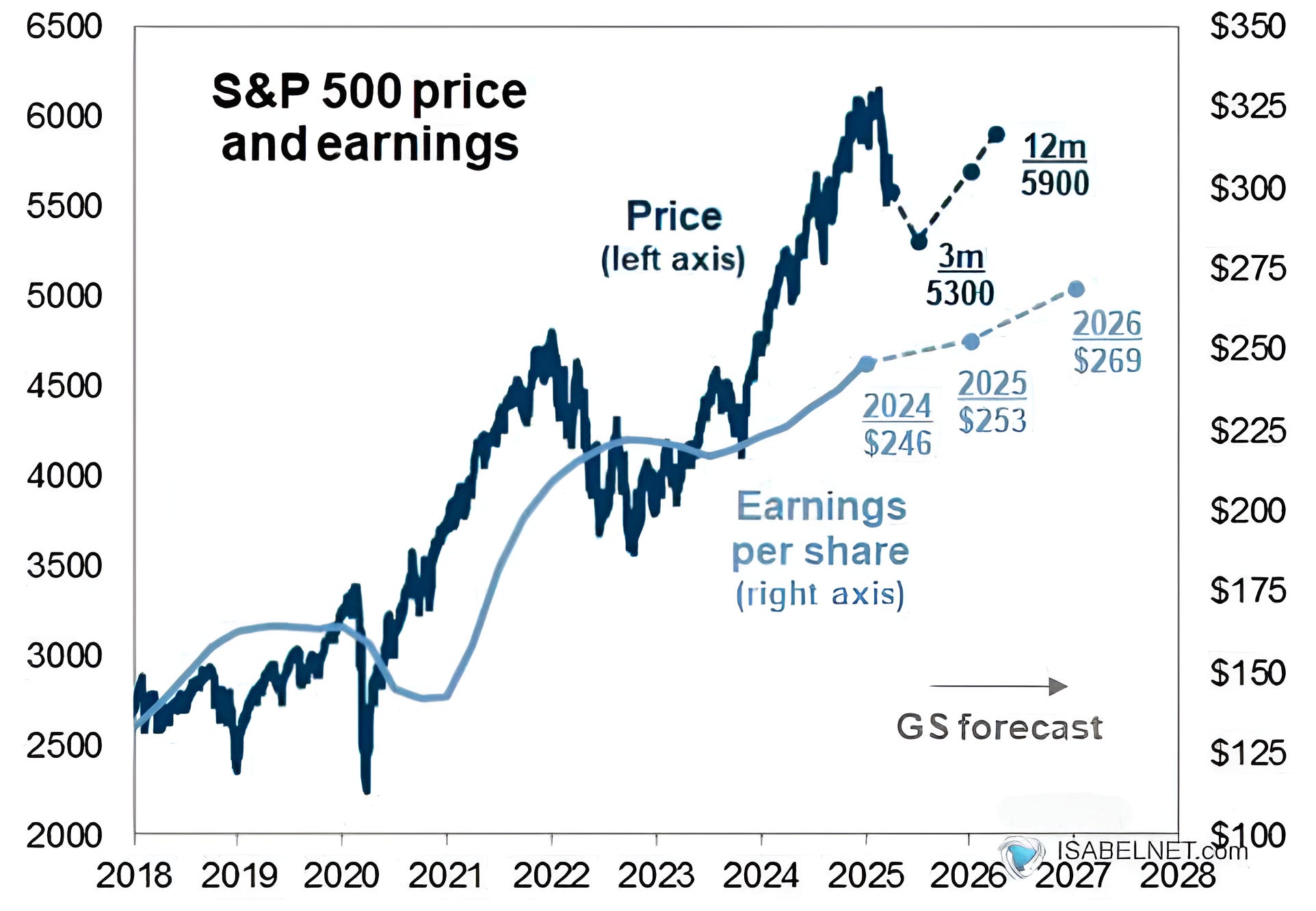
Source: Goldman Sachs and Factset. Through year-to-date 2025.
The chart above shows Goldman Sachs’ expected path of the S&P 500 (dark blue) and S&P 500 earnings (light blue line).
In mid-November (chart 3 here), we showed Goldman’s expected path and target for the S&P 500 and earnings for 2025 along with their expected path of PE valuation multiples.
At the time, we commented that the math wasn’t mathing as Goldman’s projected 2026 earnings ($288) multiplied by its expected forward PE multiple (21.5x) did not equal its target price (6500).
Goldman now sees 2025 and 2026 earnings of $253 (down from $268) and $279, respectively which are well below FactSet bottoms-up estimates of $269 and $308 (we have commented several times that current earnings expectations are too high).
Goldman has established new targets of 5300 in three months (by the end of Q2) and 5900 in 12 months (the end of Q1 2026).
Looking closely at the chart, it seems there is a blue dot at 5700 around year-end 2025.
If this is correct, they are assuming a 21.2x multiple at year-end based on their 2026 earnings estimate.
We will see if the S&P 500 cooperated with Goldman from here.
At this point, it is interesting to go back to all of the strategists forecasts that we provided at the end of 2024 (chart 3s here, here, here and here). The most interesting might be the one from BCA - the only bearish house (chart 3 here).
(Past performance is not indicative of further results. This is not a recommendation to buy or sell any security and is not investment advice. Please do your own due diligence).
5. A Typical First Quarter of the US Presidential Cycle?
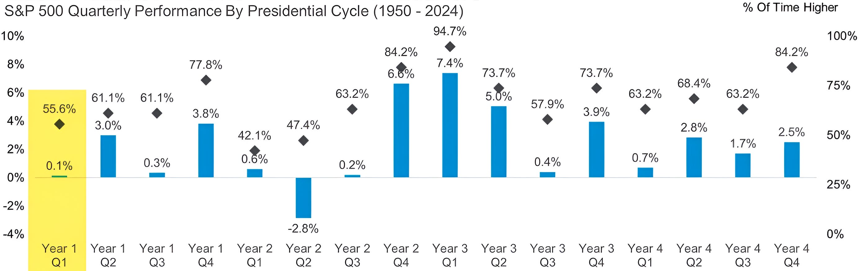
Source: Carson Investment Research / Ryan Detrick. Through year-to-date 2025.
The chart above shows the average quarterly S&P 500 performance (blue bars) and the percent positive performance (black diamonds) over the four years of the US Presidential cycle.
Historically, the first quarter of the first year has been the second worst in terms of S&P 500 return (0.1%) over the four cycle (Q2 in year two has been the worst).
On average, S&P 500 returns during the first quarter of the US Presidential cycle have only been positive 56% of the time.
Was the difficult Q1 simply typical or was it the start of more challenges to come?
In our view, it’s critical to keep an open mind and to respect a broad range of economic, fundamental and technical indicators.
The good news is that historically during Q2 of the first year of the US Presidential cycle, the S&P 500 has averaged a 3% return and has been positive 61% of the time (the percent positive is lower than I would have expected). We’ll see!
(Past performance is not indicative of future results. This is not a recommendation to buy or sell any security and is not investment advice. Please do your own research and due diligence).