


Gettin Jiggy Wit It!
The S&P 500 and Nasdaq 100 both seem to be on a glide path back to their all-time highs; however, some pushback to the bullish narrative is beginning to reemerge. Let's dig in...

For many, including me, the v-shaped recovery in equities has been a surprise.
Not only that there has been no-retest of the lows (I like the confirmation of a re-test), but also the move straight through the 200-day moving averages was “easier” that I thought it would be.
No pause, no fight, no problem.
Rather than re-tests and pauses, the v-shaped rally has been “confirmed” by technical indicators including breadth thrusts (see chart 5 here) and the percentage of S&P 500 shares simultaneously above their respective 20-day moving averages (58%) (chart 5 here).
Both of these indicators (and others that have triggered) have consistent track records of prognosticating higher markets 6- and 12-months forward.
I have tried to frame the bullish narrative from a fundamental perspective (in the introduction here and here and “tokens and tax cuts” on Tuesday here); however, from a price perspective, outside of the pandemic, we have rarely seen such an immediate and robust equity market reversal.
The difference is that the post-pandemic rally was fueled by a combination of extreme monetary easing and unprecedented fiscal stimulus.
The current environment, on the other hand, has essentially been supported by a less than feared “tax hike” (we view tariffs as a sales tax) (see chart 4, below) combined with the expectation of fiscal stimulus.
As the S&P 500 and Nasdaq 100 are both back in the neighborhood of their respective all-time highs, we are beginning to hear some of the post- “liberation day” macro concerns re-emerge.
Yesterday, Jamie Dimon, the CEO of JP Morgan, said that he wouldn’t take the recession scenario “off the table at this point.”
As a caveat, although Jamie Dimon is often a voice of reason, as the CEO of a bank, at his core, he is a risk manager. It’s his job to protect JP Morgan from economic storms.
Combined with the statement from Steve Cohen, the CEO of Point72 Asset Management (a large multi-strategy hedge fund), that he sees a 45% chance of a recession and the possibility that the S&P 500 could re-test its lows, I view Jamie Dimon’s statement as the beginning of a more negative realistic narrative that the economic digestion of the tariff changes may be more challenging than currently priced in.
Once the excitement of the v-shaped equity market recovery fades, investors will be left with a complicated narrative of:
Tariffs (see chart 4);
Will Tariffs be inflationary (despite recently soft data)?;
How much demand was pulled forward / can we expect a soft patch as a result?;
Will tax cuts and investments combine to smooth over any tariff turbulence?;
What will the Fed do?; and
Our favorite - how will 10-Year Yields react? (Remember a theme of ours last year was Fiscal Dominance (chart 4 here; here; in chart 5 here; in the introduction here; chart 2 here; and chart 2 here). One tenet of Fiscal Dominance is that long-rates continue to rise even when the central bank eases).
Our view is that all of these worries, will result in a short-term pullback (3-5%) that will likely be bought (we would make a buy list now).
We see the likelihood of a more serious correction later in the year (see chart 5, below).
In general, we have been too conservative through this rally. However, like Jamie Dimon, we often view ourselves as risk managers (perhaps one of few similarities) and we will be looking to add to equities in a pullback scenario.
“Gettin Jiggy Wit It!”
*I will be traveling next week and will be back again on May 27.

1. Nasdaq 100: A Possible Path

Source: TradingView. Through year-to-date 2025.
The chart above shows the Nasdaq 100 ETF (ticker: QQQ).
Similar to the S&P 500 ETF that we showed on Tuesday, with the announcement of the interim China tariff agreement, the Nasdaq 100 ETF jumped above its 200-day moving average (not shown above) and formed what we are viewing as an inverse “head and shoulders” pattern.
Some people ask why I show these esoteric technical formations and levels (such as Fibonaccis).
The reason is that on the downside, there is price history which often provides obvious levels for floors; however, on the upside, where no price history exists, these technical formations and levels can provide likely prices that we should consider as potential objectives.
As we mentioned on Tuesday, “head and shoulders” patterns are considered to be symmetrical - meaning that the point difference below the “neckline” to the bottom of the “head,” is the expected point difference above the “neckline” to the possible upside target.
For the Nasdaq 100 ETF, this would mean that the price target would be $646 (~12% from current levels). (492-480 = 83; 563+83=646).
While we have shown exact numbers, it is important to note that this is not exact and we view the targets as more of a zip code rather than an address.
What I didn’t include on Tuesday (and should have) is that often after breaching the “neckline” in a “head and shoulders” pattern, the “neckline” will be retested from the other side before the pattern if “confirmed”.
In the case of the Nasdaq 100 ETF (and the S&P 500 ETF), we wouldn’t be surprised to see the neckline revisited with a 3-5% pullback from current levels - particularly after the recent rally.
We would view 3-5% from current pullback very healthy and would likely look to be buyers if it were to occur.
(This is not a recommendation to buy or sell any security and is not investment advice. Past performance is not indicative of future results. Please do your own research and due diligence).
2. Nasdaq 100 Looks Like It’s Getting Ready to Outperform Again

Source: TradingView. Through year-to-date 2025.
The chart above shows the Nasdaq 100 ETF (ticker: QQQ) relative to the S&P 500 ETF (ticker: SPY) since 1999.
When the chart is moving up, the Nasdaq 100 ETF is outperforming the S&P 500 ETF and when it’s moving down, the Nasdaq 100 ETF is underperforming the S&P 500 ETF.
As a reminder, during periods of outperformance or underperformance both ETFs can be heading in the same direction - but the relative chart captures which is doing better or worse.
A few observations:
It amazes me how the Nasdaq 100 relative to the S&P 500 rallied from 2008 to 2021 and essentially stopped right at its March 2000 high.
After the sell-off in Nasdaq 100 shares in the post-dot-com bust period, after a year of outperformance, the Nasdaq 100 and S&P 500 essentially had the same performance for 5 years (2003-2008) (neither exhibited superior relative performance and the chart moved sideways).
This is known as “consolidation” a sideways move after a big move up or down. Typically, “consolidation” periods resolve in the direction of the trend preceding it.
A market that is moving up and then moves sideways will often continue moving up, and a market that is moving down and then moves sideways often resolves by moving down.
Consolidations are considered continuation patterns rather than reversal patterns.
The Nasdaq 100 relative to the S&P 500 has been consolidating at the March 2000 highs for over four years. Could we see another period of Nasdaq 100 outperformance similar to 2008-2021?
Obviously we don’t know the answer, but it looks like it is a possibility based on the chart above.
When considering the factors that played into the Nasdaq 100 outperformance from 2008-2021, the first thing I think of is zero interest rate policy and QE.
The second thing I think of is major tech innovation led by the mobile technology revolution and cloud.
While it is scary to think about what macro-event would be required for monetary policy to become as easy as it was, as we highlighted on Tuesday, we cannot underestimate the significance of AI across the economy.
Furthermore, when we consider the widespread adoption of other technologies, it should be acknowledged that yesterday, JP Morgan settled the first public blockchain transaction.
In the past we have noted the significant developments in robotics (introductions here and here).
Along with driverless cars and AR (have you tried the meta glasses?), it is possible for the convergence of these technology platforms could drive the Nasdaq 100 to its next cycle of outperformance.
(Past performance is not indicative of future results. This is not a recommendation to buy or sell any security and is not investment advice. Please do your own due diligence).
3. Value at an Interesting Juncture
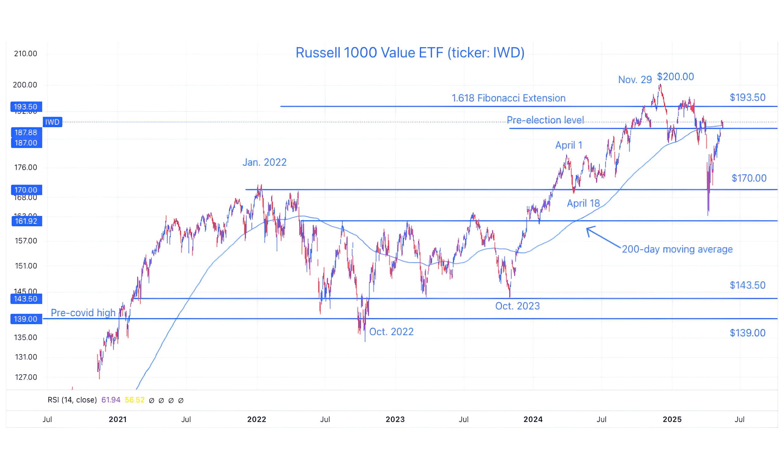
Source: TradingView. Through year-to-date 2025.
The chart above shows the Russell 1000 Value ETF (ticker: IWD) along with its 200-day moving average (curved light blue line).
I always like to find indexes that are at interesting levels, as their reactions at those levels can often provide a barometer for the broader market.
The Russell 1000 Value ETF, unlike the S&P 500 and Nasdaq 100, has not yet made it back above its 200-day moving average and is currently trading right at it.
We believe that the resolution of Value shares from this battle line will be an indication of near-term market direction.
(Past performance is not indicative of future results. This is not a recommendation to buy or sell any security and is not investment advice. Please do your own research and due diligence).
4. 10 Year Treasury Yields: Still the Big Risk…
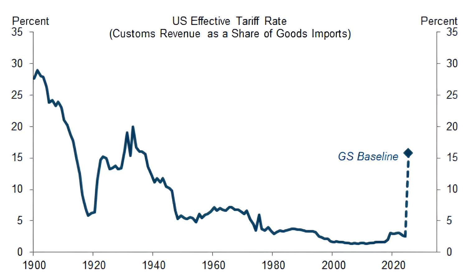
Source: Goldman Sachs. Through year-to-date 2025.
The chart above shows the US Effective Tariff Rate from 1900 including Goldman Sachs estimate based on the most recent trade deals, pauses etc.
Not great Still complicated.
While tariffs are expected to be offset by tax cuts, this will be a big change and may not be as smooth as the market is currently considering.
When thinking about this chart with chart 5 below - I have to wonder if the “noise” around all of these changes will begin to present itself in August?
(Past performance is not indicative of further results. This is not a recommendation to buy or sell any security and is not investment advice. Please do your own due diligence).
5. Seasonality Remains Bullish…
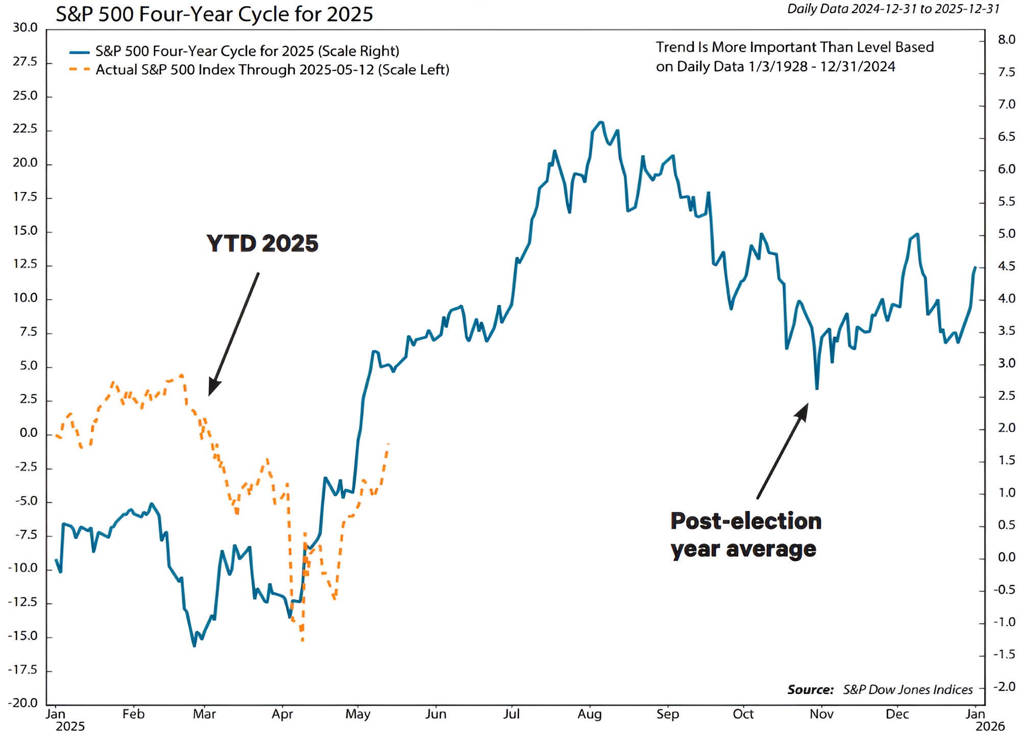
Source: Ned Davis Research and S&P Dow Jones Indices. Through year-to-date 2025.
The chart above shows the average US post-election year average S&P 500 path (blue line) and the year-to-date S&P 500 performance indexed to 100 (orange line).
While I wouldn’t necessarily invest on seasonality, it is a surprisingly useful guide.
In the chart above, we can see that on average in mid-February of the US post-election year, the S&P 500 has dropped.
While this years fall was greater in magnitude and lasted longer than average, it is likely not outside of the sample set.
Similarly, after its mid-February fall, the S&P 500 has on average begun to move higher beginning in early April. This was also consistent with what we’ve seen this year.
Historically, the post-election year April rally has lasted through mid-August at which point the S&P 500 has had a drop through October.
The August to October sell-off sets the index up for a year-end rally.
Again, we wouldn’t let this drive our investment views, but it is always interesting to note.
Have a great weekend!
(Past performance is not indicative of future results. This is not a recommendation to buy or sell any security and is not investment advice. Please do your own research and due diligence).