


Hit Me With Your Best Shot!
US equities have been resilient in the face of DeepSeek, tariffs, lower 2025 earnings expectations and, now, higher inflation. Is the storm coming or should we respect the strength? Let's dig in...

On Tuesday, we highlighted that higher inflation and, what we called the “resulting expectation (and reality) of tighter monetary policy,” historically, had been able to derail some of the strongest markets (chart 1 here).
Yesterday, the US released its Consumer Price Index (CPI) inflation data for January and it both moved higher and exceeded consensus expectations
(3.0% year-over-year vs. 2.9% in December and 2.9% expected. Core CPI (ex-food and energy) was 3.3% year-over-year vs. 3.2% in December and 3.1% expected).
However, the detail in today’s Producer Price Index (PPI) which feeds into the Fed’s favored inflation measure, the Personal Consumption Index (PCE), suggested that the PCE will be lower than the CPI and indicated that inflation is under control and moving lower.
While I don’t pretend to be an economist, there are four things that I am keeping on my radar as data comes in:
As we highlighted in mid-September (chart 4 here), Don Rissmiller, the Chief Economist as Strategas, has studied inflation “spikes” and concluded: “Once an economy sees a wave of inflation over 6%, historically, across different economies, the occurrence of a second wave over 6% has been about 85%.”
Despite the fact that this morning’s data calmed the market’s worst inflation fears, the technical “damage” to 10-Year US Treasury yields (see chart 3) may be done. We’ll watch.
Many are now expecting the Fed to hold rates steady this year. While I have written about the risk of the Fed pivoting to a tightening bias, I thought this comment from Dan Niles, a US hedge fund manager, qualified my concerns: “Starting 2025, I previewed a near 50% chance of the Fed holding/raising rates before year-end leading to a 20% drop in the stock market. For me, today’s CPI moves the odds near 2/3rds.”
We have expressed our view many times that the US is in a Fiscal Dominance regime (see chart 4 here; here; in chart 5 here; in the introduction here; chart 2 here; and chart 2 here). Very simply, Fiscal Dominance is defined as an economic condition that occurs when a country’s debt and deficit levels are sufficiently high that monetary policy can no longer effectively control inflation. Loss of faith in the Fed last occured in the 1970s and required Volcker’s extreme measures and significant fiscal restraint for the US to tame inflation.
As we watch the interplay of these characteristics, we continue to note that when combined with the changing people and priorities in the US Presidential Administration, the 2025 market (across asset classes) has a different level of complexity than the 2024 market.
Concurrently, in our view, in many instances, less risk has been priced in as equity valuations have expanded while bond spreads have narrowed.
That said, while we have reduced our exposure to equities by 10-15% across portfolios, we remain impressed with and cannot ignore the resilience of US equities in the face of myriad challenges.
As we’ve written in the past, when an asset or price doesn’t do what you might expect given the news or circumstance, it often pays to listen.
Despite our caution, we remain open-minded and are watching the charts to confirm direction.
Hit Me With Your Best Shot! Fire away.

1. The Nasdaq 100: Resilient
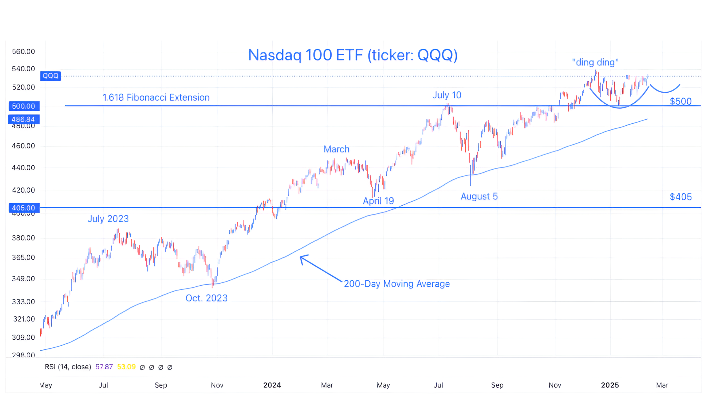
Source: TradingView. Through year-to-date 2025.
The chart above shows the Nasdaq 100 ETF (ticker: QQQ) with its 200-day moving average (curved light blue line).
Looking at this chart, it would be hard to imagine that DeepSeek presented a challenge to the core thesis (AI arms race, premium Semiconductors and Data Centers) - that has led the Nasdaq 100 higher over the past 18 months.
But, here we are.
We have drawn in the possibility of a bullish “cup and handle” formation on the far right side of the chart.
While we don’t know whether this will develop, it was simply an acknowledgement of the near complete recovery from the mid-December high (“ding ding”) to the mid-January (DeepSeek) low.
In our view resilient.
We often draw in chart patterns in order to have a plan, an explanation and characteristics to either confirm or reject.
We will see whether the “cup and handle” develops - if it does, it would be bullish. For now, we know one thing to watch for.
(This is not a recommendation to buy or sell any security and is not investment advice. Past performance is not indicative of future results. Please do your own research and due diligence).
2. A Long Road above the 200-Day Moving Average
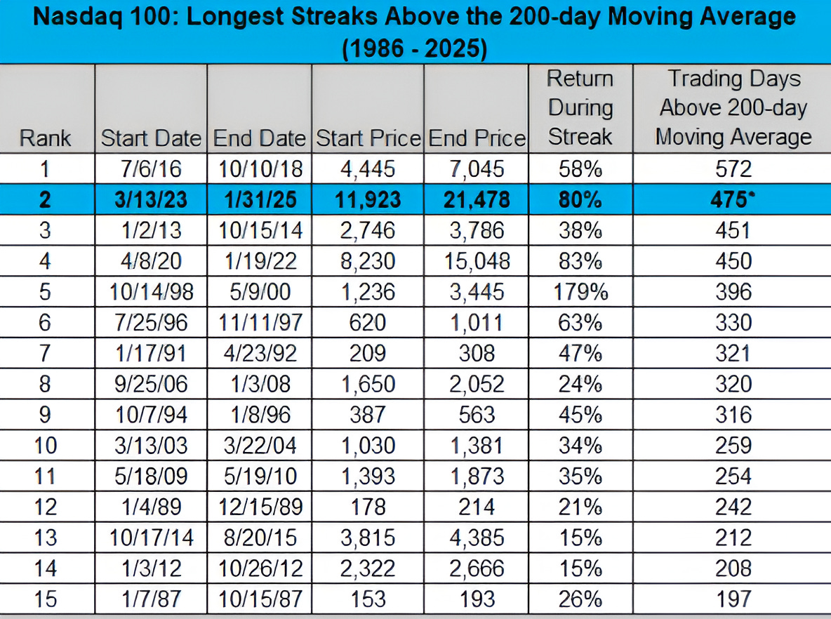
Source: Charlie Bilello, Creative Planning. Through January 31, 2025.
The chart above shows the 15 longest periods of consecutive trading days that the Nasdaq 100 has closed above its 200-day moving average since 1986.
Looking at chart 1, we can see that in October 2023 and August 2024, the Nasdaq 100 met its 200-day moving average on an intra-day basis, but by the time the market had closed, the index had moved back above.
Notably, the current streak is the second longest streak and has the second highest return.
None of these conditions are a catalyst.
The Nasdaq 100 has about another 80 days (four months) and 100% higher before it reaches the prior records in terms of duration and magnitude.
On the other hand, a near-term meeting with the 200-day moving average would occur about 8.5% below current levels.
(Past performance is not indicative of further results. This is not a recommendation to buy or sell any security and is not investment advice. Please do your own due diligence).
3. 10-Year Treasury Yields, Again

Source: TradingView. Through year-to-date 2025.
The chart above shows a short-term view of the 10-Year US Treasury Yield.
When we last showed this chart 1.5 weeks ago (here), we wrote:
“We drew in the possible bearish “head and shoulders” (the 3 arcs) on the chart…
However, we see the possibility of a move higher…
“non-confirmed / failed “head and shoulders” patterns often reverse dramatically.”
With yesterday’s inflation data (CPI), the potentially bearish “head and shoulders” that had fallen below its neckline seemed to have reversed dramatically.
However, with today’s more benign inflation data (PPI), 10-Year yields have once again dropped but have remained above the 4.5% level.
The pattern has clearly been broken and technical “damage” seems to have been done.
As we wrote the last time we showed the chart:
“If 10-Year US Treasury yields fall convincingly below 4.5%, in our view, this would be bullish for equities and confirm a move higher.
If 10-Year US Treasury yields bounce higher from current levels, this would be a headwind for equities.”
So far, US Treasury yields have bounced higher, but we want to see further confirmation.
It should also be noted that higher 10-Year Treasury yields is one of the challenges (at least in our view) that equity markets have seemed to ignore.
(Past performance is not indicative of future results. This is not a recommendation to buy or sell any security and is not investment advice. Please do your own due diligence).
4. European Banks…Tell Me Something I Didn’t Know

Source: TradingView. Through year-to-date 2025.
The chart above shows the European Financials ETF (ticker: EUFN).
We last showed this chart in mid-May (here) and, at the time, we wrote about the post-financial crisis differences between US and European financial institutions.
We recognized that while European banks had to wait out their bad debt and organically cleanse their balance sheets, US banks had been recapitalized through TARP. This allowed US banks to start lending again while the European banks (and economy) were slower to recover.
In addition, the period of negative interest rates in Europe meant that the banks would not earn anything (in fact had to pay) on deposits.
We can see (and we wrote about) the positive impact that higher Fed Funds rates had on US bank earnings through net interest income (chart 4 here).
European banks are finally healing 16 years after the crisis.
In mid-May, we noted that the European Financials ETF was still 10% below its May 2014 high, and wrote, “we wouldn’t be surprised if those highs are the next battle.”
Today, the European Financials ETF is at its May 2014 high (not shown) and we wouldn’t be surprised to see a pause as the ETF battles this level.
(Past performance is not indicative of future results. This is not a recommendation to buy or sell any security and is not investment advice. Please do your own research and due diligence).
5. 2nd Half of February Seasonality…
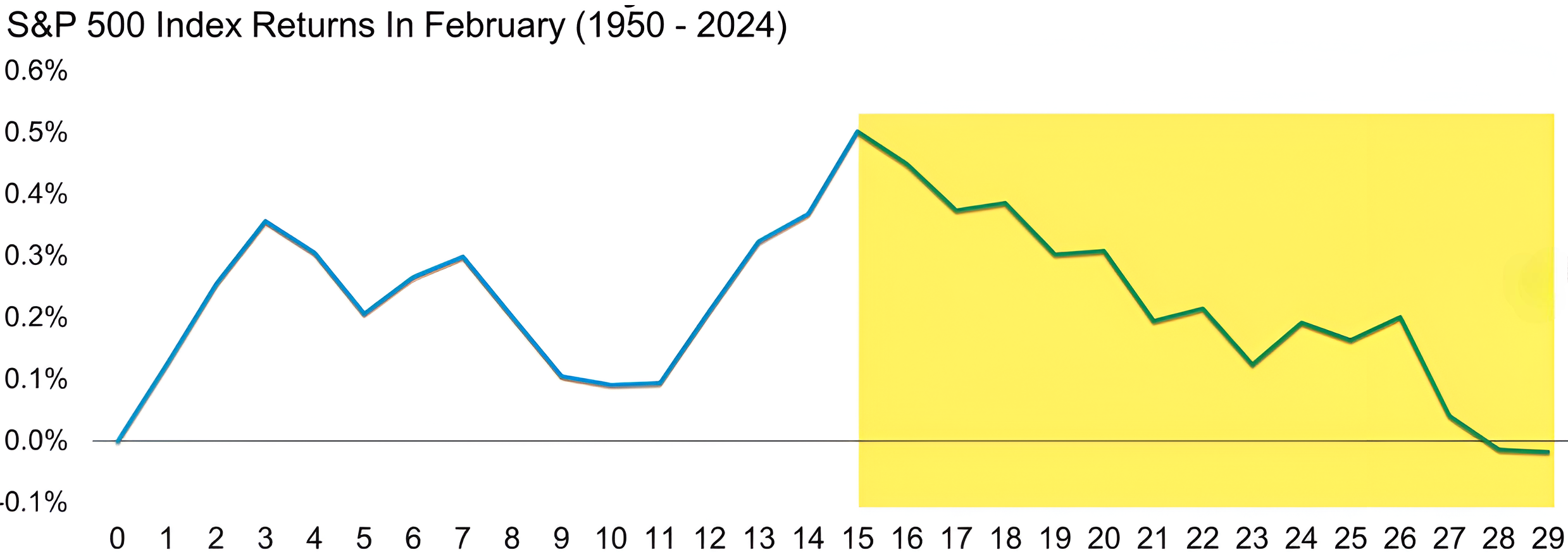
Source: Carson Investment Research / Ryan Detrick. Through year-to-date 2025.
The chart above shows the average S&P 500 price movement during February from 1950-2024.
While the first half of February has, on average, resulted in gains, the second half of February, has historically, erased those gains.
Obviously, this isn’t predictive, but we always like to keep seasonality on the radar.
(Past performance is not indicative of future results. This is not a recommendation to buy or sell any security and is not investment advice. Please do your own research and due diligence).