


A Little Bit Louder Now, Shout!
If we've had one theme this week, it's been that there's been a correction taking place under the surface. The weakness has become more apparent - is the correction nearing its end? Let's dig in...
1. The Dow Industrials Have Been Correcting
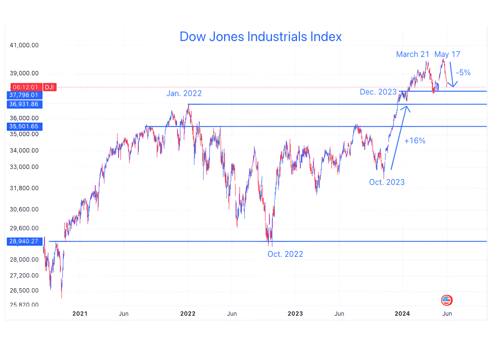
Source: TradingView. Through year-to-date 2024.
Over the past two days (here and here), we have highlighted:
the Equal Weight S&P 500,
Small Caps
Software
Consumer Discretionary
Industrials
We have showed that a correction has been taking place in each - for the most part over the past 2 months.
Today, we are showing the Dow Industrials Index.
This the “Dow” that is often published in newspapers and online alongside the S&P 500 and the Nasdaq 100.
While the Dow made a slightly higher high than its late March peak (unlike the Equal Weight S&P 500 and the Russell 2000), over the past 2-weeks, it has shed 5%.
In comparison, over the same period, the S&P 500, until today has essentially been moving sideways and the Nasdaq 100 has been up.
We view this as further evidence that a correction has been taking place “under the surface,” and it has been hidden by the performance of Nvidia and a few select mega cap shares.
Given the fact that so many shares have now been correcting for 2 months (again - we see this in the Equal Weight S&P 500 and the Russell 2000), we want to consider whether the weakness in the S&P 500 and the Nasdaq 100 yesterday and today marks the final stage of the correction rather than the beginning.
To determine this, we will begin to look for “strength under the surface.”
The first place we would look is back to the Equal Weight S&P 500 and the Russell 2000.
As of this writing, despite the Dow Industrials, S&P 500 and Nasdaq 100 being down for the day, the Russell 2000 is up.
Could the possible reverse “Head and Shoulders” pattern that I highlighted yesterday be developing? Nimble traders may be able to create low-risk options strategies around this. (Not advice).
We are also looking at the Dow Industrials Index above to see how it reacts as it moves back towards its December 2023 high.
While the current volatility may have further to go, our bias is that equities will resolve higher.
(This is not a recommendation to buy or sell any security and is not investment advice. Please do your own research and due diligence).
2. The Definition of a Challenging Market

Source: Strategas. Through year-to-date 2024.
The chart above shows the percent of Russell 1000 stocks grouped by year-to-date return.
The Russell 1000 includes the S&P 500 and the next 500 largest companies.
The Russell 1000 is up 10.4% year to date; however, 44% of the shares in the Index have negative returns.
For any diversified single-stock investor, this type of return profile means that the equity market has been a mine field this year.
(This is not a recommendation to buy or sell any security and is not investment advice. Please do your own due diligence).
3. Financials
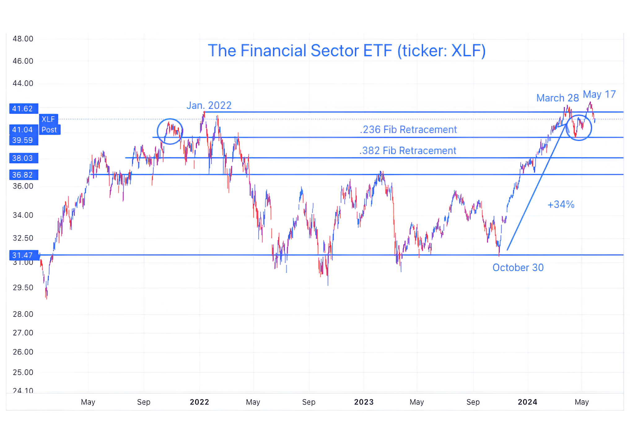
Source: TradingView. Through year-to-date 2024.
To assess the tone of the overall market, we always like to look at the Equal Weight S&P 500, the Small Caps, the Transportation Index and the Financials.
As we’ve shown the the Equal Weight S&P 500 (here), the Small Caps (here), and the Transportation Index (chart 4 here), we are going finish our assessment with a review of the Financial sector.
There are several characteristics of the chart of the Financials sector that I want to highlight:
Unlike the other 3 indices, the Financial sector surpassed its March 28 high. It resembles the Dow Industrials Index in chart 1 in this respect.
Unlike the Dow Industrials Index, the Financial Sector has dropped back below its January 2022 high.
The Financial Sector is now back near an area where we have seen significant congestion (the blue circles) in the past.
These are areas, where for some reason there seems to be indecision among investors and buying / selling / moving sideways has seemed to occur here.
As the Financial Sector is near the top of the congestion area, if it can withstand the possibility of being dragged down, it may try to move back to the 2022 high (top horizontal light blue line). If so, we want to see how it reacts when it gets there.
There is also the possibility that, once again, the Financial sector revisits the 0.236 retracement level of its October - March ascent (2nd highest horizontal light blue line).
Whereas, the sell-off in the Equal Weight S&P 500, the Small Caps, the Transportation Index each seem so dramatic that we would expect at least a bounce, the sell-off in the Financial sector is less conclusive.
When we look at these four charts in aggregate, we see a market that has been weak and challenged for two months.
Could a broader correction go further - yes.
However, the Equal Weight S&P 500, the Small Caps, the Transportation Index and, even the Dow Industrials, in our view, appear “oversold” and we wouldn’t be surprised to see a near-term bounce (at least in these indexes) even if that bounce resolves in a further correction to the downside.
If the correction continues, we believe the catalyst will be Treasury yields (we showed the 2-Year Treasury yesterday and the 10-Year is below).
(This is not a recommendation to buy or sell any security and is not investment advice. Please do your own due diligence).
4. Another Look at the 10-Year Treasury Yield
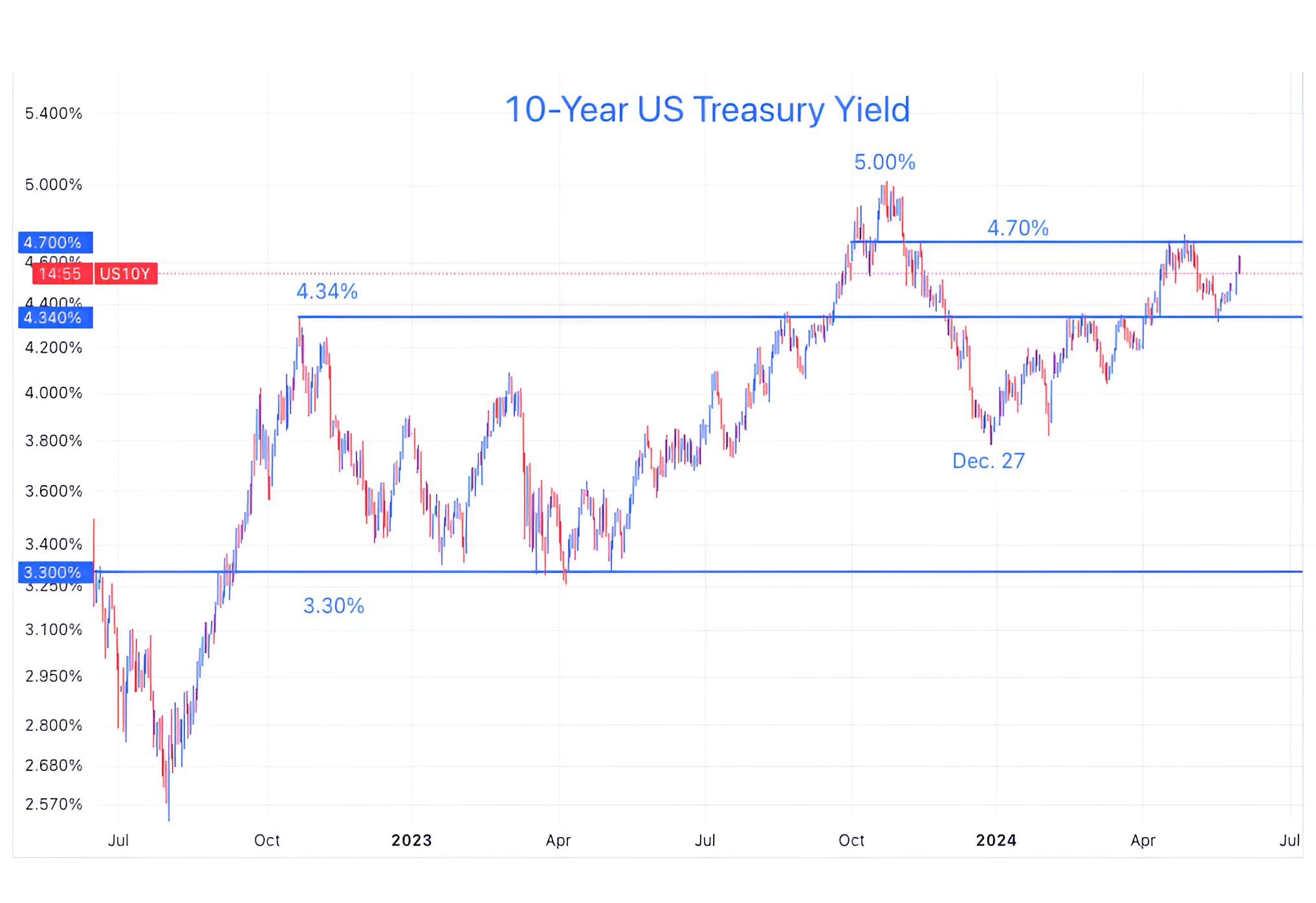
Source: US Federal Reserve Board. Through year-to-date 2024.
Last week, we provided a long-term view of 10-Year US Treasury Yields (chart 4 here).
We have continually highlighted our view that the bull market in Treasuries (yields down) from 1981 to the covid lows in 2020 is over and that 10-Year US Treasury yields will move continue to move higher. (here, here and here).
One of the key tenets to our belief is that the US has borrowed too much (“fiscal dominance” is a theme of ours - see here, chart 2 here and chart 2 here) and at some point, bond investors will require higher yields to continue investing in Treasuries (“bond vigilantes”).
Looking at the near-term chart of 10-Year US Treasury yields above, they have bounced from 4.34% - the October 2023 peak and seem to be heading back to 4.70%.
If 10-Year US Treasury yields once again move through 4.70%, we believe it is likely a new cycle high will be achieved and that 5.20-5.25% - the pre-financial crisis peak will be a likely destination.
There is no other non-equity series that we have shown more often than the 10-Year US Treasury yield.
Why?
The 10-Year Treasury Yield is the “risk free rate.”
In finance, this is the baseline of return requirements for all other assets and asset classes.
“If I can receive 4.5% risk free for 10 years, what additional return do I require from a different investment, given the risk of the different investment.”
As a result, the 10-Year Yield (at least in theory) is the basis for valuation across asset classes and investment opportunities.
In general, higher 10-Year US Treasury yields should constrain US equity valuations.
In other words, if our scenario plays out where investors are demanding higher yields, there could be a greater correction in equities than we are currently expecting.
(This is not a recommendation to buy or sell any security, please do your own research).
5. Kicked Out of the Dow…
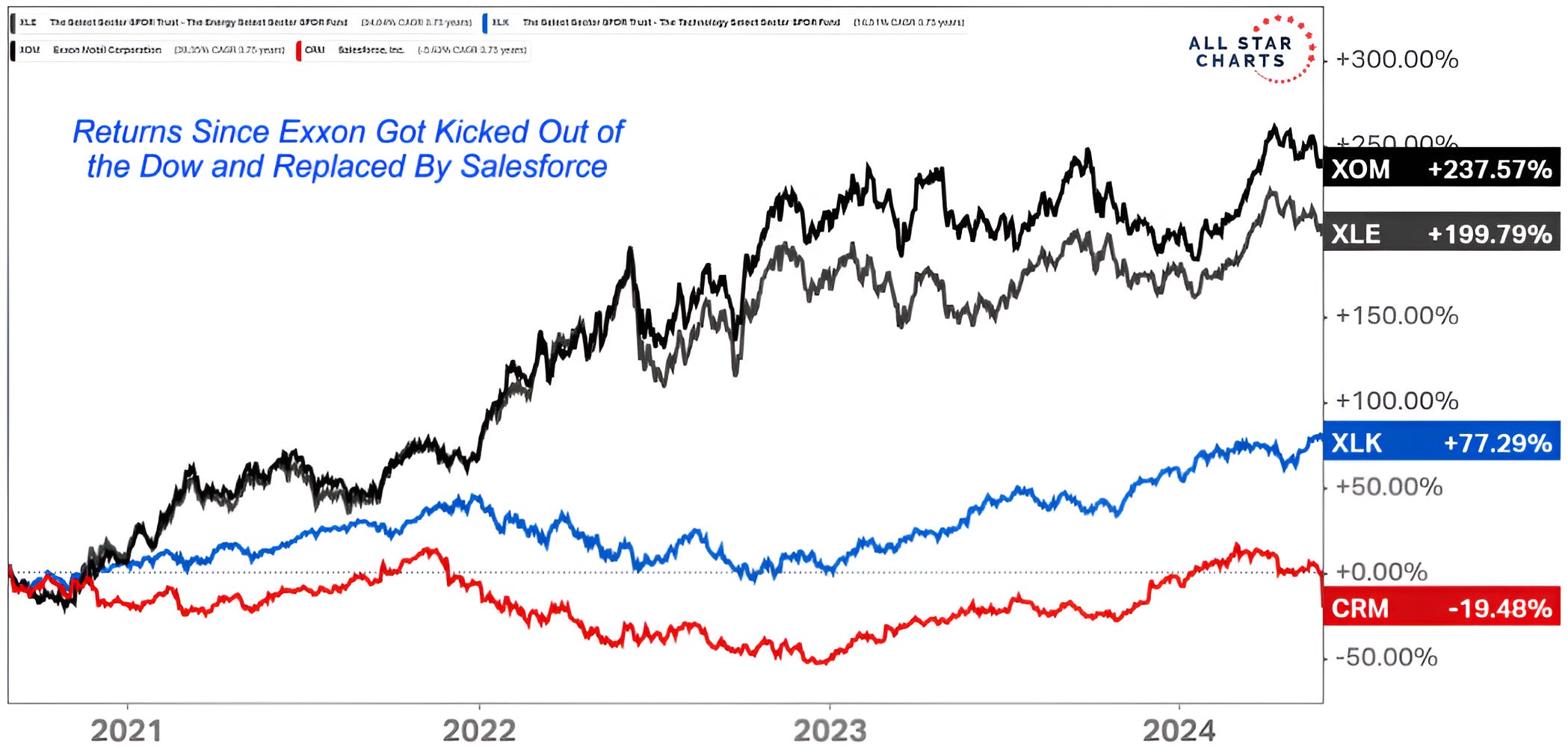
Source: All Star Charts. Through year-to-date 2024.
The chart above shows the performance of Exxon (ticker: XOM); the Energy Sector ETF (ticker: XLE); the Technology Sector ETF (ticker: XLK) and Salesforce (ticker: CRM) since 2020 when Salesforce replaced Exxon in the Dow Industrials Index.
Over that period, Exxon shares are up 238% while Salesforce shares are down 19%.
We showed a similar chart that showed how GE has dramatically outperformed Walgreens since Walgreens replaced GE in the Dow Industrials here.
We will watch for the next replacement in the Dow Industrials Index and act accordingly. ;-)
(This is not a investment advice and is not recommendation to buy or sell any security).