


Upside Down! (Girl You Turn Me...)
While not wanting to be a contrarian (particularly because this note is about identifying and following trends), there is conventional wisdom with which we don't agree. Let's dig in...

Given the holiday in the US, rather than focus directly on markets, I’m going to do something a little different today.
I always aim to be informative, educational and thought provoking.
With that in mind, I wanted to share some of my non-consensus views on:
Asset Allocation / Diversification;
The Inefficient Frontier;
US Fixed Income;
Venture Capital; and
Managing “Passive” Investments.
Parts of today’s note were inspired by conversations I’ve had with John Seitz.
John was a business school classmate of mine. He is an all around great guy and the founder and CEO of FoundationMark, the definitive source for understanding the investment framework and performance of US Foundations.
As an aside, John and I were talking and agreed that it didn’t require an MBA to recognize the signs of excess in the current market environment:
Top decile PEs in equities;
Super-tight spreads in credit;
Bitcoin at $100k;
Gold rallying; and
Bananas with duct tape selling for $6 million here.
Nevertheless, the Fed is cutting rates.
If history is a guide (and compliance will not let me say that it is), the excesses will be resolved with market and potentially economic volatility. That said, excesses are not a catalyst and timing the volatility is a challenge.
As one person I recently spoke to characterized it, markets are a bubble in search of a pin.
Nonetheless, many families with whom I speak are increasing liquid investments (equities and fixed income) at the expense of illiquids. In our view, this may be the opposite of what they should be doing.
Given the ebullient market environment, loading up on liquid US equities and fixed income seems inconsistent with the outlook for the next 1, 3, 5 and 10 years.
In my view, many investors are allocating using the rear-view mirror rather than the windshield.
Portfolios and allocations, in some cases, are upside down.

1. Asset Allocation…

Source: FoundationMark; David Swensen / Yale University. Through year-to-date 2024.
Many have heard about the “Yale Model”.
This is the asset allocation framework attributed to the former CIO of the Yale endowment, David Swensen, who was an early advocate of illiquid, alternative investments within diversified portfolios.
The chart above developed by FoundationMark reflects the risk (expected volatility); return; and target weightings (size of the bubbles) of the Yale model.
While Yale manages a very long-term oriented endowment which has a different profile than most families, the framework and conclusions are informative for any investor:
Yale likely uses fixed income (small bubble = small allocation) simply to fund commitments to other asset classes. In our view, there is little value in developed market sovereign or corporate fixed income for long-term investors other than as a cash alternative (see chart 3).
Venture capital has by far the highest returns and the returns historically seem to have compensated for the risk. (See chart 4).
Illiquid investments are a much greater allocation (size of bubbles) than liquid investments (fixed income; domestic, developed and emerging equities).
I have spoken to several families and family offices recently that only want liquid investments.
While I understand the scar tissue of illiquid investments made from 2019 through 2021 (they haven’t returned capital as expected and performance has, in general, been disappointing)…
…emphasizing liquid investments now in long-term portfolios is likely wrong.
Why?
As we showed in chart 4 here from Bank of America and chart 3 here from Apollo, prospective medium to long-term (3-10 year) public equity returns are inversely correlated with valuation levels (current valuation in chart 4 here).
Based on a starting valuation to long-term return framework, Goldman Sachs has concluded that the average annual return on the S&P 500 over the next 10-years will be 3% (despite their recent prognostication for a 10%, 1-year return - chart 3 here).
Simply stated, high PEs historically have been consistent with low returns.
This doesn’t mean the S&P 500 is set to collapse, however…
in our view, this is not the time to emphasize liquid equities in long-term portfolios.
Fixed income is also challenging (see chart 3).
On one hand, there is the question of if low sovereign yields in Europe (essentially driven down by poor economic growth) will anchor US Treasuries;
on the other hand, what we have argued is that the $36 trillion in US debt outstanding (here) and the need to refinance $20 trillion of US debt (chart 4 here) will put upward pressure on Treasury yields (long-term 10-Year US Treasury yield chart here).
We have consistently highlighted the idea of Fiscal Dominance (see here; here; in chart 5 here; in the introduction here; chart 2 here; and chart 2 here) and bond vigilantes (those investors requiring higher yields given fiscal deficits and debt outstanding.
Refinancing the US Treasuries (chart 4 here) is the biggest risk to markets (in general) that we see, and it is a risk that few seem to understand or appreciate.
While the chart above shows long-term strategic risk and return assumptions, in our view, given where we are in the cycle, we think that within liquid equities and fixed income the current prospective risk is higher and returns lower.
Where we see value is in illiquid assets where many of the families and family offices with whom we speak are seeking to reduce exposure.
Specifically, we see the best 3, 5, 7, 10 year opportunity in Venture Capital.
That feeling of indifference and or disgust you had when you read that last sentence is how I know I’m right.
Our thesis for Venture is articulated in chart 4 below.
Based on our long-term liquid market outlook and the chart above, in our view, no is not the time to overweight liquidity. Rather those seeking long-term returns need to consider Venture Capital and perhaps distressed debt.
(This is not a recommendation to buy or sell any security and is not investment advice. Past performance is not indicative of future results. Please do your own research and due diligence).
2. The Inefficient Frontier

Source: FoundationMark; David Swensen / Yale University. Through year-to-date 2024.
Using the risk / return data from chart 1 above, the team at FoundationMark has created the efficient frontier chart above.
All of the circles on the chart above correspond to the asset classes in chart 1.
The concept of the efficient frontier is that a combination of assets can deliver greater returns with lower risk than any single asset.
This “diversification benefit” is the backbone of modern portfolio theory.
However, the underlying assumptions that feed into the model and that help generate the “diversification benefit” are impossible extremely difficult to predict:
Return: we write about near-term return expectations consistently, they are challenging to predict (although we try). A year ago, few if any strategists (the best and brightest on Wall Street) expected the S&P 500 to be at (or at least near) 6000 today.
Standard Deviation / Risk: In order to project standard deviation for each asset class, we look at historical data. However, what we’ve seen is that standard deviation, like returns, is rarely average.
Correlation: Correlation is the hidden ingredient in any asset allocation model. Why is it hidden - it’s not on the chart above, nobody can predict it but it is the engine behind the concept of diversification benefits. Unfortunately, often when markets equity markets are drawing down and we need diversification benefits the most, correlation seems to go to 1 (everything is correlated).
All of that said, efficient frontiers, over time, can be roughly right despite being precisely wrong.
I am a believer in asset class diversification and think that a portfolio that includes cash, short fixed income (up to five years), liquid equities and illiquids can reduce risk and enhance return over time.
There are three critical portfolio elements that are in some ways inter-related, receive little attention but may provide the keys to outperformance:
Time diversification: each asset class has a different time horizon. If we can establish a laddered portfolio across asset classes - as they mature and deliver returns over varying periods - this can create value and a diversification benefit.
The optionality of liquidity: Liquid asset classes (and the return of capital at different times) can create options. Where should we add or reduce based on today’s scenario? Maybe it’s the same asset class with a different manager or approach, maybe we add to an existing strategy, but that optionality - based on new information (from the time of initial investment) can be critical.
Tactical allocation: The best investors sell when others are greedy and buy when others are fearful (easier written than done). We typically write with these tactical allocations in mind, however, we are always cognizant of the broader macro picture. Adding 1%-2% per year through tactical allocations can lead to significant outperformance over static strategic allocations.
Finally, while there are benefits to asset class diversification, the benefits of diversification within asset classes are less clear.
As an example, when a strategist proposes a diversified portfolio, they often always present a geographical mix of equity exposures:
“You need a little Europe, US, Japanese and EM equities to have a diversified portfolio.” As a return enhancer and risk reducer, this has been wrong for the last 15 years (see chart 5).
Asset allocation, the efficient frontier and investing are not static exercises.
Market conditions, economic outlooks, time horizons and realistic objectives need to be consistently reviewed, considered and updated in any portfolio.
(Past performance is not indicative of further results. This is not a recommendation to buy or sell any security and is not investment advice. Please do your own due diligence).
3. There’s Likely Little Value in US Credit

Source: Bloomberg. Through year to date 2024.
The chart above shows US high yield credit spreads.
It does not require a technical analyst to see that US high yield credit spreads are the tightest they’ve been in the last 15 years.
Similar to high valuations in equities, tight high yield credit spreads are not a catalyst.
However, they are likely an indication that little risk is priced into the market and that there is little value relative to risk in high yield.
In general, the time to invest in high yield is when spreads are wide rather than tight.
Combined with our concern that the path of least resistance for US Treasury Yields is higher (see here; chart 4 here; and here), we would argue that this is likely not a great time to invest in US sovereign, investment grade or high yield credit.
One area where we have specific concern is in private credit.
Most families we speak to our over-allocated to this relatively new asset class.
In our view, we have not been through a signficant default cycle yet for private credit and when a credit event occurs (they always occur), we will see who the real risk managers and detailed underwriters are vs. those that have been more aggressive.
At this point in the cycle, within fixed income, we would be seeking distressed managers.
(Past performance is not indicative of future results. This is not a recommendation to buy or sell any security and is not investment advice. Please do your own due diligence).
4. The Case for Venture Capital
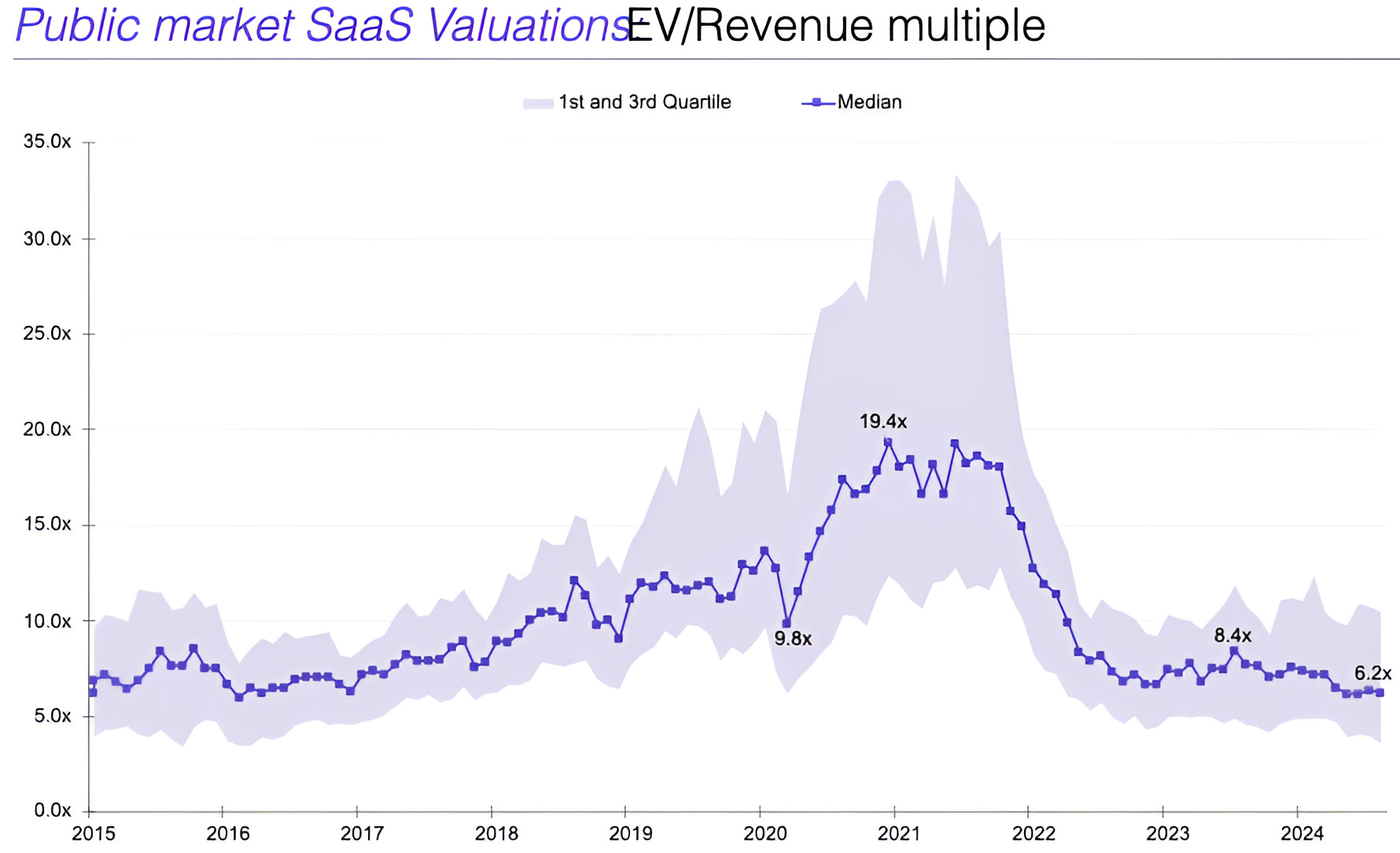
Source: Capital IQ, Aventis Advisors. Through year-to-date 2024.
The chart above shows the median Enterprise Value (EV) to Revenue multiple of publicly-traded Software as a Service (SaaS) companies.
While it’s not a perfect analog for Venture valuations, it is an indicative proxy.
Unlike US public market valuation multiples which moved back to peak levels over the past three years, Venture valuations have compressed.
In fact, we could make the argument, that relative to public markets, venture valuations have rarely been cheaper.
Despite this, the business dynamics in venture, in our view, have rarely been better.
We highlighted the argument here that AI is an interface layer in search of applications.
Previous interface layer “revolutions” include the move to the graphic interface of a Macintosh (and then Windows) from ms-dos and the mobile graphics and touchscreens of iPhones.
Both led to a broad range applications, accessibility, innovation and efficiency was unleashed.
Both were drivers of significant value creation for venture capitalists and their investors that had foresight.
There are currently at least four distinct nascent interface layers (including AI) that could lead to revolutions similar to those of the original Macintosh and the iPhone:
In our view, each of these verticals will spur innovation, apps and efficiency.
Venture capital companies are investing across this universe in a broad range of applications and, in my view, will participate in the next wave(s) of significant value creation.
Furthermore, the managers of venture backed companies and the VCs themselves are no longer college graduates with an idea and a dream.
We are seeing great business plans led by experienced founders being backed by VCs with enviable track records at appealing valuations.
Finally, Venture is out of favor (which is when we like to invest).
If you have the liquidity and the time horizon and you’re not actively allocating to venture, in our view, you’re doing something wrong.
(Past performance is not indicative of future results. This is not a recommendation to buy or sell any security and is not investment advice. Please do your own due diligence).
5. Passive Investments Need to Be Actively Managed

Source: Trading View. Through year-to-date 2024.
The chart above shows the Emerging Markets ETF (ticker: EEM) relative to the S&P 500 ETF (ticker: SPY).
When the chart is moving higher, Emerging Markets are outperforming and when it’s moving lower, the S&P 500 is outperforming. Markets trend.
It’s what they do.
It’s sort of the point of Charting Alpha.
Using relative charts like these helps us identify the trends in outperformance and allocate accordingly.
EM and most non-US regions have been performance detractors for regionally diversified equity investors for the last 15 years.
To “un-relative” this chart and provide the data behind the picture, since October 2010, the S&P 500 has gained 413% while the Emerging Markets ETF is up 0.5% (total).
How has an allocation to EM equities helped anyone’s risk or return? Has it made us “academically” feel good to know we’re on the efficient frontier?
In our view, at some point US equities will underperform, we will aim to identify when this happens by using a relative chart like the one above.
Three concluding points:
I hear from several CIOs and families - I just want to invest in ETFs. In my view, ETFs, like individual shares, need to be actively managed;
Regional diversification within equities has not added any value or reduced any risk over the past 15 years;
At some point, US outperformance will end. Portfolios will need to be managed and allocations need to be adjusted.
(Past performance is not indicative of future results. This is not a recommendation to buy or sell any security, please do your own research).
"That feeling of indifference and or disgust you had when you read that last sentence is how I know I’m right." This was great!