


My Girl Wants to Party all the Time...
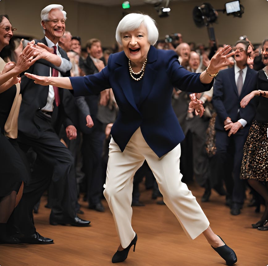
Treasury Secretary Yellen has used unconventional methods to apply liquidity to the US economy. She's leaving Washington with an empty punch bowl.* Will we suffer a hangover? Let's dig in...

As we spent the US holiday eating, giving thanks and reflecting on markets, we continue to consider the backdrop as we enter 2025:
the S&P 500 trades at 22x 2025 expected earnings;
credit spreads are historically tight;
gold is up 28% this year; and
Bitcoin nearly hit $100,000
In other words, most US dollar based risk assets have rallied beyond expectations and seem expensive.
The conundrum (mystery) here is that all of this has occurred during a nearly two-year Fed tightening cycle. (see chart 4)
As Stanley Druckemiller has says, “It’s liquidity that moves markets.”
In our view, the Fed’s tightness has been (more than) offset by Treasury “stealth” liquidity measures:
Using short-term “bills” to finance the deficit (see chart 3 here, chart 1 here, chart 2 here, and chart 2 here);
Periodically draining the Treasury General Account (“TGA”) (see chart 2 here; chart 1 here; and chart 2 here); and
Drawing down the Reverse Repo Account to buy Treasuries (see chart here and chart 4 here).
“Stealth liquidity” has been a consistent theme of ours starting here and more recently here, here, here, here, here, chart 4 here and here.
Why am I bringing this up again?
In January, there will be a transition from Treasury Secretary Yellen to Scott Bessent.
While it seems that Scott Bessent is up to the task of 1) refinancing and lengthening the maturity schedule of the US debt outstanding; 2) navigating the debt ceiling (oops, we’ve hit it again); and 3) balancing tariffs and tax cuts while making sure Treasury yields remain low and economic volatility is minimal, there are some risks.
*In our view, a more accurate description of Secretary Yellen may be that she is like a juggler or plate spinner rather than a punch bowl “spiker” (one that adds alcohol to the party). She is leaving Washington with several balls in air or plates spinning.
As Scott Bessent transitions in, there is a possibility that a ball will drop or a plate will crash.
With equity valuations rich by most measures, no 10% drawdown in the S&P 500 for over a year (according to Bespoke, since 1928, the S&P 500 has averaged a 10%+ correction once every 346 days. Half of all years since 2000 have NOT had a 10%+ correction. The July / August sell-off was 9.5%) and sentiment “bulled” up, we continue to see risks.
That said, our strategy has been to remain invested and to tactically add puts and put spreads.
With the Equal Weight S&P 500 (chart 1) at our target and the Russell 2000 back at its November 2021 high (chart 2), we are once again adding puts and put spreads to our portfolios where appropriate.
While there could simply be a pause in the market’s ascent, we are careful to balance the strength of the seasonal tailwind (don’t fight December) vs. sentiment which seem to have priced this in with everyone acknowledging December strength and sitting on the same side of the boat.
Despite the risks, my Girl Wants to Party All the Time, Party All the Time…
1. The Equal Weight S&P 500 Has Hit Our Target…
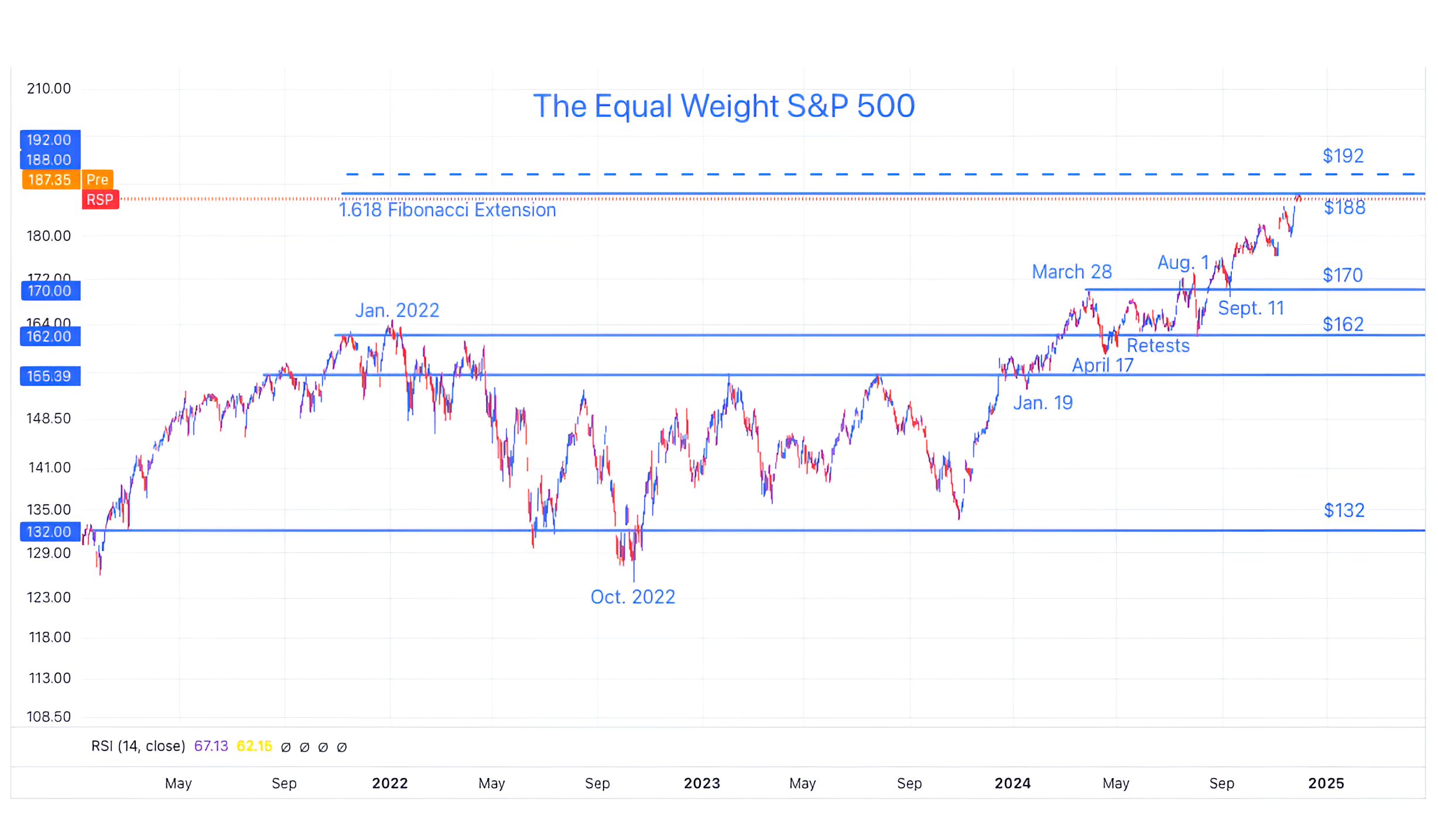
Source: Trading View. Through year-to-date 2024.
The chart above shows the Equal Weight S&P 500 (ticker: RSP).
We last showed this chart three weeks ago here.
At the time, we noted that after the 50 basis point rate cut in September, the Equal Weight S&P 500 ETF was able to break free from its 2022 to 2024 trading range and was approaching our target of $188 (the 1.618 Fibonacci extension of its 2022 sell-off).
The Equal Weight S&P 500 ETF is now at our target.
Given the 16% 4-month move higher (from August 6), we would not be surprised to see a pause and possibly a 2-3% move lower as some take profits.
Our slightly more distant target for the Equal Weight S&P 500 ETF is $192.
This is based on simple symmetry from the $162 January 2022 high to the $132 October 2022 low. ($162 + ($162-$132))
Looking at a longer range of price history, we noticed that $192 also coincided with the 2.618 Fibonacci extension of the 2020 covid sell-off (not shown).
As we are expecting a more dramatic sell-off in Q1 (10-20%) (we wrote about this in the introduction here) in the first half of 2025, we are watching the $192 level as a potentially important peak while we see the current level as an area of consolidation / small sell-off.
(This is not a recommendation to buy or sell any security and is not investment advice. Past performance is not indicative of future results. Please do your own research and due diligence).
2. Small Caps - Ready for a Pause?
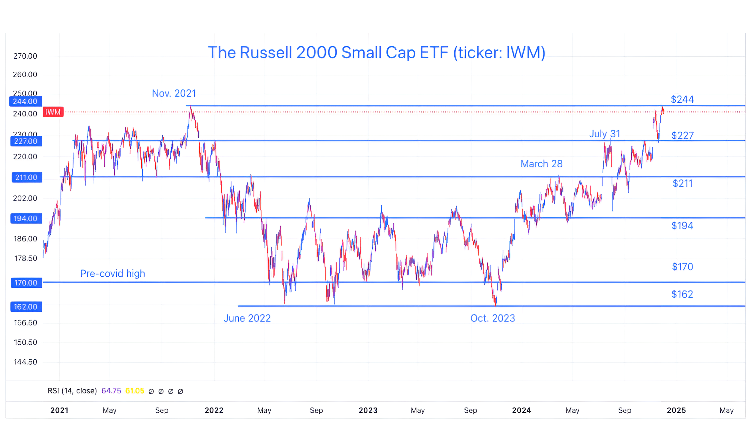
Source: Trading View. Through year-to-date 2024.
The chart above shows the Russell 2000 Small Cap ETF (ticker: IWM).
We last showed the Small Caps two weeks ago (here) after they had moved toward their November 2021 peak and were “re-testing” the $227 level (the post-election relief line).
At the time, we wrote:
“We believe that the ability of Small Caps to have a successful re-test (bounce) at the post-election relief line will be a critical barometer for equities in general in Q4.”
Since that time, Small Caps clearly bounced at the $227 level and are now back to the November 2021 high.
While we wouldn’t be surprised by a pause / consolidation (sideways movement, profit taking), we think that Small Caps (like the Equal Weight S&P 500 in chart 1) can achieve a new high before a more significant sell-off.
(Past performance is not indicative of further results. This is not a recommendation to buy or sell any security and is not investment advice. Please do your own due diligence).
3. Semiconductors Relative to the S&P 500 - Our Current Signal

Source: Bloomberg. Through year to date 2024.
The chart above shows the Semiconductor ETF (ticker: SMH) relative to the S&P 500.
We are often looking for one chart or indicator that we believe will act as a “tell” for the market overall.
While there is no one signal, in our view, a single chart can often act as an barometer or early warning that we should raise our antennae and look for further evidence (in either direction).
Right now, in our view, the Semiconductors relative to the S&P 500 is at an important level and may be the current barometer.
I don’t need to remind anybody that Semiconductors - led by Nvidia and SMCI - were the dramatic outperformers in the first half of the year.
The recent peaks in the relationship between Semiconductors and the S&P 500 in March and June occured two to three weeks before the two periods of volatility in US equities this year (April and July).
The most recent bout of Semiconductor underperformance began three weeks ago.
Could this once again be a warning signal of broader market weakness?
(Past performance is not indicative of future results. This is not a recommendation to buy or sell any security and is not investment advice. Please do your own due diligence).
4. When Waller Speaks, We Listen…

Source: US Commerce Department. Through year-to-date 2024.
The chart above shows the US Core (ex-food and energy) Personal Consumption Expenditures (“PCE”) Index.
This is the Fed’s preferred measure of inflation.
When the PCE report was released last week, it indicated that the October Core PCE increased 0.27% month over month. This was the largest month-over-month increase since March.
The 12-month rate (dark blue line on the chart) rose to 2.8% from 2.7% in September;
The 6-month annualized rate (light brown line) held at 2.3%; and
The 3-month rate (light blue line) was 2.8% vs 2.4% in September.
At best, inflation is holding steady slightly below 3%. At worst, the report could be interpreted to indicate that inflation is picking back up albeit slowly.
The Feds target is 2% (the yellow line on the chart).
Given this report, we found it curious when Fed Governor Waller in a speech yesterday at the Monetary Policy Forum in Washington, said that “at present I lean toward supporting a cut to the policy rate at our December meeting.”
Other than Powell, there is no more authoritative voice on the Fed than Waller.
He also said:
“After we cut by 75 basis points, I believe the evidence is strong that policy continues to be significantly restrictive and that cutting again will only mean that we aren’t pressing on the brake pedal quite as hard.”
In other words…
despite the fact that the S&P 500 is at a record high;
the index is trading at nearly its highest valuation since the dot-com bubble (chart 4 here);
credit spreads are historically tight (chart 3 here);
bitcoin is near $100,000 (chart 5 here);
a banana duct taped to a wall just sold for over $6 million; and
the Fed’s favored measure of inflation - the Core PCE - just ticked up and is above the Fed’s target…
the Fed thinks that monetary policy is restrictive.
Maybe the Fed wants to or needs to cut rates for a different reason…
Either:
the economy is weaker than it seems
GDP has been strong, but employment has continually been revised down and long-term jobless claims are hitting levels that in the past have been associated with recessions; or
the Government needs lower interest rates at which it can refinance its debt…
Which brings us to…chart 5.
(Past performance is not indicative of future results. This is not a recommendation to buy or sell any security and is not investment advice. Please do your own due diligence).
5. The Challenge for the “DOGE”
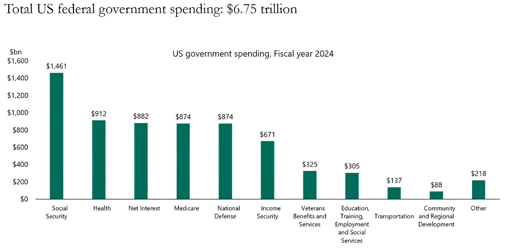
Source: Apollo Chief Economist. Through year-to-date 2024.
The chart above shows the breakdown in US Government Spending by category for 2024.
Notably, Net Interest, which was the third highest category for 2024 at $882 billion, is already on a run rate of over $1 trillion for 2025.
This would place Net Interest (the US government borrowing cost) as the number two line item (behind social security) in the US government’s expense ledger.
While we are intrigued by Elon Musk’s Department of Government Efficiency (“DOGE”), when looking at the largest expense categories:
social security; medicaid (healthcare for lower income);
medicare (healthcare for senior citizens);
and defense,
there seems to be little scope for significant cost reductions.
In our view, refinancing the US Treasuries is the biggest risk to markets (in general) that we see, and it is a risk that few seem to understand or appreciate.
As we wrote in (chart 4 here), 54% of all US debt outstanding needs to be refinanced over the next 3 years.
To put this in context - there is now $36 trillion in US debt outstanding.
This means that over $19 trillion in debt will need to be refinanced over the next three years plus the amount of new debt that will need to be issued to cover the fiscal deficit.
In our view, that much supply could be greater than demand at current yields and, if so, would push yields higher.
Even if the new supply doesn’t lead to higher yields, the current weighted average yield on the debt outstanding is 3.4%. (source: Strategas).
With 2-Year and 10-Year US Yields currently at 4.2% (and nowhere on the Treasury curve below 3.4%), it is likely that when the government refinances its debt, the interest expense will increase.
This increase in interest expense would likely off-set any cost cutting that the DOGE is able to achieve.
Maybe this is why the Fed is trying to push short term-rates lower despite current macro-conditions.
It should be noted that in fiscal dominance regimes (see here; here; in chart 5 here; in the introduction here; chart 2 here; and chart 2 here), a key characteristic is that while the government lowers its key rate (in the case of the US, the Fed Funds rate), yields on longer maturities move higher.
(Past performance is not indicative of future results. This is not a recommendation to buy or sell any security and is not investment advice. Please do your own research and due diligence).