


King of Pain
It is said that markets will fool most of the people, most of the time. Another way to consider this is "what's the pain trade?" For US equities, the pain trade may still be lower. Let's dig in...

While we continue to see investor surveys that show pessimism (such as chart 2 here) and put buying finally spiked on Monday, we don’t yet see a “buyable” low.
Maybe it’s the circles we in which we travel, the publications we read and/or the financial television we watch - but the chorus in our sphere has consistently been saying to buy the dip. This isn’t maximum pessimism in our view.
Throughout 2024, as US equities moved relentlessly higher, we noticed how calls for a correction slowly began to fade away.
Occasionally, there would be a lonely voice that called for a sell-off, but that voice would quickly be drowned out by a combination of those calling for 7000 on the S&P 500 and a market that went further, in our view, than fundamentals warranted.
We have yet to see a similar dynamic in reverse - that would actually represent pessimism - on the downside.
It is important to recall what drove the markets higher. In our view, it was the combination of:
Stealth liquidity (see here, here, here, here, here, here, here, chart 4 here and here). Our view of liquidity as a market driver is why we have continued to emphasize the change from Treasury Secretary Yellen (who provided the stealth liquidity) to Treasury Secretary Bessent, who as we highlighted on Tuesday is content with transitional volatility as critical.
Fiscal Stimulus. The Biden administration ran a fiscal deficit of over 6% of GDP.
Hyper-scaler Spending. Given the $800 billion that the hyper-scalers were spending on data centers and AI, we viewed this as a stimulus in itself (see chart 4 here). But we have cautioned that a slowdown in spending or any disappointment could lead to volatility (we called this a “metaverse” moment see here).
Traditional liquidity has been paused, stealth liquidity has been somewhat removed, fiscal stimulus has reversed (DOGE) and the best of hyper-scaler spending growth has been priced in.
We are not confident that the reversal of these market drivers has been fully priced into earnings expectations, growth or equity market.
One of the most challenging aspects of the rapidly changing macro narrative driven by quickly evolving policy decisions is second order effects.
On Tuesday, we highlighted that even if certain policy decisions are not implemented - the uncertainty that they could be - can sometimes be enough to impact real world decisions.
Within markets, quickly evolving policy decisions impact price. In the charts below, it is most evident in Small Caps (chart 2) and the Dollar (chart 3).
Although we haven’t shown them - there have been significant changes and reversals in global bond markets (German yields higher, US yields lower).
Any time, we see rapid price movements, there is the possibility that someone has too much exposure or that there will be a margin call.
We learned from Long Term Capital Management in 1998 that risk can hide in some unlikely places.
This doesn’t mean equity markets will collapse, but it does mean, particularly with all of the macro noise surrounding US foreign policy and tariffs that we want to be more thoughtful, deliberate and patient about buying every dip.
The pain trade, in our view, may still be lower and may continue until the chorus of bulls quiets down.
King of Pain.
(For people of a certain age, the three stripes below are easily recognizable as those from the cover of Synchronicity album by the Police. King of Pain was song eight of eleven.)

1. The Nasdaq 100 ETF: The Fight at 500 has Begun

Source: TradingView. Through year-to-date 2025.
The chart above shows the Nasdaq 100 ETF (ticker: QQQ) with its 200-day moving average (curved light blue line).
We have written several times that the “fight” in our view would be at the $500 level (1.618 Fibonacci extension of the 2022 sell-off) which is now converging with the 200-day moving average.
We wrote about this likelihood two months ago (here):
“The 200-day moving average is moving higher and if the Nasdaq 100 ETF “checks back” to it, it will likely be in the neighborhood of the 1.618 Fibonacci extension that we have been citing as an important level since July 1 (here).
As we wrote with respect to the S&P 500 on Tuesday, we expect the real battle to occur (once again) at the 1.618 Fibonacci extension level.”
We don’t see the Nasdaq 100 falling through these two levels of support (the 1.618 Fibonacci extension level and 200-day moving average) without making a stand.
Needless to say, a meaningful break below the 200-day moving average for the first time in two years, would likely foreshadow further downside.
We are maintaining our stance with 15-20% cash in our portfolios and watching the battle at current levels before reacting further.
(This is not a recommendation to buy or sell any security and is not investment advice. Past performance is not indicative of future results. Please do your own research and due diligence).
2. An Update on Small Caps

Source: TradingView. Through year-to-date 2025.
The chart above shows the Russell 2000 Small Cap ETF (ticker: IWM) with its 200-day moving average (curved light blue line).
Two weeks ago (here), we wrote: “the recent action looks similar to the movement prior to the 2022 sell off” and we highlighted the similarity on the chart with the pink boxes.
Since that time, the fall below both the 200-day moving average and the $212 line are definite negatives.
If the 2022 parallel holds, the Russell 2000 ETF will move down to $194 before bouncing back higher to meet the underside of $212 and the 200-day moving average (I’ve highlighted this with the green arrow).
For now, we view the Small Caps as better reflecting the broad macro-economic uncertainties than the large caps.
In our view, without positive surprises from the Magnificent 7 or some other large cap sector, the negativity that is priced into Small Caps could transcend into the S&P 500 and Nasdaq 100.
(Past performance is not indicative of further results. This is not a recommendation to buy or sell any security and is not investment advice. Please do your own due diligence).
3. Dollar Weakness
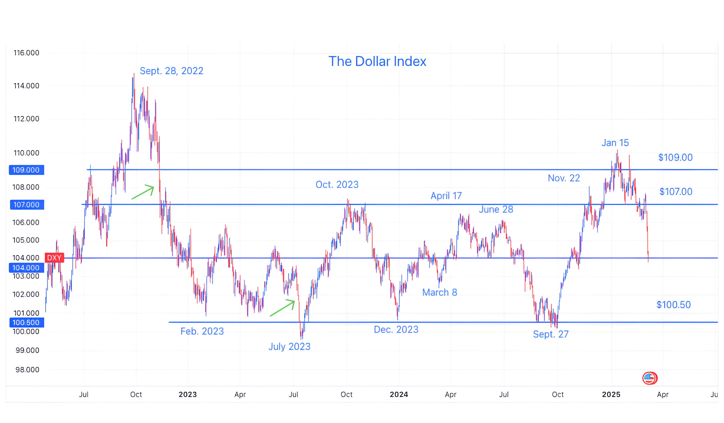
Source: TradingView. Through year-to-date 2025.
The chart above shows the US Dollar Index (DXY).
We last showed this chart a 6 weeks ago (here).
At the time, the Dollar was near its recent high and we wanted to see how it reacted if it fell back to the $109 level.
Well, we have our answer!
It’s obviously no coincidence that the Dollar has been weakening since shortly after President Trump’s inauguration, however, the sell-off over the past two days has been dramatic.
There have been two somewhat similar sell-offs over the past two years - I have noted them with green arrows.
In the first instance, the dollar sold off, paused and then sold off further. In the second instance, the dollar sold off and reversed.
As the dollar is now at the $104 level - which has been both a floor and a ceiling over the past two years, we wouldn’t be surprised to see a pause.
We believe that whether the dollar sells off further or reverses will be policy driven and given the nature of the decision making process will be hard to predict.
As we typically write when considering the Dollar, since 2022 large moves in the US Dollar have generally been inverse to equity market performance.
In other words, US Dollar strength has often foreshadowed equity weakness and vice versa.
That said, we find it notable that from September 27 to January 15 as the dollar strengthened, the S&P 500 moved higher by 6%.
Given that the inverse relationship didn’t hold during that period, we question if dollar weakness in the current period will lead to US equity strength.
(Past performance is not indicative of future results. This is not a recommendation to buy or sell any security and is not investment advice. Please do your own due diligence).
4. The Sahm Rule is Flashing Yellow, Again

Source: BLS, Macrobond and Swiss Re. Through year-to-date 2025.
The chart above shows the “Sahm Rule” at the state level. (We last wrote about the Sahm Rule in early September here).
The Sahm Rule, developed by economist Claudia Sahm, correlates the change in unemployment to US growth / recessions.
Specifically, the Sahm Rule states that when the three-month moving average of the US unemployment rate is at least half a percentage point (0.5%) higher than the 12-month low, than the US is or will soon be in a recession.
While the Sahm Rule is based on US employment overall, it can be looked at on a state by state basis (as in the chart above) to provide an early warning on the national indicator.
Last year, the Sahm Rule came thisclose to flashing Red (decimal points away) and, as can be seen on the chart made a rare (but not unprecedented) reversal after moving above 30 at the state level.
We also highlighted employment in chart 3 here as we considered BCA’s case for a US recession in 2025 (chart 3 here).
Although our base case does not call for a recession - in line with the introduction - its seems as if no one is. Could this be a “pain trade.”
With the February employment report coming out tomorrow, we want to watch closely and keep an open mind.
(Past performance is not indicative of future results. This is not a recommendation to buy or sell any security and is not investment advice. Please do your own research and due diligence).
5. Third Year of a Bull Market
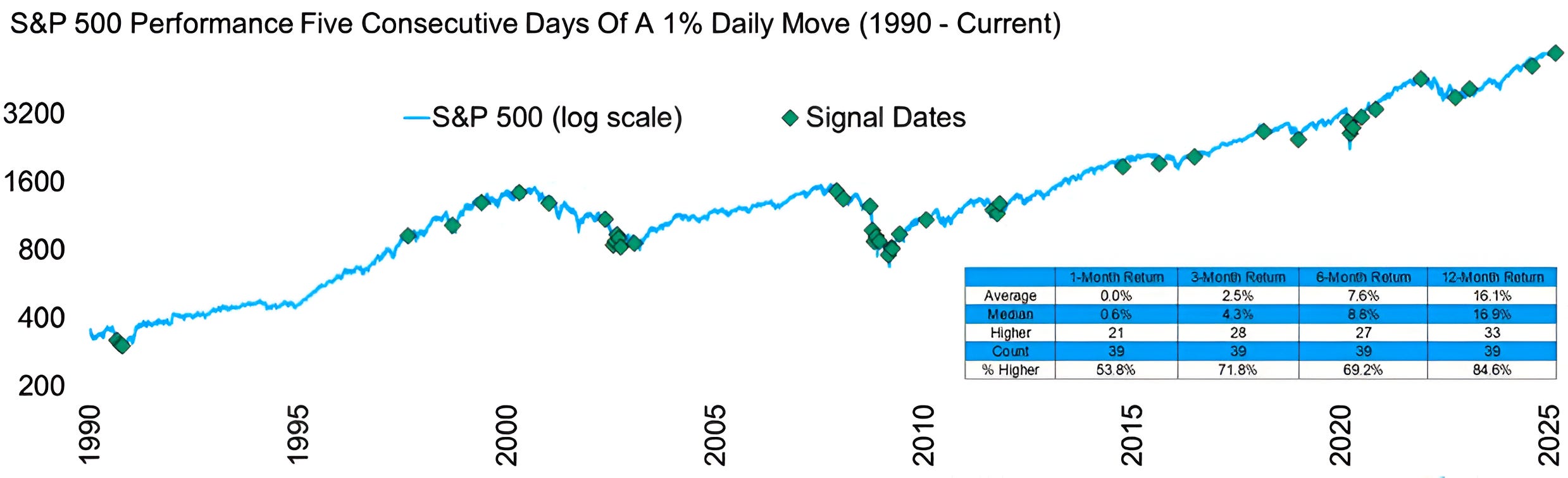
Source: Carson Investment Research / Ryan Detrick. Through year-to-date 2025.
The chart above shows the instances when the S&P 500 has experienced five consecutive days of a 1% move (either up or down) and the subsequent performance.
On average, after five consecutive days of a 1% move, the S&P been higher one month 54% of the time.
Six months following five consecutive days of a 1% move, the S&P 500 has only been positive 69%.
However, after one year, the S&P 500 has been positive 85% of the time. In other words, the short and medium-term volatility is generally resolved.
Why do I find this interesting?
It is somewhat consistent with chart 5 on Tuesday (here) that showed the third-year of bull markets.
The conclusion of that piece showed that Year 3 of bull markets (what we’re presently in) on average have returned 1% with a wide dispersion (+14.5% to -11.4%) of returns.
As we showed the current year 3 of the bull market has been behaving in line with the past.
That said, year 3 of the current bull market ends at around the same time that the market will enter the second six month following five consecutive days of a 1% move.
As we showed the first six months after five consecutive days of a 1% move seem volatile, while the second six months reflect recovery.
What this says to me is that there may be volatility and inconsistency through September, but September / October this year - as is often the case - will be a buying opportunity.
(Past performance is not indicative of future results. This is not a recommendation to buy or sell any security and is not investment advice. Please do your own research and due diligence).